依赖
项目基础配置使用 vue-cli 生成
自适应方案核心: 阿里可伸缩布局方案 lib-flexible
px转rem:px2rem,它有webpack的loader px2rem
开始
先使用vue脚手架初始化一个项目
vue create 项目名
项目初始化好了之后,进入项目目录中 (cd 项目名) 安装 lib-flexible 和 px2rem-loader
npm i lib-flexible -S
npm i px2rem-loader -D
安装好了之后还需要在项目的入口文件 main.js 里引入 lib-flexible
// main.js
import 'lib-flexible'
接下来为了验证 lib-flexible 是否生效,可以将app.vue中的内容改成:
<template>
  <div class="wrapper">
    <div class="box1"></div>
    <div class="box2"></div>
    <div class="box3"></div>
    <div class="box4"></div>
    <div class="box5"></div>
  </div>
</template>

<style>
	* {
	  margin: 0;
	  padding: 0;
	}
</style>

<style scoped>
	.wrapper div {
	  height: 1rem;
	}
	.box1 {
	  width: 2rem;
	  background-color: coral;
	}
	.box2 {
	  width: 4rem;
	  background-color: skyblue;
	}
	.box3 {
	  width: 6rem;
	  background-color: palegreen;
	}
	.box4 {
	  width: 8rem;
	  background-color: wheat;
	}
	.box5 {
	  width: 10rem;
	  background-color: darkred;
	}
</style>

但是在实际开发中,我们通过设计稿得到的单位是px,所以要将px转换成rem再进行样式中。但如果都需要手动转的话,就很麻烦,所以需要一个工具替我们完成这项工作,这个时候就需要配置px2rem了,当然,编辑器可能也要对应的插件。
在 vue.config.js(没有的话就新建一个)中配置如下:
module.exports = {
  chainWebpack: config => {
    config.module
      .rule("css")
      .test(/\.css$/)
      .oneOf("vue")
      .resourceQuery(/\?vue/)
      .use("px2rem")
      .loader("px2rem-loader")
      .options({
        remUnit: 75
      });
  }
};
remUnit的值请自行修改。
修改配置以后 重启服务器,将原来app.vue文件中的样式改成:
<style scoped>
.wrapper div {
  height: 1rem;
}
.box1 {
  /* 750 * 20% */
  width: 150px;
  background-color: coral;
}
.box2 {
  /* 750 * 40% */
  width: 300px;
  background-color: skyblue;
}
.box3 {
  /* 750 * 60% */
  width: 450px;
  background-color: palegreen;
}
.box4 {
  /* 750 * 80% */
  width: 600px;
  background-color: wheat;
}
.box5 {
  /* 750 * 100% */
  width: 750px;
  background-color: darkred;
}
</style>
但是有一个问题,我明明设置的宽度是按1920来的,为什么计算出来1rem=54px?

是不是插件哪里出了问题,或者在哪里定义过跟54或者540相关的东西?
找到node_modules下的lib-flexible文件夹

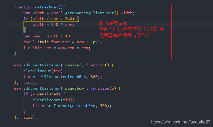
找到问题了就解决问题,既然文件把屏幕宽度写死了,那就不写死:
扫描二维码关注公众号,回复:
11250461 查看本文章

function refreshRem(){
        var width = docEl.getBoundingClientRect().width;
        if (width / dpr > 540) {
            width = width * dpr;
        }
        var rem = width / 10;
        docEl.style.fontSize = rem + 'px';
        flexible.rem = win.rem = rem;
    }
现在再重启项目,看一下运行结果:

END…