.Net Framework 4.5和.Net Core开始提供类似Office界面风格的控件。没事想抄个Windows自带的画图玩玩,Ribbon窗口往一套,倒也简单,只是细节方面有些不同,最明显的就是主菜单部分,画图里是扁平的形状,并且内容是用的文本。然而RibbonApplicationMenu去没有提供这样的选项,只能使用图片,而且没有地方可以设置。如果想做得跟画图一样,那就要定制这个菜单了。好在Xaml的机制下可以比较灵活地修改内容模板。以下就说说修改的过程。
定制WPF控件有两种方法,一种是通过继承,另一种是就是新建内容模板。前一种一般是要增加控件的新功能,后一种只是为了修改显式样式。这里只是为了修改显示样式,所以选择后一种就行了。
开始之前,先了解一下Ribbon窗口的结构。
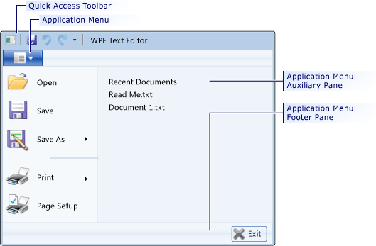
从图中可以看出,这是一个复合控件。如果是简单控件,直接重给控件内容就行了,比如自定义一个圆形按钮,
<ControlTemplate x:Key="roundbutton" TargetType="Button">
    <Grid>
        <Ellipse x:Name="backgroundElement" Fill="{TemplateBinding Background}" Stroke="{TemplateBinding Foreground}" />
        <ContentPresenter HorizontalAlignment="Center" VerticalAlignment="Center" />
    </Grid>
</ControlTemplate>
但如果重绘一个复合控件,只是这么简单的绘制的话,会发现控件不可用了,比如一个ComboBox控件,它实际上包含一个Textbox、一个ToggleButton、一个弹出窗口以及菜单项的模板。这些子控件称为Parts,每个part有一个名称,在呈现控件树的时候使用。
ComboBox 有两个part
PART_EditableTextBox ComboBox的文本内容.
PART_Popup Popup 下拉弹出窗口.
同样,RibbonApplicationMenu也有5个part,分别是
PART_PopupToggleButton 默认按扭,类型为RibbonToggleButton
PART_Popup 下拉框,类型为Popup
PART_SubmenuPlaceholder 子菜单容器,类型为一个容器,比如StackPanel
PART_FooterPaneContentPresenter 底部内容,类型为ContentPresenter
PART_AuxiliaryPaneContentPresenter 右侧内容,类型为ContentPresenter
我们定义这个按钮:
<RibbonToggleButton x:Name="PART_ToggleButton" ClickMode="Release" Label="文件" IsChecked="{Binding IsDropDownOpen, Mode=TwoWay, RelativeSource={RelativeSource TemplatedParent}}" Foreground="White" Background="#FF3E3EC7" Focusable="False" IsTabStop="False" FocusedBackground="#FF6161F7" CornerRadius="0,0,0,0" MouseOverBackground="#FF6161F7" MouseOverBorderBrush="#FF6161F7"/>
这里需要注意的两个属性,一个是ClickMode,要设置成Release,否则因为绑定的原因不能正常触发,将CornerRadius设置成"0,0,0,0",默认是“2,2,2,2”。
有了按钮后,还只能触发IsDropDownOpen属性的变化,接下来就要根据这个属性来触发弹框了。我们要定义一个Popup.
<Popup x:Name="PART_Popup" IsOpen="{TemplateBinding IsDropDownOpen}" PopupAnimation="Slide" Placement="Relative">
</Popup>
有了这个Popup,点击蓝色的按钮就看一个弹出的小框框。接下来完善一下其它部分的内容:
<Popup x:Name="PART_Popup" IsOpen="{TemplateBinding IsDropDownOpen}" PopupAnimation="Slide" Placement="Relative" Width="450">
                                    <Border Background="#FFE6E6E6" BorderBrush="#FF5EADCB" BorderThickness="1,1,1,1">
                                        <Grid MinWidth="{TemplateBinding ActualWidth}" MaxHeight="{TemplateBinding MaxHeight}">
                                            <Grid.RowDefinitions>
                                                <RowDefinition/>
                                                <RowDefinition/>
                                                <RowDefinition/>
                                            </Grid.RowDefinitions>
                                            <Grid.ColumnDefinitions>
                                                <ColumnDefinition/>
                                                <ColumnDefinition/>
                                            </Grid.ColumnDefinitions>
                                            <Border Grid.Row="1" Width="150">
                                                <StackPanel  IsItemsHost="True"/>
                                            </Border>
                                            <Border Grid.Row="1" Grid.Column="1" BorderBrush="Gray" Width="150">
                                                <ContentPresenter x:Name="PART_AuxiliaryPaneContentPresenter"  ContentTemplateSelector="{TemplateBinding AuxiliaryPaneContentTemplateSelector}" Content="{TemplateBinding AuxiliaryPaneContent}" ContentTemplate="{TemplateBinding AuxiliaryPaneContentTemplate}"/>
                                            </Border>
                                            <Border Grid.Row="2" Grid.ColumnSpan="2" Height="30">
                                                <ContentPresenter x:Name="PART_FooterPaneContentPresenter"  Content="{TemplateBinding FooterPaneContent}" ContentTemplate="{TemplateBinding FooterPaneContentTemplate}" ContentTemplateSelector="{TemplateBinding FooterPaneContentTemplateSelector}"/>
                                            </Border>
                                            <RibbonToggleButton x:Name="PART_PopupToggleButton" ClickMode="Release" Label="文件" IsChecked="{Binding IsDropDownOpen, Mode=TwoWay, RelativeSource={RelativeSource TemplatedParent}}" Foreground="White" Background="#FF3E3EC7" Focusable="False" IsTabStop="False" IsHitTestVisible="True" HorizontalAlignment="Left" VerticalAlignment="Center" Height="{Binding ActualHeight, ElementName=PART_ToggleButton, Mode=OneWay}" Width="{Binding ActualWidth, ElementName=PART_ToggleButton, Mode=OneWay}" FocusedBackground="#FF6161F7" CornerRadius="0,0,0,0" MouseOverBackground="#FF6161F7" MouseOverBorderBrush="#FF6161F7" />

                                        </Grid>
                                    </Border>
                                </Popup>
这个代码中多了一个RibbonToggleButton,画图程序菜单里有这么一个按钮,这个也是RibbonApplicationMenu的一个Part,实际是继承了RibbonMenuButton的内容,画图里将这个按钮显示在了最上方,如果没这个按钮,主菜单按钮会被挡在下边,为了保持外观的一至性,在弹出框再放一个相同的按钮。同样的,Windows资源管理器也是相同的设计。
整个模板的实现代码如下:
<ControlTemplate TargetType="RibbonApplicationMenu">
                            <Grid>
                                <Popup x:Name="PART_Popup" IsOpen="{TemplateBinding IsDropDownOpen}" PopupAnimation="Slide" Placement="Relative" Width="450">
                                    <Border Background="#FFE6E6E6" BorderBrush="#FF5EADCB" BorderThickness="1,1,1,1">
                                        <Grid MinWidth="{TemplateBinding ActualWidth}" MaxHeight="{TemplateBinding MaxHeight}">
                                            <Grid.RowDefinitions>
                                                <RowDefinition/>
                                                <RowDefinition/>
                                                <RowDefinition/>
                                            </Grid.RowDefinitions>
                                            <Grid.ColumnDefinitions>
                                                <ColumnDefinition/>
                                                <ColumnDefinition/>
                                            </Grid.ColumnDefinitions>
                                            <Border Grid.Row="1" Width="150">
                                                <StackPanel  IsItemsHost="True"/>
                                            </Border>
                                            <Border Grid.Row="1" Grid.Column="1" BorderBrush="Gray" Width="150">
                                                <ContentPresenter x:Name="PART_AuxiliaryPaneContentPresenter"  ContentTemplateSelector="{TemplateBinding AuxiliaryPaneContentTemplateSelector}" Content="{TemplateBinding AuxiliaryPaneContent}" ContentTemplate="{TemplateBinding AuxiliaryPaneContentTemplate}"/>
                                            </Border>
                                            <Border Grid.Row="2" Grid.ColumnSpan="2" Height="30">
                                                <ContentPresenter x:Name="PART_FooterPaneContentPresenter"  Content="{TemplateBinding FooterPaneContent}" ContentTemplate="{TemplateBinding FooterPaneContentTemplate}" ContentTemplateSelector="{TemplateBinding FooterPaneContentTemplateSelector}"/>
                                            </Border>
                                            <RibbonToggleButton x:Name="PART_PopupToggleButton" ClickMode="Release" Label="文件" IsChecked="{Binding IsDropDownOpen, Mode=TwoWay, RelativeSource={RelativeSource TemplatedParent}}" Foreground="White" Background="#FF3E3EC7" Focusable="False" IsTabStop="False" IsHitTestVisible="True" HorizontalAlignment="Left" VerticalAlignment="Center" Height="{Binding ActualHeight, ElementName=PART_ToggleButton, Mode=OneWay}" Width="{Binding ActualWidth, ElementName=PART_ToggleButton, Mode=OneWay}" FocusedBackground="#FF6161F7" CornerRadius="0,0,0,0" MouseOverBackground="#FF6161F7" MouseOverBorderBrush="#FF6161F7" />

                                        </Grid>
                                    </Border>
                                </Popup>
                                <RibbonToggleButton x:Name="PART_ToggleButton" ClickMode="Release" Label="文件" IsChecked="{Binding IsDropDownOpen, Mode=TwoWay, RelativeSource={RelativeSource TemplatedParent}}" Foreground="White" Background="#FF3E3EC7" Focusable="False" IsTabStop="False" FocusedBackground="#FF6161F7" CornerRadius="0,0,0,0" MouseOverBackground="#FF6161F7" MouseOverBorderBrush="#FF6161F7"/>


                            </Grid>

                        </ControlTemplate>