上一篇介绍了如何使用阿里巴巴图标和制作带图标的按钮,前面的做法只是简单介绍,要真正能够运用到项目中,还有一段路要走,这里继续介绍如何完善之前的自定义按钮,使之能够合理的运用到以后的项目中。
就拿上一个测试代码来说:
<Window x:Class="WpfApplication1.MainWindow"
xmlns="http://schemas.microsoft.com/winfx/2006/xaml/presentation"
xmlns:x="http://schemas.microsoft.com/winfx/2006/xaml"
xmlns:d="http://schemas.microsoft.com/expression/blend/2008"
xmlns:mc="http://schemas.openxmlformats.org/markup-compatibility/2006"
xmlns:local="clr-namespace:WpfApplication1"
xmlns:controls="clr-namespace:WpfCustomControlLibrary.Controls;assembly=WpfCustomControlLibrary"
mc:Ignorable="d"
Title="MainWindow" Height="350" Width="525">
<Grid>
<Grid.RowDefinitions>
<RowDefinition></RowDefinition>
<RowDefinition></RowDefinition>
<RowDefinition></RowDefinition>
</Grid.RowDefinitions>
<Grid.ColumnDefinitions>
<ColumnDefinition></ColumnDefinition>
<ColumnDefinition></ColumnDefinition>
</Grid.ColumnDefinitions>
<Button Grid.Row="0" Grid.Column="0" Content="Default Button" Width="100" Height="50"></Button>
<controls:MyButton1 Grid.Row="0" Grid.Column="1" Width="100" Height="50" Content="MyButton1" Background="Orange" />
<TextBlock Grid.Row="1" Grid.Column="0" Text="" FontSize="50" Foreground="Green" Style="{StaticResource MyIcon}" ></TextBlock>
</Grid>
</Window>
接下来介绍一种方式,能够在前台设置各种Icon,就是使用 附加属性:
1.修改 MyButton1.cs 代码为:
    public class MyButton1 : Button
    {
        static MyButton1()
        {
            DefaultStyleKeyProperty.OverrideMetadata(typeof(MyButton1), new FrameworkPropertyMetadata(typeof(MyButton1)));
        }

        public static readonly DependencyProperty MyIconProperty =
    DependencyProperty.Register("MyIcon", typeof(string), typeof(MyButton1), new PropertyMetadata("\ue6f0"));
        /// <summary>
        /// 按钮字体图标编码
        /// </summary>
        public string MyIcon
        {
            get { return (string)GetValue(MyIconProperty); }
            set { SetValue(MyIconProperty, value); }
        }
    }
2.修改 MyButton1.xaml 样式代码为:
扫描二维码关注公众号,回复:
1532736 查看本文章

<ResourceDictionary xmlns="http://schemas.microsoft.com/winfx/2006/xaml/presentation"
                    xmlns:x="http://schemas.microsoft.com/winfx/2006/xaml"
                    xmlns:local="clr-namespace:WpfCustomControlLibrary.Controls">

    <ResourceDictionary.MergedDictionaries>
        <ResourceDictionary Source="pack://application:,,,/WpfCustomControlLibrary;component/Controls/MyIcon.xaml" />
    </ResourceDictionary.MergedDictionaries>


    <ControlTemplate x:Key="MyButton1_Template" TargetType="{x:Type local:MyButton1}">
        <Border x:Name="border" Background="{Binding RelativeSource={RelativeSource Mode=TemplatedParent}, Path= Background}"
                                    Height="{Binding RelativeSource={RelativeSource Mode=TemplatedParent}, Path=Height}"
                                    CornerRadius="2"
                                    BorderBrush="{TemplateBinding BorderBrush}" BorderThickness="{TemplateBinding BorderThickness}"
                                    Width="{Binding RelativeSource={RelativeSource Mode=TemplatedParent}, Path=Width}">
            <!--Icon/Text-->
            <StackPanel Orientation="Horizontal" VerticalAlignment="Center"
                        Margin="{TemplateBinding Padding}"
                        HorizontalAlignment="{TemplateBinding HorizontalContentAlignment}">
                <TextBlock x:Name="icon"  Margin="3"
                           RenderTransformOrigin="0.5,0.5" Style="{StaticResource MyIcon}"
                           Text="{Binding RelativeSource={RelativeSource Mode=TemplatedParent}, Path= MyIcon}"
                           FontSize="30"
                           Foreground="Green">
                    <TextBlock.RenderTransform>
                        <RotateTransform x:Name="transIcon" Angle="0"/>
                    </TextBlock.RenderTransform>
                </TextBlock>

                <TextBlock VerticalAlignment="Center"  x:Name="txt"
                           TextDecorations="{Binding RelativeSource={RelativeSource Mode=TemplatedParent}, Path=ContentDecorations}"
                                               Text="{Binding RelativeSource={RelativeSource Mode=TemplatedParent}, Path=Content}" />
            </StackPanel>
        </Border>
    </ControlTemplate>

    <Style TargetType="{x:Type local:MyButton1}">
        <Setter Property="Template" Value="{StaticResource MyButton1_Template}"/>
    </Style>

</ResourceDictionary>
实际上就改了一行代码:
Text="{Binding RelativeSource={RelativeSource Mode=TemplatedParent}, Path= MyIcon}"
3.修改测试程序前端代码:
<Window x:Class="WpfApplication1.MainWindow"
xmlns="http://schemas.microsoft.com/winfx/2006/xaml/presentation"
xmlns:x="http://schemas.microsoft.com/winfx/2006/xaml"
xmlns:d="http://schemas.microsoft.com/expression/blend/2008"
xmlns:mc="http://schemas.openxmlformats.org/markup-compatibility/2006"
xmlns:local="clr-namespace:WpfApplication1"
xmlns:controls="clr-namespace:WpfCustomControlLibrary.Controls;assembly=WpfCustomControlLibrary"
mc:Ignorable="d"
Title="MainWindow" Height="350" Width="525">
<Grid>
<Grid.RowDefinitions>
<RowDefinition></RowDefinition>
<RowDefinition></RowDefinition>
<RowDefinition></RowDefinition>
</Grid.RowDefinitions>
<Grid.ColumnDefinitions>
<ColumnDefinition></ColumnDefinition>
<ColumnDefinition></ColumnDefinition>
</Grid.ColumnDefinitions>
<Button Grid.Row="0" Grid.Column="0" Content="Default Button" Width="100" Height="50"></Button>
<controls:MyButton1 Grid.Row="0" Grid.Column="1" Width="100" Height="50" Content="MyButton1" MyIcon="" Background="Orange" />
<TextBlock Grid.Row="1" Grid.Column="0" Text="" FontSize="50" Foreground="Green" Style="{StaticResource MyIcon}" ></TextBlock>
<controls:MyButton1 Grid.Row="1" Grid.Column="1" Width="100" Height="50" Content="MyButton1" MyIcon="" Background="Orange" />
</Grid>
</Window>
这样就能在前台修改任意的icon了:
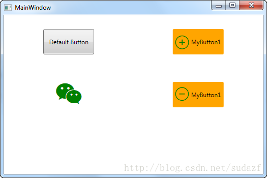
当然,仅仅能够修改icon还是远远不够的,;还有icon大小,颜色,边距等都要能够在前台自由设置,所以需要添加的附加依赖属性还有很多,这就要看具体要求了,这里继续为它添加几个附加属性,包括:icon大小,边距 这2个;(颜色属性一般可以直接使用Button自带的 Foreground 即可)
1.修改 MyButton1.cs 代码:
public class MyButton1 : Button
    {
        static MyButton1()
        {
            DefaultStyleKeyProperty.OverrideMetadata(typeof(MyButton1), new FrameworkPropertyMetadata(typeof(MyButton1)));
        }

        public static readonly DependencyProperty MyIconProperty =
    DependencyProperty.Register("MyIcon", typeof(string), typeof(MyButton1), new PropertyMetadata("\ue6f0"));
        /// <summary>
        /// 按钮字体图标编码
        /// </summary>
        public string MyIcon
        {
            get { return (string)GetValue(MyIconProperty); }
            set { SetValue(MyIconProperty, value); }
        }

        public static readonly DependencyProperty MyIconSizeProperty =
           DependencyProperty.Register("MyIconSize", typeof(int), typeof(MyButton1), new PropertyMetadata(20));
        /// <summary>
        /// 按钮字体图标大小
        /// </summary>
        public int MyIconSize
        {
            get { return (int)GetValue(MyIconSizeProperty); }
            set { SetValue(MyIconSizeProperty, value); }
        }

        public static readonly DependencyProperty MyIconMarginProperty = DependencyProperty.Register(
            "MyIconMargin", typeof(Thickness), typeof(MyButton1), new PropertyMetadata(new Thickness(0, 1, 3, 1)));
        /// <summary>
        /// 字体图标间距
        /// </summary>
        public Thickness MyIconMargin
        {
            get { return (Thickness)GetValue(MyIconMarginProperty); }
            set { SetValue(MyIconMarginProperty, value); }
        }
    }
2.修改 MyButton1.xaml 代码:
<ResourceDictionary xmlns="http://schemas.microsoft.com/winfx/2006/xaml/presentation"
                    xmlns:x="http://schemas.microsoft.com/winfx/2006/xaml"
                    xmlns:local="clr-namespace:WpfCustomControlLibrary.Controls">

    <ResourceDictionary.MergedDictionaries>
        <ResourceDictionary Source="pack://application:,,,/WpfCustomControlLibrary;component/Controls/MyIcon.xaml" />
    </ResourceDictionary.MergedDictionaries>


    <ControlTemplate x:Key="MyButton1_Template" TargetType="{x:Type local:MyButton1}">
        <Border x:Name="border" Background="{Binding RelativeSource={RelativeSource Mode=TemplatedParent}, Path= Background}"
                                    Height="{Binding RelativeSource={RelativeSource Mode=TemplatedParent}, Path=Height}"
                                    CornerRadius="2"
                                    BorderBrush="{TemplateBinding BorderBrush}" BorderThickness="{TemplateBinding BorderThickness}"
                                    Width="{Binding RelativeSource={RelativeSource Mode=TemplatedParent}, Path=Width}">
            <!--Icon/Text-->
            <StackPanel Orientation="Horizontal" VerticalAlignment="Center"
                        Margin="{TemplateBinding Padding}"
                        HorizontalAlignment="{TemplateBinding HorizontalContentAlignment}">
                <TextBlock x:Name="icon"
                           Margin="{Binding RelativeSource={RelativeSource Mode=TemplatedParent}, Path=MyIconMargin}"
                           FontSize="{Binding RelativeSource={RelativeSource Mode=TemplatedParent}, Path= MyIconSize}"
                           Foreground="{Binding RelativeSource={RelativeSource Mode=TemplatedParent}, Path= Foreground}"
                           RenderTransformOrigin="0.5,0.5" Style="{StaticResource MyIcon}"
                           Text="{Binding RelativeSource={RelativeSource Mode=TemplatedParent}, Path= MyIcon}"
                          >
                    <TextBlock.RenderTransform>
                        <RotateTransform x:Name="transIcon" Angle="0"/>
                    </TextBlock.RenderTransform>
                </TextBlock>

                <TextBlock VerticalAlignment="Center"  x:Name="txt"
                           TextDecorations="{Binding RelativeSource={RelativeSource Mode=TemplatedParent}, Path=ContentDecorations}"
                                               Text="{Binding RelativeSource={RelativeSource Mode=TemplatedParent}, Path=Content}" />
            </StackPanel>
        </Border>
    </ControlTemplate>

    <Style TargetType="{x:Type local:MyButton1}">
        <Setter Property="Template" Value="{StaticResource MyButton1_Template}"/>
    </Style>

</ResourceDictionary>
3.测试代码:
<Window x:Class="WpfApplication1.MainWindow"
xmlns="http://schemas.microsoft.com/winfx/2006/xaml/presentation"
xmlns:x="http://schemas.microsoft.com/winfx/2006/xaml"
xmlns:d="http://schemas.microsoft.com/expression/blend/2008"
xmlns:mc="http://schemas.openxmlformats.org/markup-compatibility/2006"
xmlns:local="clr-namespace:WpfApplication1"
xmlns:controls="clr-namespace:WpfCustomControlLibrary.Controls;assembly=WpfCustomControlLibrary"
mc:Ignorable="d"
Title="MainWindow" Height="350" Width="525">
<Grid>
<Grid.RowDefinitions>
<RowDefinition></RowDefinition>
<RowDefinition></RowDefinition>
<RowDefinition></RowDefinition>
</Grid.RowDefinitions>
<Grid.ColumnDefinitions>
<ColumnDefinition></ColumnDefinition>
<ColumnDefinition></ColumnDefinition>
</Grid.ColumnDefinitions>
<Button Grid.Row="0" Grid.Column="0" Content="Default Button" Width="100" Height="50"></Button>
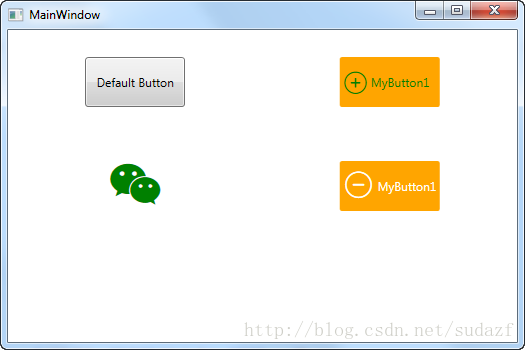
<controls:MyButton1 Grid.Row="0" Grid.Column="1" Width="100" Height="50" Content="MyButton1" MyIcon="" MyIconMargin="3" MyIconSize="25" Foreground="Green" Background="Orange" />
<TextBlock Grid.Row="1" Grid.Column="0" Text="" FontSize="50" Foreground="Green" Style="{StaticResource MyIcon}" ></TextBlock>
<controls:MyButton1 Grid.Row="1" Grid.Column="1" Width="100" Height="50" Content="MyButton1" MyIcon="" MyIconMargin="4" MyIconSize="30" Foreground="White" Background="Orange" />
</Grid>
</Window>
效果如下:
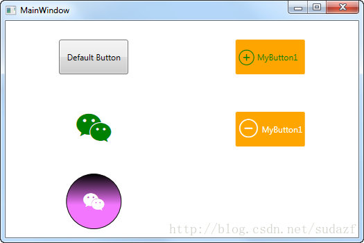
有了这两个附加属性之后,还可以结合 WPF自定义控件 按钮 (一)中的圆形按钮,做成带图标的圆形按钮,只需要:
1)在 MyButton1.xaml 中新增一个 key 为 RoundButton 的 Style :
<ResourceDictionary xmlns="http://schemas.microsoft.com/winfx/2006/xaml/presentation"
                    xmlns:x="http://schemas.microsoft.com/winfx/2006/xaml"
                    xmlns:local="clr-namespace:WpfCustomControlLibrary.Controls">

    <ResourceDictionary.MergedDictionaries>
        <ResourceDictionary Source="pack://application:,,,/WpfCustomControlLibrary;component/Controls/MyIcon.xaml" />
    </ResourceDictionary.MergedDictionaries>


    <ControlTemplate x:Key="MyButton1_Template" TargetType="{x:Type local:MyButton1}">
        <Border x:Name="border" Background="{Binding RelativeSource={RelativeSource Mode=TemplatedParent}, Path= Background}"
                                    Height="{Binding RelativeSource={RelativeSource Mode=TemplatedParent}, Path=Height}"
                                    CornerRadius="2"
                                    BorderBrush="{TemplateBinding BorderBrush}" BorderThickness="{TemplateBinding BorderThickness}"
                                    Width="{Binding RelativeSource={RelativeSource Mode=TemplatedParent}, Path=Width}">
            <!--Icon/Text-->
            <StackPanel Orientation="Horizontal" VerticalAlignment="Center"
                        Margin="{TemplateBinding Padding}"
                        HorizontalAlignment="{TemplateBinding HorizontalContentAlignment}">
                <TextBlock x:Name="icon"
                           Margin="{Binding RelativeSource={RelativeSource Mode=TemplatedParent}, Path=MyIconMargin}"
                           FontSize="{Binding RelativeSource={RelativeSource Mode=TemplatedParent}, Path= MyIconSize}"
                           Foreground="{Binding RelativeSource={RelativeSource Mode=TemplatedParent}, Path= Foreground}"
                           RenderTransformOrigin="0.5,0.5" Style="{StaticResource MyIcon}"
                           Text="{Binding RelativeSource={RelativeSource Mode=TemplatedParent}, Path= MyIcon}"
                          >
                    <TextBlock.RenderTransform>
                        <RotateTransform x:Name="transIcon" Angle="0"/>
                    </TextBlock.RenderTransform>
                </TextBlock>

                <TextBlock VerticalAlignment="Center"  x:Name="txt"
                           TextDecorations="{Binding RelativeSource={RelativeSource Mode=TemplatedParent}, Path=ContentDecorations}"
                                               Text="{Binding RelativeSource={RelativeSource Mode=TemplatedParent}, Path=Content}" />
            </StackPanel>
        </Border>
    </ControlTemplate>

    <ControlTemplate x:Key="MyButton1_RountTemplate" TargetType="{x:Type local:MyButton1}">
        <Grid>
            <VisualStateManager.VisualStateGroups>
                <VisualStateGroup x:Name="CommonStates">
                    <VisualStateGroup.Transitions>
                        <VisualTransition From="Normal" GeneratedDuration="0:0:0.3" To="MouseOver"/>
                        <VisualTransition From="MouseOver" GeneratedDuration="0:0:0.3" To="Normal"/>
                        <VisualTransition From="Pressed" GeneratedDuration="0:0:0.2" To="Normal"/>
                    </VisualStateGroup.Transitions>
                    <VisualState x:Name="Normal"/>
                    <VisualState x:Name="MouseOver">
                        <Storyboard>
                            <ColorAnimationUsingKeyFrames Storyboard.TargetProperty="(Shape.Fill).(GradientBrush.GradientStops)[1].(GradientStop.Color)" Storyboard.TargetName="ellipse">
                                <EasingColorKeyFrame KeyTime="0" Value="#FFEFE9F0"/>
                            </ColorAnimationUsingKeyFrames>
                        </Storyboard>
                    </VisualState>
                    <VisualState x:Name="Pressed">
                        <Storyboard>
                            <ColorAnimationUsingKeyFrames Storyboard.TargetProperty="(Shape.Fill).(GradientBrush.GradientStops)[1].(GradientStop.Color)" Storyboard.TargetName="ellipse">
                                <EasingColorKeyFrame KeyTime="0" Value="#FF650A6E"/>
                            </ColorAnimationUsingKeyFrames>
                        </Storyboard>
                    </VisualState>
                    <VisualState x:Name="Disabled"/>
                </VisualStateGroup>
            </VisualStateManager.VisualStateGroups>
            <Ellipse x:Name="ellipse" Stroke="Black">
                <Ellipse.Fill>
                    <LinearGradientBrush EndPoint="0.5,1" StartPoint="0.5,0">
                        <GradientStop Color="Black" Offset="0"/>
                        <GradientStop Color="#FFF376FF" Offset="0.566"/>
                    </LinearGradientBrush>
                </Ellipse.Fill>
            </Ellipse>
            <!--Icon/Text-->
            <Canvas VerticalAlignment="Center"
                        Margin="{TemplateBinding Padding}"
                        HorizontalAlignment="{TemplateBinding HorizontalContentAlignment}">
                <TextBlock x:Name="icon"
                           Margin="{Binding RelativeSource={RelativeSource Mode=TemplatedParent}, Path=MyIconMargin}"
                           FontSize="{Binding RelativeSource={RelativeSource Mode=TemplatedParent}, Path= MyIconSize}"
                           Foreground="{Binding RelativeSource={RelativeSource Mode=TemplatedParent}, Path= Foreground}"
                           RenderTransformOrigin="0.5,0.5" Style="{StaticResource MyIcon}"
                           Text="{Binding RelativeSource={RelativeSource Mode=TemplatedParent}, Path= MyIcon}"
                          >
                    <TextBlock.RenderTransform>
                        <RotateTransform x:Name="transIcon" Angle="0"/>
                    </TextBlock.RenderTransform>
                </TextBlock>

                <TextBlock VerticalAlignment="Center"  x:Name="txt"
                           TextDecorations="{Binding RelativeSource={RelativeSource Mode=TemplatedParent}, Path=ContentDecorations}"
                                               Text="{Binding RelativeSource={RelativeSource Mode=TemplatedParent}, Path=Content}" />
            </Canvas>
        </Grid>
        <ControlTemplate.Triggers>
            <Trigger Property="IsFocused" Value="True"/>
            <Trigger Property="IsDefaulted" Value="True"/>
            <Trigger Property="IsMouseOver" Value="True"/>
            <Trigger Property="IsPressed" Value="True"/>
            <Trigger Property="IsEnabled" Value="False"/>
        </ControlTemplate.Triggers>
    </ControlTemplate>

    <Style TargetType="{x:Type local:MyButton1}">
        <Setter Property="Template" Value="{StaticResource MyButton1_Template}"/>
    </Style>

    <Style x:Key="RoundButton" TargetType="{x:Type local:MyButton1}">
        <Setter Property="Template" Value="{StaticResource MyButton1_RountTemplate}"/>
    </Style>

</ResourceDictionary>
2.在测试项目 App.xaml 中增加 MyButton1.xaml 的引用:
<Application x:Class="WpfApplication1.App"
             xmlns="http://schemas.microsoft.com/winfx/2006/xaml/presentation"
             xmlns:x="http://schemas.microsoft.com/winfx/2006/xaml"
             xmlns:local="clr-namespace:WpfApplication1"
             StartupUri="MainWindow.xaml">
    <Application.Resources>
        <ResourceDictionary>
            <ResourceDictionary.MergedDictionaries>
                <ResourceDictionary Source="pack://application:,,,/WpfCustomControlLibrary;component/Controls/MyIcon.xaml"/>
                <ResourceDictionary Source="pack://application:,,,/WpfCustomControlLibrary;component/Controls/MyButton1.xaml"/>
            </ResourceDictionary.MergedDictionaries>
        </ResourceDictionary>
    </Application.Resources>

</Application>
3.修改测试代码:
<Window x:Class="WpfApplication1.MainWindow"
xmlns="http://schemas.microsoft.com/winfx/2006/xaml/presentation"
xmlns:x="http://schemas.microsoft.com/winfx/2006/xaml"
xmlns:d="http://schemas.microsoft.com/expression/blend/2008"
xmlns:mc="http://schemas.openxmlformats.org/markup-compatibility/2006"
xmlns:local="clr-namespace:WpfApplication1"
xmlns:controls="clr-namespace:WpfCustomControlLibrary.Controls;assembly=WpfCustomControlLibrary"
mc:Ignorable="d"
Title="MainWindow" Height="350" Width="525">
<Grid>
<Grid.RowDefinitions>
<RowDefinition></RowDefinition>
<RowDefinition></RowDefinition>
<RowDefinition></RowDefinition>
</Grid.RowDefinitions>
<Grid.ColumnDefinitions>
<ColumnDefinition></ColumnDefinition>
<ColumnDefinition></ColumnDefinition>
</Grid.ColumnDefinitions>
<Button Grid.Row="0" Grid.Column="0" Content="Default Button" Width="100" Height="50"></Button>
<controls:MyButton1 Grid.Row="0" Grid.Column="1" Width="100" Height="50" Content="MyButton1" MyIcon="" MyIconMargin="3" MyIconSize="25" Foreground="Green" Background="Orange" />
<TextBlock Grid.Row="1" Grid.Column="0" Text="" FontSize="50" Foreground="Green" Style="{StaticResource MyIcon}" ></TextBlock>
<controls:MyButton1 Grid.Row="1" Grid.Column="1" Width="100" Height="50" Content="MyButton1" MyIcon="" MyIconMargin="4" MyIconSize="30" Foreground="White" Background="Orange" />
<controls:MyButton1 Grid.Row="2" Grid.Column="0" Style="{StaticResource RoundButton}" Width="80" MyIcon="" Height="80" MyIconMargin="25,-15,0,0" MyIconSize="30" Foreground="White" />
</Grid>
</Window>
以上仅仅介绍了附加属性+样式模板的使用,鼠标经过+鼠标点击等效果还没有做,下一篇介绍如何制作鼠标经过+点击效果动画。