谏言:穷则独善其身,达则兼济天下
模块datetime
from datetime import datetime
first_date = datetime.strptime('2014-7-1','%Y-%m-%d')
print(first_date)
在图标中添加日期
import csv
from datetime import datetime
import matplotlib.pyplot as plt
filename='sitka_weather_07-2014.csv'
with open(filename) as f:
reader = csv.reader(f)
header_row = next(reader)
dates,highs=[],[]
for row in reader:
current_date = datetime.strptime(row[0],'%Y-%m-%d')
dates.append(current_date)
high=int(row[1])
highs.append(high)
fig =plt.figure(dpi=128,figsize=(10,6))
plt.plot(dates,highs,c='red')
# 设置图形风格
plt.title("Daily high temperatures , July 2014", fontsize=24)
plt.xlabel('', fontsize=16)
fig.autofmt_xdate()
plt.ylabel("Temperature (F)", fontsize=16)
plt.tick_params(axis='both', which='major', labelsize=16)
plt.show()

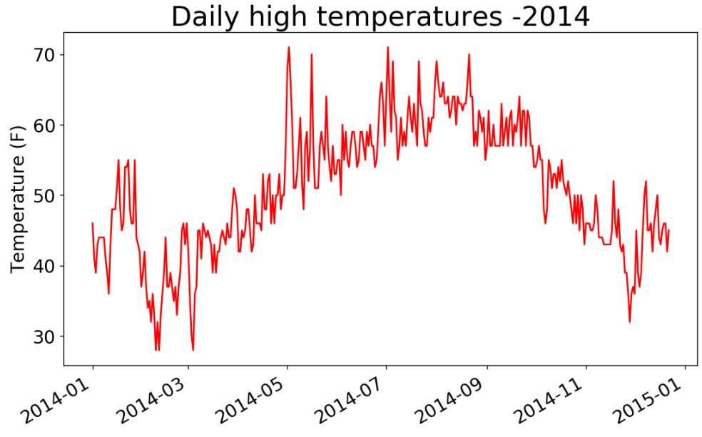
涵盖更长的时间
import csv
from datetime import datetime
import matplotlib.pyplot as plt
filename='sitka_weather_2014.csv'
with open(filename) as f:
reader = csv.reader(f)
header_row = next(reader)
dates,highs=[],[]
for row in reader:
current_date = datetime.strptime(row[0],'%Y-%m-%d')
dates.append(current_date)
high=int(row[1])
highs.append(high)
fig =plt.figure(dpi=128,figsize=(10,6))
plt.plot(dates,highs,c='red')
# 设置图形风格
plt.title("Daily high temperatures -2014", fontsize=24)
plt.xlabel('', fontsize=16)
fig.autofmt_xdate()
plt.ylabel("Temperature (F)", fontsize=16)
plt.tick_params(axis='both', which='major', labelsize=16)
plt.show()
再绘制一个数据系列
import csv
from datetime import datetime
import matplotlib.pyplot as plt
filename='sitka_weather_2014.csv'
with open(filename) as f:
reader = csv.reader(f)
header_row = next(reader)
dates,highs,lows=[],[],[]
for row in reader:
current_date = datetime.strptime(row[0],'%Y-%m-%d')
dates.append(current_date)
high=int(row[1])
highs.append(high)
low = int(row[3])
lows.append(low)
fig =plt.figure(dpi=128,figsize=(10,6))
plt.plot(dates,highs,c='red')
plt.plot(dates,lows,c='skyblue')
# 设置图形风格
plt.title("Daily high and low temperatures -2014", fontsize=24)
plt.xlabel('', fontsize=16)
fig.autofmt_xdate()
plt.ylabel("Temperature (F)", fontsize=16)
plt.tick_params(axis='both', which='major', labelsize=16)
plt.show()

import csv
from datetime import datetime
import matplotlib.pyplot as plt
filename='sitka_weather_2014.csv'
with open(filename) as f:
reader = csv.reader(f)
header_row = next(reader)
dates,highs,lows=[],[],[]
for row in reader:
current_date = datetime.strptime(row[0],'%Y-%m-%d')
dates.append(current_date)
high=int(row[1])
highs.append(high)
low = int(row[3])
lows.append(low)
fig =plt.figure(dpi=128,figsize=(10,6))
plt.plot(dates,highs,c='red',alpha=0.5)
plt.plot(dates,lows,c='red',alpha=0.5)
plt.fill_between(dates,highs,lows,facecolor='blue',alpha=0.1)
plt.plot(dates,highs,c='red')
plt.plot(dates,lows,c='skyblue')
# 设置图形风格
plt.title("Daily high and low temperatures -2014", fontsize=24)
plt.xlabel('', fontsize=16)
fig.autofmt_xdate()
plt.ylabel("Temperature (F)", fontsize=16)
plt.tick_params(axis='both', which='major', labelsize=16)
plt.show()
给图表区域着色

错误检查
import csv
from datetime import datetime
import matplotlib.pyplot as plt
filename='death_valley_2014.csv'
with open(filename) as f:
reader = csv.reader(f)
header_row = next(reader)
dates,highs,lows=[],[],[]
for row in reader:
try:
current_date = datetime.strptime(row[0],'%Y-%m-%d')
high=int(row[1])
low = int(row[3])
except ValueError:
print(current_date,'数据缺失')
else:
dates.append(current_date)
highs.append(high)
lows.append(low)
fig =plt.figure(dpi=128,figsize=(10,6))
plt.plot(dates,highs,c='red',alpha=0.5)
plt.plot(dates,lows,c='red',alpha=0.5)
plt.fill_between(dates,highs,lows,facecolor='blue',alpha=0.1)
plt.plot(dates,highs,c='red')
plt.plot(dates,lows,c='skyblue')
# 设置图形风格
title="Daily high and low temperatures -2014\nDeath Valley,CA"
plt.title(title,fontsize=20)
plt.xlabel('', fontsize=16)
fig.autofmt_xdate()
plt.ylabel("Temperature (F)", fontsize=16)
plt.tick_params(axis='both', which='major', labelsize=16)
plt.show()
# 报错
# ValueError Traceback (most recent call last)
# <ipython-input-14-ccfb79eb7adc> in <module>
# 12 dates.append(current_date)
# 13
# ---> 14 high=int(row[1])
# 15 highs.append(high)
# 16
# ValueError: invalid literal for int() with base 10: ''
# 数据为空字符串
# 需要进行处理