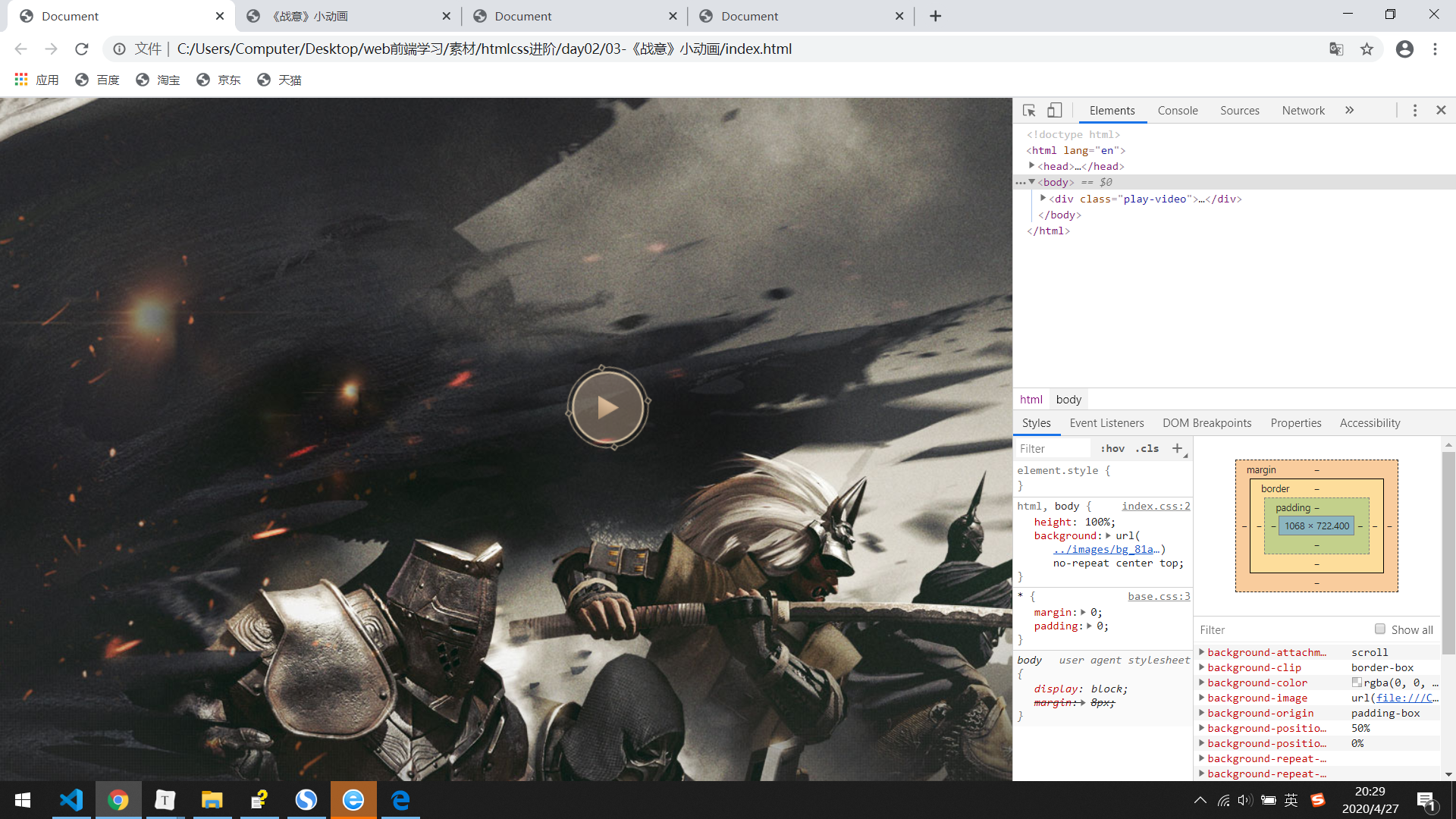
效果图:
我自己写的:
<!DOCTYPE html>
<html lang="en">

<head>
    <meta charset="UTF-8">
    <meta name="viewport" content="width=device-width, initial-scale=1.0">
    <title>《战意》小动画</title>
    <style>
    * {
            margin: 0;
            padding: 0;
        }

        .main {
            position: relative;
            width: 100%;
            height: 1000px;
            background-image: url(images/bg_81ab3d6.jpg);
            background-repeat: no-repeat;
            background-position: center top;
        }
        /* .main img {
            width: 1035px;
            height: 966px;
        } */

        .circle {
            position: absolute;
            width: 94px;
            height: 93px;
            background-image: url(images/index_z_9769688.png);
            background-repeat: no-repeat;
            background-position: -220px -492px;
            top: 277px;
            right: 344px;
            animation: rotate1 2s linear infinite;
        }

        .play {
            position: absolute;
            width: 94px;
            height: 93px;
            background-image: url(images/index_z_9769688.png);
            background-repeat: no-repeat;
            background-position: -1002px -670px;
            top: 292px;
            right: 328px;
        }

        @keyframes rotate1 {
            0% {
                transform: rotate(0deg);
            }
            100% {
                transform: rotate(360deg);
            }
        }
    }
    </style>
</head>

<body>
    <div class="main">
        <!-- <img src="images/bg_81ab3d6.jpg" alt=""> -->
        <div class="circle"></div>
        <div class="play"></div>
    </div>
</body>

</html>
答案:
基本设置:

* {
    margin: 0;
    padding: 0;
}

ul, ol {
    list-style: none;
}

input, button {
    outline: none;
    border: none;
}

a {
    text-decoration: none;
}

.clearfix::before,
.clearfix::after {
    content: "";
    height: 0;
    line-height: 0;
    display: block;
    visibility: hidden;
}

.clearfix::after {
    clear: both;
}
思路:body贴进去最大背景,置顶中心摆放,一个div中放两个微元素,前面的伪元素旋转,后面的伪元素居中

html,
body {
    height: 100%;
    background: url(../images/bg_81ab3d6.jpg) no-repeat center top;大的背景图片,居中置顶
}

.play-video {
    /* background-color: green; */使用绝对定位浮在大背景上
    position: absolute;
    top: 280px;移动相对于大背景的距离
    right: 380px;
    width: 93px;设置宽度和高度
    height: 93px;
    margin-left: -47px;居中对齐
    z-index: 4;
}

.play-video::before,
.play-video::after {
    display: block;
    width: 100%;块内元素使用绝对定位后,变为块级元素,宽度和高度都生效
    height: 100%;
    content: "";
    position: absolute;
}

.play-video::before {
    background-image: url(../images/index_z_9769688.png);精灵图通过背景图片找到指定图标
    /* background-color: pink; */
    background-position: -744px -819px;定位背景图片的指定图标
    background-repeat: no-repeat;背景图片不重复
    top: 0;默认绝对定位
    left: 0;
    -webkit-animation: rotate1 2s linear infinite 300ms 0 ease;
    -moz-animation: rotate1 2s linear infinite 300ms 0 ease;
    -ms-animation: rotate1 2s linear infinite 300ms 0 ease;
    animation: rotate1 2s linear infinite 300ms 0 ease;
    -moz-animation: rotate1 2s linear infinite;
    -webkit-animation: rotate1 2s linear infinite;
    -o-animation: rotate1 2s linear infinite;
    -ms-animation: rotate1 2s linear infinite;
    animation: rotate1 2s linear infinite;
}

.play-video::after {
    position: absolute;相对为div的绝对定位
    /* background-color: red; */
    left: 50%;块内元素绝对定位后宽度和高度都生效
    top: 50%;
    width: 21px;设置宽度和高度
    height: 25px;
    margin-top: -12px;居中对齐
    margin-left: -10px;
    background-image: url(../images/index_z_9769688.png);
    background-position: -2290px -107px;找到指定的背景图片
    background-repeat: no-repeat;背景图片不重复
}

@keyframes rotate1 {
    0% {
        transform: rotate(0deg);2d旋转改变的是位置,3d旋转是动态变化
    }
    100% {
        transform: rotate(360deg);
    }
}

.play-video:hover {
    cursor: pointer;
}

.play-video:hover::before {
    -webkit-animation-play-state: paused;
    -moz-animation-play-state: paused;
    -o-animation-play-state: paused;
    animation-play-state: paused;
    background-repeat: no-repeat;
}