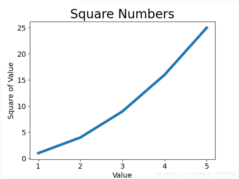
1.绘制折线图
使用matplotlib绘制一个简单的折线图,使用平方数1,4,9,16,25绘制这个图表
import matplotlib.pyplot as plt

input_values = [1, 2, 3, 4, 5]
squares = [1, 4, 9, 16, 25]
plt.plot(input_values, squares, lw = 5)

"""
plt.plot(x, y,  ls="-", lw=2, label="plot figure")x:
x:x轴上的数值
y: y轴上的数值
ls:折线图的线条风格
lw:折线图的线条宽度
label:标记图内容的标签文本
"""

"""设置图表标题"""
plt.title("Square Numbers", fontsize=24)
plt.xlabel("Value", fontsize=14)
plt.ylabel("Square of Value", fontsize=14)

"""设置刻度标记的大小"""
plt.tick_params(axis = 'both', labelsize=14)

plt.show()
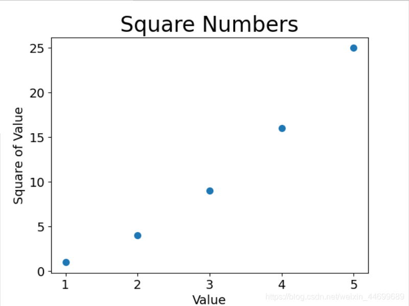
2.绘制散点图
绘制单个点,使用函数scatter(),并向其传递一对x,y坐标,它将在指定位置绘制一个点
import matplotlib.pyplot as plt

x_values = [1, 2, 3, 4, 5]
y_values = [1, 4, 9, 16, 25]

plt.scatter(x_values, y_values, s=50)

"""设置图表标题并给坐标轴加上标签"""
plt.title("Square Numbers", fontsize=24)
plt.xlabel("Value", fontsize=14)
plt.ylabel("Square of Value", fontsize=14)

"""设置刻度标记大小"""
plt.tick_params(axis='both', which='major', labelsize=14)
plt.show()
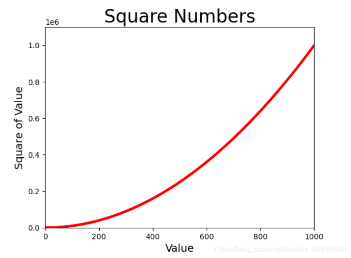
自动计算绘制1000个点
import matplotlib.pyplot as plt

x_values = list(range(1, 1001))
y_values = [x ** 2 for x in x_values]

plt.scatter(x_values, y_values, c='red', edgecolors='none', s=10)
#c为点的颜色,edgecolors为点边缘的颜色,s为点大小

"""设置图表标题并给坐标轴加上标签"""
plt.title("Square Numbers", fontsize=24)
plt.xlabel("Value", fontsize=14)
plt.ylabel("Square of Value", fontsize=14)

"""设置刻度标记大小"""
plt.axis([0, 1000, 0, 1100000])
#plt.tick_params(axis='both', which='major', labelsize=14)

#plt.show()
plt.savefig('squares_plot.png', bbox_inches='tight')
#保存文件,第一个为需要保存的文件名称,第二个参数为将图表多余的空白区域裁剪掉
3.随机漫步
使用python生成随机漫步数据,使用matplotlib将这些数据呈现出来
#random_walk.py
from random import choice

class RandomWalk():
    """生成随机漫步数据的类"""
    def __init__(self, num_points=5000):
        """初始化随机漫步的属性"""
        self.num_points = num_points

        """所有随机漫步始于(0,0)"""
        self.x_value = [0]
        self.y_value = [0]

    def fill_walk(self):
        """计算随机漫步包含的所有点"""

        #不断漫步,直到列表达到指定的长度
        while len(self.x_value) < self.num_points:
            #决定前进防线以及沿这个方向前进的距离
            x_direction = choice([1, -1])#choice 在给出的列表元素中随机选择一个
            x_distance = choice([0, 1, 2, 3, 4])
            x_step = x_direction * x_distance

            y_direction = choice([1, -1])
            y_distance = choice([0, 1, 2, 3, 4])
            y_step = y_direction * y_distance

            #拒绝原地踏步
            if x_step == 0 and y_step == 0:
                continue

            #计算下一个点的x和y的值 将x_step与x_value中最后一个值相加,y也相同
            next_x = self.x_value[-1] + x_step
            next_y = self.y_value[-1] + y_step

            self.x_value.append(next_x)
            self.y_value.append(next_y)
#rw_visual.py
import matplotlib.pyplot as plt
from random_walk import RandomWalk

rw = RandomWalk(50000)
rw.fill_walk()
point_numbers = list(range(rw.num_points))
plt.scatter(rw.x_value, rw.y_value, c=point_numbers, cmap=plt.cm.Blues, edgecolor='none', s=1)
#c给出一个参数列表,映射cmap中的一组颜色,数值越小,颜色越浅,数值越大 颜色越深

"""突出起点和终点"""
plt.scatter(0, 0, c='green', edgecolors='none', s=100)
plt.scatter(rw.x_value[-1], rw.y_value[-1], c='red', edgecolors='none')

"""隐藏坐标轴"""
plt.axes().get_xaxis().set_visible(False)
plt.axes().get_yaxis().set_visible(False)
plt.show()

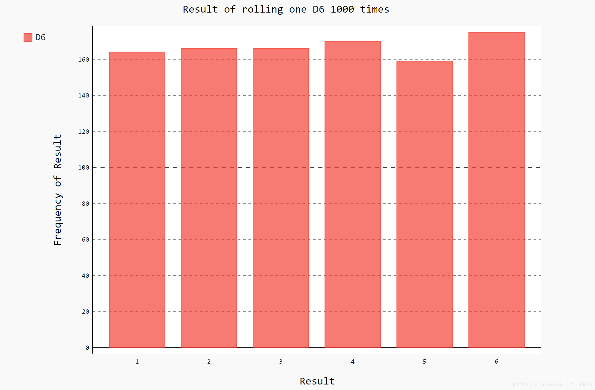
4.使用pygal模拟掷骰子
pygal可以生成可缩放的矢量图形文件
#die.py
from random import randint

class Die():
    """表示一个骰子的类"""

    def __init__(self, num_sides=6):
        """默认骰子为6面"""
        self.num_sides = num_sides

    def roll(self):
        """返回一个位于1和骰子面数之间的随机值"""
        return randint(1, self.num_sides)#返回一个[1,num_sides]之间的任何数
#die_visual.py
import pygal
from die import Die

"""创建一个骰子"""
die = Die()

"""掷几次骰子,将结果存储在一个队列中"""
results = []
for roll_num in range(1000):
    result = die.roll()
    results.append(result)

"""分析结果"""
frequencies = []
for value in range(1, die.num_sides + 1):
    frequency = results.count(value)
    frequencies.append(frequency)

"""结果进行可视化"""
hist = pygal.Bar()
hist.title = "Result of rolling one D6 1000 times"
hist.x_labels = ['1', '2', '3', '4', '5', '6']
hist.x_title = "Result"
hist.y_title = "Frequency of Result"

hist.add('D6', frequencies)
hist.render_to_file('die_visual.svg')
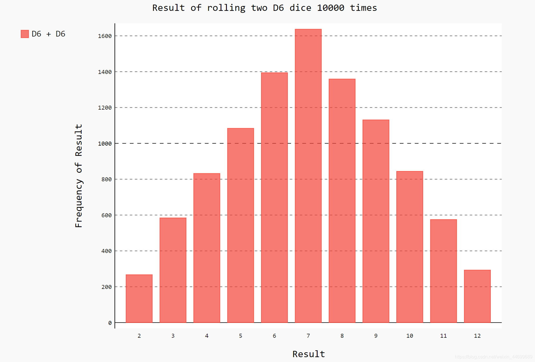
同时掷两个骰子10000次
#die_visual.py
import pygal
from die import Die

"""创建一个骰子"""
die_1 = Die()
die_2 = Die()


"""掷几次骰子,将结果存储在一个队列中"""
results = []
for roll_num in range(1000):
    result = die_1.roll() + die_2.roll()
    results.append(result)

"""分析结果"""
frequencies = []
max_result = die_1.num_sides + die_2.num_sides
for value in range(2, max_result + 1):
    frequency = results.count(value)
    frequencies.append(frequency)

"""结果进行可视化"""
hist = pygal.Bar()
hist.title = "Result of rolling two D6 dice 1000 times"
hist.x_labels = ['2', '3', '4', '5', '6', '7', '8', '9', '10', '11', '12']
hist.x_title = "Result"
hist.y_title = "Frequency of Result"

hist.add('D6 + D6', frequencies)
hist.render_to_file('die_visual.svg')
5.csv格式数据
csv格式即以将以逗号分隔的值写入文件
如获取某地某天的天气数据

导入csv模块,将要用的文件存入filename中,打开文件,将文件对象存储在f中。
调用csv.reader()方法,将前面存储的文件对象作为实参传给它,从而创建一个与该文件相关联的阅读器对象存储在reader中。
next方法返回文件的下一行,得到文件的第一行。
reader处理文件以逗号分割的第一行数据,并将每项数据作为一个元素存储在列表中
(header_row中包含文件头,如第一个元素为AKDT表示阿拉斯加事件,表明每行第一个值都是日期或者时间)
import csv

filename = 'sitka_weather_07-2014.csv'
with open(filename) as f:
    reader = csv.reader(f)#创建一个阅读器对象,将参数传传入进去
    header_row = next(reader)#返回文件中的下一行
    """将每个文件头打印出来"""
    for index, column_header in enumerate(header_row):
        print(index, column_header)
#output
0 AKDT
1 Max TemperatureF
2 Mean TemperatureF
3 Min TemperatureF
4 Max Dew PointF
5 MeanDew PointF
6 Min DewpointF
7 Max Humidity
8  Mean Humidity
9  Min Humidity
10  Max Sea Level PressureIn
11  Mean Sea Level PressureIn
12  Min Sea Level PressureIn
13  Max VisibilityMiles
14  Mean VisibilityMiles
15  Min VisibilityMiles
16  Max Wind SpeedMPH
17  Mean Wind SpeedMPH
18  Max Gust SpeedMPH
19 PrecipitationIn
20  CloudCover
21  Events
22  WindDirDegrees
注:enumerate() 函数用于将一个可遍历的数据对象(如列表、元组或字符串)组合为一个索引序列,同时列出数据和数据下标,一般用在 for 循环当中。
由于日期和最高气温分别为第0列和第1列,为了处理这些数据,将处理csv文件中的每行数据,并提取其中索引值为0和1的值,然后使用matplotlib进行数据可视化
import csv
from datetime import datetime
from matplotlib import pyplot as plt


filename = 'sitka_weather_07-2014.csv'
with open(filename) as f:
    reader = csv.reader(f)#创建一个阅读器对象,将参数传传入进去
    header_row = next(reader)#返回文件中的下一行

    dates, highs = [], []
    for row in reader:
        current_data = datetime.strptime(row[0], '%Y-%m-%d')#获取时间并格式化
        dates.append(current_data)
        high = int(row[1])
        highs.append(high)

fig = plt.figure(dpi=128, figsize=(10, 6))
plt.plot(dates, highs, c='red')
plt.title("Daily high temperatures,July 2014", fontsize=24)
plt.xlabel('', fontsize=16)
fig.autofmt_xdate()#绘制斜的标签,防止重合
plt.ylabel('Temperature (F)', fontsize=16)
plt.tick_params(axis='both', which='major', labelsize=16)
plt.show()

关于datatime模块,strptime()接受两个参数,可以将日期数据进行格式化成日期变量
from datetime import datetime

first_data = datetime.strptime('2014-7-1', '%Y-%m-%d')
print(first_data)
#output
2014-07-01 00:00:00
加上最低气温绘制全年天气图并对中间填色:
import csv
import csv
from datetime import datetime
from matplotlib import pyplot as plt

filename = 'sitka_weather_2014.csv'
with open(filename) as f:
    reader = csv.reader(f)#创建一个阅读器对象,将参数传传入进去
    header_row = next(reader)#返回文件中的下一行

    dates, highs, lows = [], [], []
    for row in reader:
        current_data = datetime.strptime(row[0], '%Y-%m-%d')
        dates.append(current_data)
        high = int(row[1])
        highs.append(high)
        low = int(row[3])
        lows.append(low)

fig = plt.figure(dpi=128, figsize=(10, 6))
plt.plot(dates, highs, c='red', alpha=0.5)
plt.plot(dates, lows, c='blue', alpha=0.5)
plt.fill_between(dates, highs, lows, facecolor='blue', alpha=0.1)#对low与high之间填充 颜色为facecolor,透明度alpha
plt.title("Daily high temperatures-2014", fontsize=24)
plt.xlabel('', fontsize=16)
fig.autofmt_xdate()#绘制斜的标签,防止重合
plt.ylabel('Temperature (F)', fontsize=16)
plt.tick_params(axis='both', which='major', labelsize=16)
plt.show()

6.json格式数据
使用json.load()方法读入json文件保存为一个字典,将字典中的元素读取出来,显示出来
import json

"""将数据加载在一个列表中"""
filename = 'btc_close_2017.json'
with open(filename) as f:
    btc_data = json.load(f)

"""打印每一天的信息"""
for btc_dict in btc_data:
    date = btc_dict['date']
    month = btc_dict['month']
    week = btc_dict['week']
    weekday = btc_dict['weekday']
    close = btc_dict['close']
    print("{}is month{} week{},{},the close prices is {} RMB".format(date, month, week, weekday, close))
2017-01-01 is month01 week52,Sunday,the close prices is 6928.6492 RMB
2017-01-02 is month01 week1,Monday,the close prices is 7070.2554 RMB
2017-01-03 is month01 week1,Tuesday,the close prices is 7175.1082 RMB
--snip--
2017-12-10 is month12 week49,Sunday,the close prices is 99525.1027 RMB
2017-12-11 is month12 week50,Monday,the close prices is 110642.88 RMB
2017-12-12 is month12 week50,Tuesday,the close prices is 113732.6745 RMB
将字符串值转换为数字值可视化处理,使用pygal绘制收盘价折线图
import json
import pygal

"""将数据加载在一个列表中"""
filename = 'btc_close_2017.json'
with open(filename) as f:
    btc_data = json.load(f)

"""创建5个列表,存储日期和收盘价"""
dates, months, weeks, weekdays, close = [], [], [], [], []
for btc_dict in btc_data:
    dates.append(btc_dict['date'])
    months.append(int(btc_dict['month']))
    weeks.append(int(btc_dict['week']))
    weekdays.append(btc_dict['weekday'])
    close.append(int(float(btc_dict['close'])))


line_chart = pygal.Line(x_label_rotation=20, show_minor_x_labels=False)#x轴日期顺时针旋转20度,不用显示所有的x轴标签
line_chart._title = '收盘价'
line_chart.x_labels = dates
N = 20#x轴坐标每隔20天显示一次
line_chart._x_labels_major = dates[::N]
line_chart.add('收盘价',close)
line_chart.render_to_file('收盘价折线图.svg')

