七、盒模型
在css中盒模型被分为两种,第一种是w3c的标准盒模型,另一种是IE6混杂模式的传统模型。他们都是对元素计算尺寸的模型。但他们的不同是计算的方式不同。
①W3C标准盒模型
clientWidth= width + padding + border;

②IE6混杂模式盒模型
clientWidth= width - padding - border
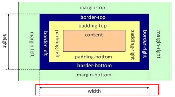
2、box-sizing:可以选择盒模型
①标准(W3C标准)模式盒模型:box-sizing : border-box(优势:向内扩展,加上border、padding不会影响布局)
②IE6混杂模式盒模型:box-sizing :content-box
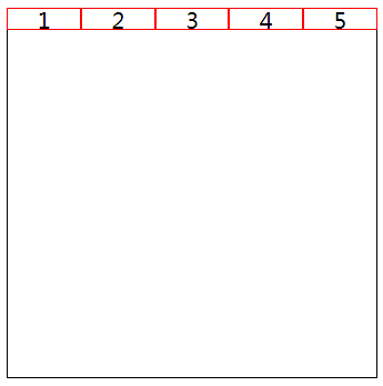
八、弹性盒子flex
实例:
<!DOCTYPE html>

<html lang="en">


<head>

    <meta charset="UTF-8">

    <meta name="viewport" content="width=device-width, initial-scale=1.0">

    <meta http-equiv="X-UA-Compatible" content="ie=edge">

    <title>Document</title>

    <style>

        * {

            padding: 0;

            margin: 0;

        }


        .wrapper {

            margin: 100px;

            display: flex;

            width: 500px;

            height: 500px;

            border: 1px solid black;

        }


        .item {

            flex: 1;

            width: 100px;

            height: 30px;

            border: 1px solid red;

            line-height: 30px;

            text-align: center;

            box-sizing: border-box;

            font-size: 30px;

        }

    </style>

</head>


<body>

    <div class="wrapper">

        <div class="item">1</div>

        <div class="item">2</div>

        <div class="item">3</div>

        <div class="item">4</div>

        <div class="item">5</div>

    </div>

</body>


</html>
1、父级(容器)
display:flex;
2、父级身上属性
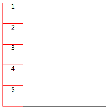
①flex-direction 决定主轴的方向
flex-direction:row | row-reverse | column | column-reverse
row(默认值):主轴为水平方向,起点在左端。
row-reverse:主轴为水平方向,起点在右端。
column:主轴为垂直方向,起点在上沿。
column-reverse:主轴为垂直方向,起点在下沿。
实例:
<!DOCTYPE html>

<html lang="en">


<head>

    <meta charset="UTF-8">

    <meta name="viewport" content="width=device-width, initial-scale=1.0">

    <meta http-equiv="X-UA-Compatible" content="ie=edge">

    <title>Document</title>

    <style>

        * {

            padding: 0;

            margin: 0;

        }


        .wrapper {

            display: flex;

            margin: 100px;

            width: 500px;

            height: 500px;

            border: 1px solid black;

            flex-direction: column;

        }


        .item {

            flex: 1;

            width: 100px;

            height: 30px;

            border: 1px solid red;

            line-height: 30px;

            text-align: center;

            box-sizing: border-box;

            font-size: 30px;

        }

    </style>

</head>


<body>

    <div class="wrapper">

        <div class="item">1</div>

        <div class="item">2</div>

        <div class="item">3</div>

        <div class="item">4</div>

        <div class="item">5</div>

    </div>

</body>


</html>
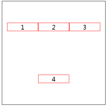
②flex-wrap 是否换行
flex-wrap:nowrap(默认) | wrap | wrap-reverse
默认情况下,项目都排在一条线(又称"轴线")上。flex-wrap属性定义,如果一条轴线排不下,如何换行。
nowrap(默认):不换行。
wrap:换行,第一行在上方。
wrap-reverse:换行,第一行在下方。
当设置flex-grow属性的时候wrap失效,flex-basis尽可能按basis值往大了去从而达到折行的目的, flex-shrink会失效 (根据子元素实际的宽度判断是否折行)
实例:
<!DOCTYPE html>

<html lang="en">


<head>

    <meta charset="UTF-8">

    <meta name="viewport" content="width=device-width, initial-scale=1.0">

    <meta http-equiv="X-UA-Compatible" content="ie=edge">

    <title>Document</title>

    <style>

        * {

            padding: 0;

            margin: 0;

        }


        .wrapper {

            display: flex;

            margin: 100px;

            width: 500px;

            height: 500px;

            border: 1px solid black;

            justify-content: center;

            align-items: center;

            flex-wrap: wrap;

        }


        .item {

            /* flex: 1; */

            width: 150px;

            height: 40px;

            border: 1px solid red;

            line-height: 40px;

            text-align: center;

            box-sizing: border-box;

            font-size: 30px;

            flex-wrap: wrap;

        }

    </style>

</head>


<body>

    <div class="wrapper">

        <div class="item">1</div>

        <div class="item">2</div>

        <div class="item">3</div>

        <div class="item">4</div>

    </div>

</body>


</html>
③flex-flow:flex-direction和flex-wrap的简写
默认值:默认值为row nowrap
flex-flow:column wrap;
④justify-content项目在主轴上的对齐方式
justify-content: flex-start | flex-end | center | space-between | space-around;
flex-start(默认值):左对齐
flex-end:右对齐
center: 居中
space-between:两端对齐,项目之间的间隔都相等。
space-around:每个项目两侧的间隔相等。所以,项目之间的间隔比项目与边框的间隔大一倍。(手拉手)
实例:
<!DOCTYPE html>

<html lang="en">


<head>

    <meta charset="UTF-8">

    <meta name="viewport" content="width=device-width, initial-scale=1.0">

    <meta http-equiv="X-UA-Compatible" content="ie=edge">

    <title>Document</title>

    <style>

        * {

            padding: 0;

            margin: 0;

        }


        .wrapper {

            display: flex;

            margin: 100px;

            width: 500px;

            height: 500px;

            border: 1px solid black;

            justify-content: center;

        }


        .item {

            /* flex: 1; */

            width: 150px;

            height: 40px;

            border: 1px solid red;

            line-height: 40px;

            text-align: center;

            box-sizing: border-box;

            font-size: 30px;

            flex-wrap: wrap;

        }

    </style>

</head>


<body>

    <div class="wrapper">

        <div class="item">1</div>

        <div class="item">2</div>

    </div>

</body>


</html>
⑤align-items 在侧轴上如何对齐
align-items: flex-start | flex-end | center | baseline | stretch;
flex-start:交叉轴的起点对齐。
flex-end:交叉轴的终点对齐。
center:交叉轴的中点对齐。
baseline: 项目的第一行文字的基线对齐。
stretch(默认值):如果项目未设置高度或设为auto,将占满整个容器的高度。
实例:
<!DOCTYPE html>

<html lang="en">


<head>

    <meta charset="UTF-8">

    <meta name="viewport" content="width=device-width, initial-scale=1.0">

    <meta http-equiv="X-UA-Compatible" content="ie=edge">

    <title>Document</title>

    <style>

        * {

            padding: 0;

            margin: 0;

        }


        .wrapper {

            display: flex;

            margin: 100px;

            width: 500px;

            height: 500px;

            border: 1px solid black;

            justify-content: center;

            align-items: center;

        }


        .item {

            /* flex: 1; */

            width: 150px;

            height: 40px;

            border: 1px solid red;

            line-height: 40px;

            text-align: center;

            box-sizing: border-box;

            font-size: 30px;

            flex-wrap: wrap;

        }

    </style>

</head>


<body>

    <div class="wrapper">

        <div class="item">1</div>

        <div class="item">2</div>

    </div>

</body>


</html>
⑥align-content 多根轴线的对齐方式
align-content: flex-start | flex-end | center | space-between | space-around | stretch;
flex-start:与交叉轴的起点对齐。
flex-end:与交叉轴的终点对齐。
center:与交叉轴的中点对齐。
space-between:与交叉轴两端对齐,轴线之间的间隔平均分布。
space-around:每根轴线两侧的间隔都相等。所以,轴线之间的间隔比轴线与边框的间隔大一倍。
stretch(默认值):轴线占满整个交叉轴。
align-content属性定义了多根轴线的对齐方式。如果项目只有一根轴线,该属性不起作用。
实例:
<!DOCTYPE html>

<html lang="en">


<head>

    <meta charset="UTF-8">

    <meta name="viewport" content="width=device-width, initial-scale=1.0">

    <meta http-equiv="X-UA-Compatible" content="ie=edge">

    <title>Document</title>

    <style>

        * {

            padding: 0;

            margin: 0;

        }


        .wrapper {

            display: flex;

            margin: 100px;

            width: 500px;

            height: 500px;

            border: 1px solid black;

            justify-content: center;

            flex-wrap: wrap;

            align-content: center;

        }


        .item {

            /* flex: 1; */

            width: 150px;

            height: 40px;

            border: 1px solid red;

            line-height: 40px;

            text-align: center;

            box-sizing: border-box;

            font-size: 30px;

            flex-wrap: wrap;

        }

    </style>

</head>


<body>

    <div class="wrapper">

        <div class="item">1</div>

        <div class="item">2</div>

        <div class="item">3</div>

        <div class="item">4</div>

        <div class="item">5</div>

    </div>

</body>


</html>
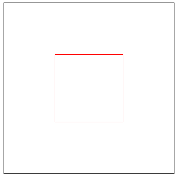
实例:用flex实现元素水平垂直居中
<!DOCTYPE html>

<html lang="en">


<head>

    <meta charset="UTF-8">

    <meta name="viewport" content="width=device-width, initial-scale=1.0">

    <meta http-equiv="X-UA-Compatible" content="ie=edge">

    <title>Document</title>

    <style>

        * {

            padding: 0;

            margin: 0;

        }


        .wrapper {

            display: flex;

            margin: 50px auto;

            width: 500px;

            height: 500px;

            border: 1px solid black;

            justify-content: center;

            align-items: center;

        }


        .item {

            /* flex: 1; */

            width: 200px;

            height: 200px;

            border: 1px solid red;

            box-sizing: border-box;

            flex-wrap: wrap;

        }

    </style>

</head>


<body>

    <div class="wrapper">

        <div class="item"></div>

    </div>

</body>


</html>
3、子级(项目)身上的属性
①flex-grow:放大比例
根据所设置的比例分配盒子所剩余的空间
flex-grow: number
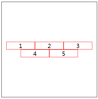
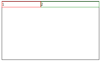
实例:两栏布局
<!DOCTYPE html>

<html lang="en">


<head>

    <meta charset="UTF-8">

    <meta name="viewport" content="width=device-width, initial-scale=1.0">

    <meta http-equiv="X-UA-Compatible" content="ie=edge">

    <title>Document</title>

    <style>

        * {

            padding: 0;

            margin: 0;

        }


        .wrapper {

            display: flex;

            margin: 50px auto;

            width: 500px;

            height: 300px;

            border: 1px solid black;

        }

        .item {

            /* flex: 1; */

            height: 30px;

            box-sizing: border-box;

            flex-wrap: wrap;

        }

        .item:nth-of-type(1){

            width: 200px;

            border: 1px solid red;

        }

        .item:nth-of-type(2){

            flex-grow: 1;

            border: 1px solid green;

        }

    </style>

</head>


<body>

    <div class="wrapper">

        <div class="item">1</div>

        <div class="item">2</div>

    </div>

</body>


</html>
实例:
flex-direction: row-reverse;

实例:
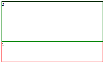
<!DOCTYPE html>

<html lang="en">


<head>

    <meta charset="UTF-8">

    <meta name="viewport" content="width=device-width, initial-scale=1.0">

    <meta http-equiv="X-UA-Compatible" content="ie=edge">

    <title>Document</title>

    <style>

        * {

            padding: 0;

            margin: 0;

        }


        .wrapper {

            display: flex;

            margin: 50px auto;

            width: 500px;

            height: 300px;

            border: 1px solid black;

            flex-direction: column;

        }

        .item {

            /* flex: 1; */

            box-sizing: border-box;

        }

        .item:nth-of-type(1){

            height: 100px;

            border: 1px solid red;

        }

        .item:nth-of-type(2){

            flex-grow: 1;

            border: 1px solid green;

        }

    </style>

</head>


<body>

    <div class="wrapper">

        <div class="item">1</div>

        <div class="item">2</div>

    </div>

</body>


</html>

实例:
flex-direction: column-reverse;
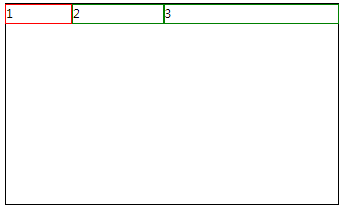
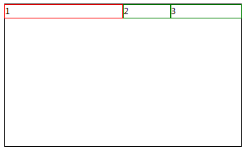
实例:三栏布局
<!DOCTYPE html>

<html lang="en">


<head>

    <meta charset="UTF-8">

    <meta name="viewport" content="width=device-width, initial-scale=1.0">

    <meta http-equiv="X-UA-Compatible" content="ie=edge">

    <title>Document</title>

    <style>

        * {

            padding: 0;

            margin: 0;

        }


        .wrapper {

            display: flex;

            margin: 50px auto;

            width: 500px;

            height: 300px;

            border: 1px solid black;

        }

        .item {

            /* flex: 1; */

            height: 30px;

            box-sizing: border-box;

            flex-wrap: wrap;

        }

        .item:nth-of-type(1){

            width: 100px;

            border: 1px solid red;

        }

        .item:nth-of-type(2){

            flex-grow: 1;

            border: 1px solid green;

        }

        .item:nth-of-type(3){

            flex-grow: 2;

            border: 1px solid green;

        }

    </style>

</head>


<body>

    <div class="wrapper">

        <div class="item">1</div>

        <div class="item">2</div>

        <div class="item">3</div>

    </div>

</body>


</html>
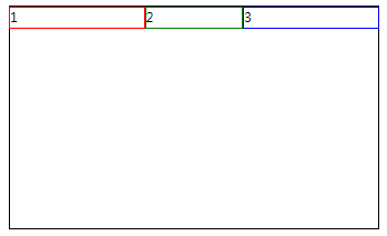
②flex-shrink:缩小比例
多出盒子的部分,按照比例的大小砍掉相应的大小,即比例越大,被砍的越大,默认值1;
缩减的宽度=(flex-shrink1 * width1) /( flex-shrink1 * width1 + flex-shrink2 * width2) * moreWidth
实例:
<!DOCTYPE html>

<html lang="en">


<head>

    <meta charset="UTF-8">

    <meta name="viewport" content="width=device-width, initial-scale=1.0">

    <meta http-equiv="X-UA-Compatible" content="ie=edge">

    <title>Document</title>

    <style>

        * {

            padding: 0;

            margin: 0;

        }


        .wrapper {

            display: flex;

            margin: 50px auto;

            width: 500px;

            height: 300px;

            border: 1px solid black;

        }

        .item {

            flex-grow: 1;

            width: 200px;

            box-sizing: border-box;

            height: 30px;

        }

        .item:nth-of-type(1){

            flex-shrink: 1;

            border: 1px solid red;

        }

        .item:nth-of-type(2){

            flex-shrink: 4;

            border: 1px solid green;

        }

        .item:nth-of-type(3){

            flex-shrink: 1;

            border: 1px solid blue;

        }

    </style>

</head>


<body>

    <div class="wrapper">

        <div class="item">1</div>

        <div class="item">2</div>

        <div class="item">3</div>

    </div>

</body>


</html>
③flex-basis:伸缩基准值
伸缩基准值.项目占据主轴的空间
该属性设置元素的宽度或高度,当然width也可以用来设置元素宽度,如果元素上同时出现了width 和flex-basis那么flex-basis会覆盖width的值
子元素宽度尽可能按照basis来如果基准值相加大于容器宽度那么 下面由下面公式分配宽度给子元素 ( flex-basis/(flex-basis相加) ) * 容器的宽度
实例:
<!DOCTYPE html>

<html lang="en">


<head>

    <meta charset="UTF-8">

    <meta name="viewport" content="width=device-width, initial-scale=1.0">

    <meta http-equiv="X-UA-Compatible" content="ie=edge">

    <title>Document</title>

    <style>

        * {

            padding: 0;

            margin: 0;

        }


        .wrapper {

            display: flex;

            margin: 50px auto;

            width: 500px;

            height: 300px;

            border: 1px solid black;

        }

        .item {

            /* flex: 1; */

            height: 30px;

            box-sizing: border-box;

        }

        .item:nth-of-type(1){

            flex-basis: 50%;

            border: 1px solid red;

        }

        .item:nth-of-type(2){

            flex-basis: 20%;

            border: 1px solid green;

        }

        .item:nth-of-type(3){

            flex-basis: 30%;

            border: 1px solid green;

        }

    </style>

</head>


<body>

    <div class="wrapper">

        <div class="item">1</div>

        <div class="item">2</div>

        <div class="item">3</div>

    </div>

</body>


</html>
④flex:是flex-grow, flex-shrink 和 flex-basis的简写
flex:1 —> flex:1 1 0%;
flex:3 —> flex:3 1 0%;
注意:flexbox布局和原来的布局是两个概念,部分css属性在flexbox盒子里面不起作用,eg:float, clear, column,vertical-align 等等
⑤order:排列顺序
number定义项目的排列顺序。数值越小,排列越靠前,默认为0
order: number;
⑥align-self :单个项目对齐方式
align-self: auto | flex-start | flex-end | center | baseline | stretch;
align-self属性允许单个项目有与其他项目不一样的对齐方式,可覆盖align-items属性。默认值为auto,表示继承父元素的align-items属性,如果没有父元素,则等同于stretch。