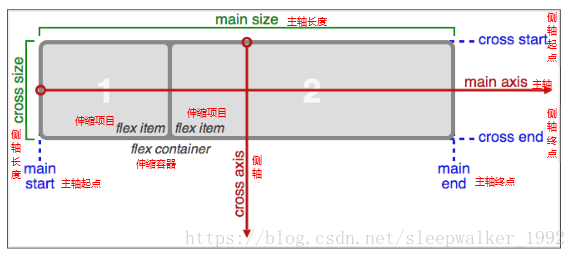
容器的属性
以下6个属性设置在容器上,就是说给flex container添加这些属性,来布局flex item。
- flex-direction
- flex-wrap
- flex-flow
- justify-content
- align-items
- align-content
flex-direction属性:
决定主轴的方向(即项目的排列方向)。
属性值:
row(默认值):主轴为水平方向,起点在左端。
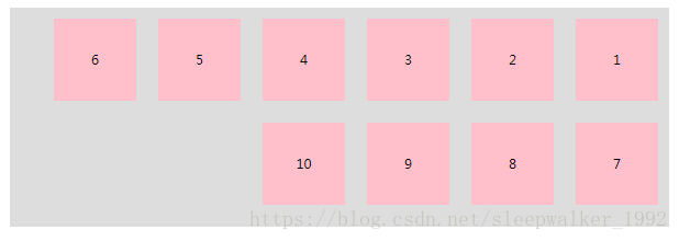
row-reverse:主轴为水平方向,起点在右端。
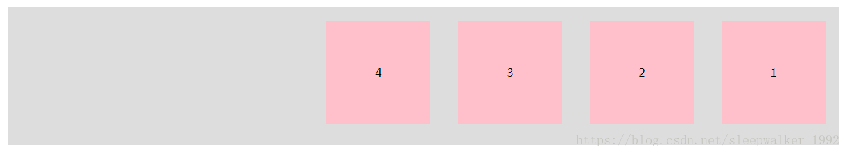
column:主轴为垂直方向,起点在上沿。
column-reverse:主轴为垂直方向,起点在下沿。
column:

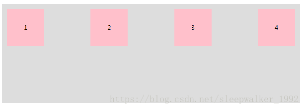
flex-wrap属性
默认情况下,项目都排在一条线(又称”轴线”)上。flex-wrap属性定义,如果一条轴线排不下,如何换行
<!DOCTYPE html>
<html lang="en">
<head>
    <meta charset="UTF-8">
    <title>Title</title>
    <style>
        *{
            margin: 0;
            padding: 0;
        }
        .flexBox{
            width: 1200px;
            height: 400px;
            margin: 20px auto;
            background-color: #ddd;
        }
        .flexBox ul{
            list-style: none;
            display: flex;
            flex-wrap: wrap;    //设置换行方式
        }
        .flexBox li{
            width: 150px;
            height: 150px;
            text-align: center;
            line-height: 150px;
            margin: 20px;
            background-color: pink;
        }
    </style>
</head>
<body>
<div class="flexBox">
    <ul>
        <li>1</li>
        <li>2</li>
        <li>3</li>
        <li>4</li>
        <li>5</li>
        <li>6</li>
        <li>7</li>
        <li>8</li>
        <li>9</li>
        <li>10</li>
    </ul>
</div>
</body>
</html>
属性值:
flex-wrap: nowrap; 不换行
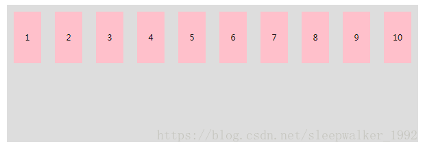
flex-wrap: wrap; 换行,第一行在上面
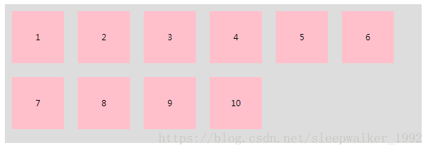
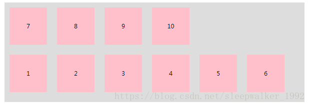
flex-wrap: wrap-reverse; 换行,第一行在下面
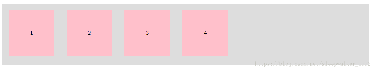
flex-flow属性
flex-flow属性是flex-direction属性和flex-wrap属性的简写形式,默认值为row nowrap。
例如:
flex-flow: row-reverse wrap;
等价于:
flex-direction: row-reverse;
flex-wrap: wrap;
justify-content属性
justify-content属性定义了项目在主轴上的对齐方式。具体对齐方式与轴的方向有关。
<!DOCTYPE html>
<html lang="en">
<head>
    <meta charset="UTF-8">
    <title>Title</title>
    <style>
        *{
            margin: 0;
            padding: 0;
        }
        .flexBox{
            width: 1200px;
            height: 400px;
            margin: 20px auto;
            background-color: #ddd;
        }
        .flexBox ul{
            list-style: none;
            display: flex;
            justify-content: center; //主轴上的对齐方式
        }
        .flexBox li{
            width: 150px;
            height: 150px;
            text-align: center;
            line-height: 150px;
            margin: 20px;  //设置了margin
            background-color: pink;
        }
    </style>
</head>
<body>
<div class="flexBox">
    <ul>
        <li>1</li>
        <li>2</li>
        <li>3</li>
        <li>4</li>
    </ul>
</div>
</body>
</html>
下面假设主轴为从左到右。
属性值:
flex-start(默认值):左对齐
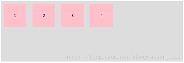
flex-end:右对齐

center: 居中(水平居中)
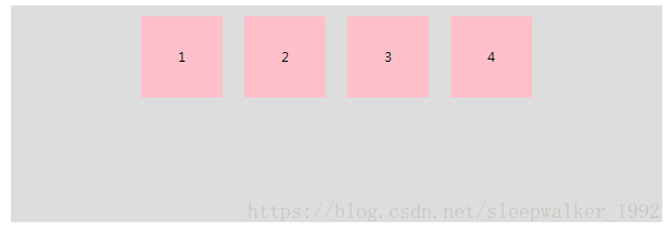
space-between:两端对齐,项目之间的间隔都相等。
space-around:每个项目两侧的间隔相等。所以,项目之间的间隔比项目与边框的间隔大一倍。

align-items属性
定义项目在交叉轴(cross axis)上如何对齐。具体的对齐方式与交叉轴的方向有关。
<!DOCTYPE html>
<html lang="en">
<head>
    <meta charset="UTF-8">
    <title>Title</title>
    <style>
        *{
            margin: 0;
            padding: 0;
        }
        .flexBox{
            width: 1200px;
            height: 400px;
            margin: 20px auto;
            background-color: #ddd;
        }
        .flexBox ul{
            list-style: none;
            display: flex;
            align-items: baseline; //设置交叉轴对齐方式
        }
        .flexBox li{
            margin: 20px;
            background-color: pink;
        }
        .flexBox li:first-child{
            width: 150px;
            height: 200px;
            text-align: center;
            line-height: 100px;
        }
        .flexBox li:nth-child(2){
            width: 150px;
            height: 250px;
            text-align: center;
            line-height: 120px;
        }
        .flexBox li:nth-child(3){
            width: 150px;
            height: 150px;
            text-align: center;
            line-height: 70px;
        }
        .flexBox li:last-child{
            width: 150px;
            height: 300px;
            text-align: center;
            line-height: 150px;
        }
    </style>
</head>
<body>
<div class="flexBox">
    <ul>
        <li>1<p>1</p></li>
        <li>2<p>2</p></li>
        <li>3<p>3</p></li>
        <li>4<p>4</p></li>
    </ul>
</div>
</body>
</html>下面假设交叉轴从上到下。
属性值:flex-start:交叉轴的起点对齐。
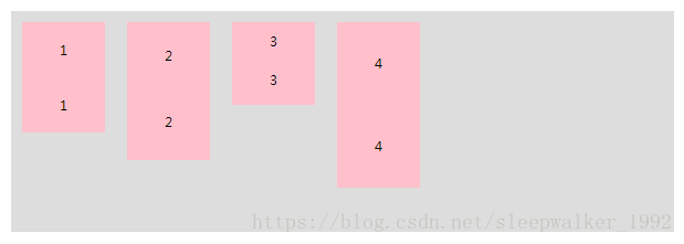
flex-end:交叉轴的终点对齐。
center:交叉轴的中点对齐。
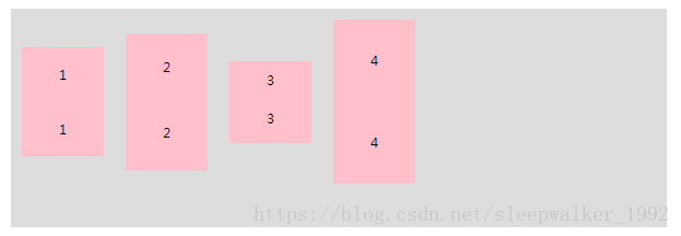
baseline: 项目的第一行文字的基线对齐。
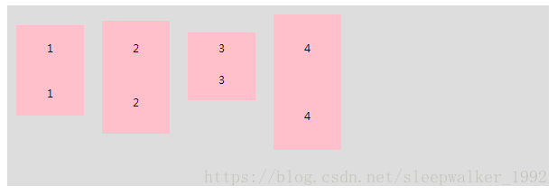
align-content属性
align-content属性定义了多根轴线的对齐方式。如果项目只有一根轴线,该属性不起作用。
属性值:
flex-start:与交叉轴的起点对齐。
flex-end:与交叉轴的终点对齐。
center:与交叉轴的中点对齐。
space-between:与交叉轴两端对齐,轴线之间的间隔平均分布。
space-around:每根轴线两侧的间隔都相等。所以,轴线之间的间隔比轴线与边框的间隔大一倍。stretch(默认值):轴线占满整个交叉轴。
项目的属性
以下6个属性设置在项目上,就是说给flex item添加这些属性,来布局flex item。
- order
- flex-grow
- flex-shrink
- flex-basis
- flex
- align-self
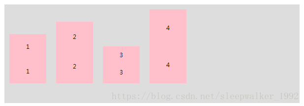
order属性
order属性定义项目的排列顺序。数值越小,排列越靠前,默认为0。<!DOCTYPE html>
<html lang="en">
<head>
<meta charset="UTF-8">
<title>Title</title>
<style>
*{
margin: 0;
padding: 0;
}
.flexBox{
width: 1200px;
height: 400px;
margin: 20px auto;
background-color: #ddd;
}
.flexBox ul{
list-style: none;
display: flex;
}
.flexBox li{
margin: 20px;
background-color: pink;
}
.flexBox li:first-child{
width: 150px;
height: 200px;
text-align: center;
line-height: 200px;
order: 4;
}
.flexBox li:nth-child(2){
width: 150px;
height: 250px;
text-align: center;
line-height: 250px;
order: 2;
}
.flexBox li:nth-child(3){
width: 150px;
height: 150px;
text-align: center;
line-height: 150px;
order: 3;
}
.flexBox li:last-child{
width: 150px;
height: 300px;
text-align: center;
line-height: 300px;
order: 1;
}
</style>
</head>
<body>
<div class="flexBox">
<ul>
<li>1</li>
<li>2</li>
<li>3</li>
<li>4</li>
</ul>
</div>
</body>
</html>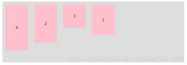
flex-grow属性
flex-grow属性定义项目的放大比例,默认为0,即如果存在剩余空间,也不放大。
如果所有项目的flex-grow属性都为1,则它们将等分剩余空间(如果有的话)。如果一个项目的flex-grow属性为2,其他项目都为1,则前者占据的剩余空间将比其他项多一倍。
flex-shrink属性
flex-shrink属性定义了项目的缩小比例,默认为1,即如果空间不足,该项目将缩小。
如果所有项目的flex-shrink属性都为1,当空间不足时,都将等比例缩小。如果一个项目的flex-shrink属性为0,其他项目都为1,则空间不足时,前者不缩小。
负值对该属性无效。
flex-basis属性
flex-basis属性定义了在分配多余空间之前,项目占据的主轴空间(main size)。浏览器根据这个属性,计算主轴是否有多余空间。它的默认值为auto,即项目的本来大小。
它可以设为跟width或height属性一样的值(比如350px),则项目将占据固定空间。
flex属性
flex属性是flex-grow, flex-shrink 和 flex-basis的简写,默认值为0 1 auto。后两个属性可选。
该属性有两个快捷值:auto (1 1 auto) 和 none (0 0 auto)。
建议优先使用这个属性,而不是单独写三个分离的属性,因为浏览器会推算相关值。
align-self属性
align-self属性允许单个项目有与其他项目不一样的对齐方式,可覆盖align-items属性。默认值为auto,表示继承父元素的align-items属性,如果没有父元素,则等同于stretch。
align-self: auto | flex-start | flex-end | center | baseline | stretch;
该属性可能取6个值,除了auto,其他都与align-items属性完全一致。