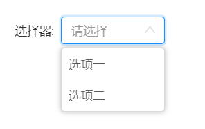
一、使用图例:
二、使用方法:
import Select from '../../components/Select/index';

<Select label="选择器"
        options={[{key: 1, value: '选项一'},{key: 2, value: '选项二'}]}
        placeholder="请选择"
        onChange={(item)=>{console.log(item)}}
/>
三、组件代码:
import React, { Component } from "react";
import cx from "classnames";
import "./index.less";

export default class Select extends Component {
  constructor(props) {
    super(props);
    this.state = { isOpen: false, value: "" };
    this.toggleContainer = React.createRef();
  }
  componentDidMount() {
    window.addEventListener("click", this.onClickOutsideHandler);
  }

  componentWillUnmount() {
    window.removeEventListener("click", this.onClickOutsideHandler);
  }

  onClickHandler = () => {
    this.setState(currentState => ({
      isOpen: !currentState.isOpen
    }));
  };

  onClickOutsideHandler = event => {
    if (
      this.state.isOpen &&
      !this.toggleContainer.current.contains(event.target)
    ) {
      this.setState({ isOpen: false });
    }
  };

  onChange = item => {
    this.setState({
      value: item.value,
      isOpen: false
    });
    this.props.onChange(item);
  };
  render() {
    const { isOpen, value } = this.state;
    const { label, options, placeholder } = this.props;
    return (
      <div className="select-box">
        {label && <label className="label">{label}:</label>}

        <div className="select" ref={this.toggleContainer}>
          <input
            class="self-input"
            className={cx({
              "self-input": true,
              "input-hover": isOpen
            })}
            readonly=""
            value={value}
            onClick={this.onClickHandler}
            placeholder={placeholder}
          />
          <svg
            viewBox="64 64 896 896"
            focusable="false"
            class="svg"
            className={cx({
              up: isOpen,
              down: !isOpen
            })}
            data-icon="down"
            width="1em"
            height="1em"
            fill="currentColor"
            aria-hidden="true"
          >
            <path d="M884 256h-75c-5.1 0-9.9 2.5-12.9 6.6L512 654.2 227.9 262.6c-3-4.1-7.8-6.6-12.9-6.6h-75c-6.5 0-10.3 7.4-6.5 12.7l352.6 486.1c12.8 17.6 39 17.6 51.7 0l352.6-486.1c3.9-5.3.1-12.7-6.4-12.7z"></path>
          </svg>

          <div
            className="options"
            className={cx({
              options: true,
              "options-hidden": !isOpen
            })}
          >
            {options &&
              options.map((item) => {
                return (
                  <div
                    key={item.key}
                    className="item"
                    onClick={this.onChange.bind(this, item)}
                  >
                    {item.value}
                  </div>
                );
              })}
          </div>
        </div>
      </div>
    );
  }
}
.select-box {
  display: flex;
  align-items: center;
  .label {
    display: inline-block;
    padding-right: 8px;
    color: #333333;
  }
  .select {
    position: relative;
    .self-input {
      width: 120px;
      box-sizing: border-box;
      margin: 0;
      padding: 0;
      list-style: none;
      display: inline-block;
      height: 32px;
      padding: 4px 11px;
      color: rgba(0, 0, 0, 0.65);
      font-size: 14px;
      line-height: 1.5;
      background-color: #fff;
      background-image: none;
      border: 1px solid #d9d9d9;
      border-radius: 4px;
      transition: all 0.3s;
      overflow: visible;
      cursor: pointer;
    }
    .input-hover {
        box-shadow: 0 0 0 2px rgba(24, 144, 255, 0.2);
        border: 1px solid rgba(24, 144, 255, 1);
    }
    .down {
      color: #dddddd;
      position: absolute;
      right: 10px;
      top: 8px;
      transform: rotate(0);
      transition: 0.35s;
    }
    .up {
      color: #dddddd;
      position: absolute;
      right: 10px;
      top: 8px;
      transform: rotate(180deg);
      transition: 0.35s;
    }
    .options {
      width: 120px;
      box-sizing: border-box;
      position: absolute;
      top: 36px;
      right: 0;
      color: rgba(0, 0, 0, 0.65);
      font-size: 14px;
      background-color: #fff;
      background-image: none;
      border: 1px solid #d9d9d9;
      border-radius: 4px;
      cursor: pointer;
      transition: 0.35s;
      opacity: 1;
      box-shadow: 0 0 6px 0 rgba(0, 0, 0, 0.3);
      z-index: 666;
      .item {
        line-height: 20px;
        padding: 8px;
        &:hover {
          background: #0C3EC2;
        }
      }
    }
    .options-hidden {
      opacity: 0;
    }
    // 修改输入框默认样式
    input:-moz-placeholder,
    textarea:-moz-placeholder {
      color: #999999;
    }

    input:-ms-input-placeholder,
    textarea:-ms-input-placeholder {
      color: #999999;
    }

    input::-webkit-input-placeholder,
    textarea::-webkit-input-placeholder {
      color: #999999;
    }
  }
}
