利用js做一个类似开关灯的效果!
效果图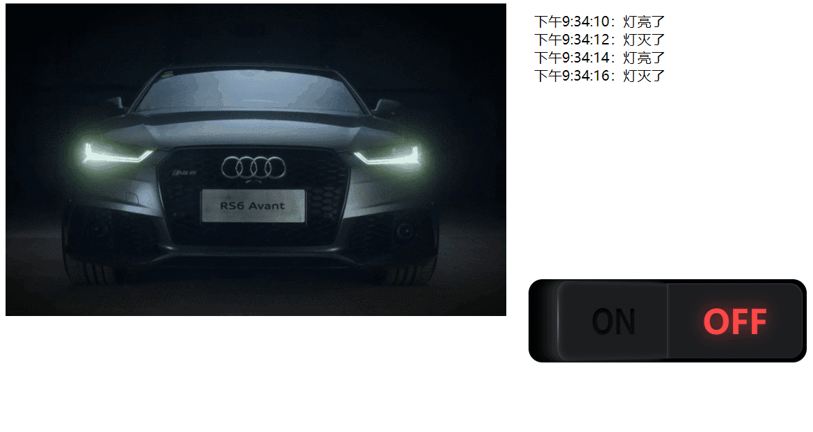
这是主页代码
<html>
	<head>
		<meta charset="UTF-8">
		<title>鼠标移入文本高亮显示</title>
		<link rel="stylesheet" href="css/index.css" />
	</head>
	<body>
		<div>
			<label class="button">
				<input type="checkbox" onclick="on()">
				<span></span>
				<span></span>
			</label>
			<img src="img/1.jpg" id="i" />
		</div>

		<div>
			<ul id="u"></ul>
		</div>
	</body>
	<script>
		var i = 2;
		var b = document.getElementsByTagName("body")[0];
		var img = document.getElementById("i");
		var ull = document.getElementById("u");

		function on() {
			if (i % 2 == 0) {
				b.style.backgroundColor = " #000000";
				img.src = "img/2.png";
				ull.style.color = "aliceblue";
				addNode(i);
				i++;
			} else {
				b.style.backgroundColor = " #ffffff";
				img.src = "img/1.jpg";
				ull.style.color = "black";
				addNode(i);
				i = 2;
			}
		}

		function addNode(a) {
			var date = new Date().toLocaleTimeString();
			var lii = document.createElement("li");
			var text;
			if (a % 2 == 0) {
				text = document.createTextNode(date + ":灯亮了");
			} else {
				text = document.createTextNode(date + ":灯灭了");
			}
			lii.appendChild(text);
			ull.appendChild(lii);
		}
	</script>
</html>
这是css样式
			* {
				transition: background-color 1s linear;
			}

			li {
				list-style: none;
				font-size: 20px;
			}

			div {
				float: left;
			}
*,
*:before,
*:after {
  -moz-box-sizing: border-box;
       box-sizing: border-box;
}
.button {
  display: block;
  width: 400px;
  height: 120px;
  position: absolute;
  top: 50%;
  left: 50%;
  -webkit-transform: translate(-50%, -50%);
      -ms-transform: translate(-50%, -50%);
          transform: translate(-50%, -50%);
  background-color: #000000;
  box-shadow: 0 -1px 0 rgba(255, 255, 255, 0.2) inset;
  border-radius: 20px;
  overflow: hidden;
  cursor: pointer;
  -webkit-tap-highlight-color: rgba(0, 0, 0, 0);
}
.button span {
  display: block;
  position: absolute;
  top: 6px;
  width: 194px;
  height: 108px;
  background-color: #1c1d1f;
  -webkit-transition: -webkit-transform 300ms ease, box-shadow 300ms ease;
          transition: transform 300ms ease, box-shadow 300ms ease;
}
.button span:before {
  position: absolute;
  top: 50%;
  left: 50%;
  -webkit-transform: translate(-50%, -50%);
      -ms-transform: translate(-50%, -50%);
          transform: translate(-50%, -50%);
  font-family: "Open Sans";
  font-weight: 800;
  font-size: 48px;
  -webkit-transition: text-shadow 800ms ease 100ms, color 800ms ease 100ms;
          transition: text-shadow 800ms ease 100ms, color 800ms ease 100ms;
}
.button span:after {
  content: "";
  width: 4px;
  height: 108px;
  position: absolute;
  top: 0;
  background: -webkit-radial-gradient(center, ellipse, rgba(255, 255, 255, 0.5) 0%, transparent 50%);
  background: radial-gradient(ellipse at center, rgba(255, 255, 255, 0.5) 0%, transparent 50%);
  -webkit-transition: opacity 300ms ease;
          transition: opacity 300ms ease;
}
.button span:first-of-type {
  left: 6px;
  border-top-left-radius: 18px;
  border-bottom-left-radius: 18px;
  -webkit-transform-style: preserve3d;
          transform-style: preserve3d;
  -webkit-transform-origin: right center;
      -ms-transform-origin: right center;
          transform-origin: right center;
  -webkit-transform: perspective(2000px) rotateY(40deg);
          transform: perspective(2000px) rotateY(40deg);
  box-shadow: -1px 0 1px rgba(255, 255, 255, 0.1) inset, 4px 0 8px rgba(255, 255, 255, 0.1) inset, 1px 0 0 rgba(255, 255, 255, 0.1) inset, -10px 0 8px rgba(40, 42, 44, 0.9), -20px 0 8px rgba(28, 29, 31, 0.7), -30px 0 8px rgba(28, 29, 31, 0.4);
}
.button span:first-of-type:before {
  content: "ON";
  color: rgba(0, 0, 0, 0.5);
  text-shadow: 1px 4px 6px #1c1d1f, 0 0 0 #000000, 1px 4px 6px #1c1d1f;
}
.button span:first-of-type:after {
  left: -1px;
}
.button span:last-of-type {
  right: 6px;
  border-top-right-radius: 18px;
  border-bottom-right-radius: 18px;
  -webkit-transform-origin: left center;
      -ms-transform-origin: left center;
          transform-origin: left center;
  box-shadow: -1px 1px 1px rgba(255, 255, 255, 0.1) inset, 2px 0 2px rgba(255, 255, 255, 0.05) inset;
}
.button span:last-of-type:before {
  content: "OFF";
  color: #ff4847;
  text-shadow: 0 0 24px rgba(255, 72, 71, 0.6);
}
.button span:last-of-type:after {
  right: -1px;
  opacity: 0;
}
.button input[type="checkbox"] {
  display: none;
}
.button input[type="checkbox"]:checked ~ span:first-of-type {
  -webkit-transform: none;
      -ms-transform: none;
          transform: none;
  box-shadow: 1px 1px 1px rgba(255, 255, 255, 0.1) inset, -2px 0 2px rgba(255, 255, 255, 0.05) inset;
}
.button input[type="checkbox"]:checked ~ span:first-of-type:before {
  color: #93c913;
  text-shadow: 0 0 24px rgba(147, 201, 19, 0.6);
}
.button input[type="checkbox"]:checked ~ span:first-of-type:after {
  opacity: 0;
}
.button input[type="checkbox"]:checked ~ span:last-of-type {
  -webkit-transform: perspective(2000px) rotateY(-40deg);
          transform: perspective(2000px) rotateY(-40deg);
  box-shadow: 1px 0 1px rgba(255, 255, 255, 0.1) inset, -4px 0 8px rgba(255, 255, 255, 0.1) inset, -1px 0 0 rgba(255, 255, 255, 0.1) inset, 10px 0 8px rgba(40, 42, 44, 0.9), 20px 0 8px rgba(28, 29, 31, 0.7), 30px 0 8px rgba(28, 29, 31, 0.4);
}
.button input[type="checkbox"]:checked ~ span:last-of-type:before {
  color: rgba(0, 0, 0, 0.5);
  text-shadow: 1px 4px 6px #1c1d1f, 0 0 0 #000000, 1px 4px 6px #1c1d1f;
}
.button input[type="checkbox"]:checked ~ span:last-of-type:after {
  opacity: 1;
			.button {
  display: block;
  width: 400px;
  height: 120px;
  position: absolute;
  top: 50%;
  left: 50%;
  -webkit-transform: translate(-50%, -50%);
      -ms-transform: translate(-50%, -50%);
          transform: translate(-50%, -50%);
  background-color: #000000;
  box-shadow: 0 -1px 0 rgba(255, 255, 255, 0.2) inset;
  border-radius: 20px;
  overflow: hidden;
  cursor: pointer;
  -webkit-tap-highlight-color: rgba(0, 0, 0, 0);
}
.button span {
  display: block;
  position: absolute;
  top: 6px;
  width: 194px;
  height: 108px;
  background-color: #1c1d1f;
  -webkit-transition: -webkit-transform 300ms ease, box-shadow 300ms ease;
          transition: transform 300ms ease, box-shadow 300ms ease;
}
.button span:before {
  position: absolute;
  top: 50%;
  left: 50%;
  -webkit-transform: translate(-50%, -50%);
      -ms-transform: translate(-50%, -50%);
          transform: translate(-50%, -50%);
  font-family: "Open Sans";
  font-weight: 800;
  font-size: 48px;
  -webkit-transition: text-shadow 800ms ease 100ms, color 800ms ease 100ms;
          transition: text-shadow 800ms ease 100ms, color 800ms ease 100ms;
}
.button span:after {
  content: "";
  width: 4px;
  height: 108px;
  position: absolute;
  top: 0;
  background: -webkit-radial-gradient(center, ellipse, rgba(255, 255, 255, 0.5) 0%, transparent 50%);
  background: radial-gradient(ellipse at center, rgba(255, 255, 255, 0.5) 0%, transparent 50%);
  -webkit-transition: opacity 300ms ease;
          transition: opacity 300ms ease;
}
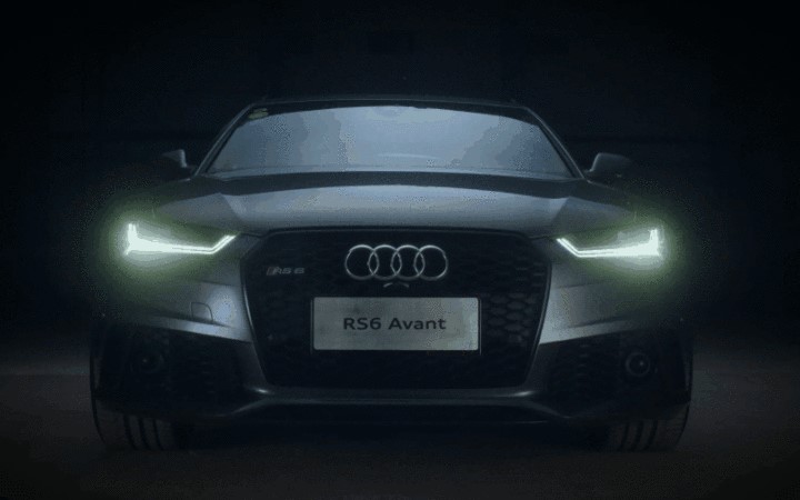
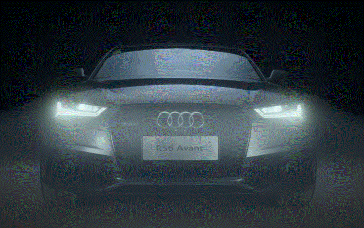
需要的两张图片
因为那个开关按钮比较花,所以css样式就多了一点…
