今晚趁一点时间练习一下animation。这次的代码很简单,仅仅是一个平面旋转的特性。在一些场合里面会使用到。包括小程序也适应。
<!DOCTYPE html>
<html>
<head>
<meta charset="UTF-8">
<title>旋转</title>
</head>
<style type="text/css">
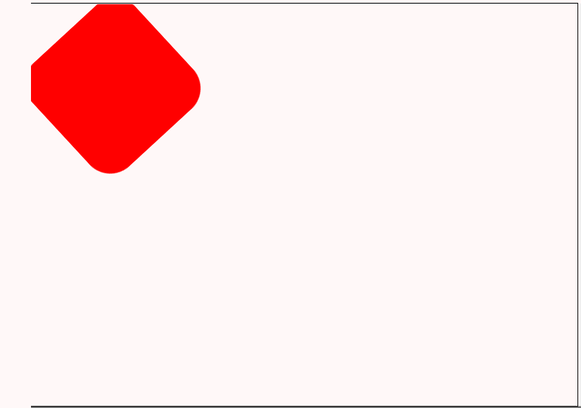
.box{
background: red;
width: 100px;
height: 100px;
border-radius: 20%;
animation:myrotation 0.5s infinite ; //设置无尽
-webkit-animation:myrotation 0.5s infinite ;
}
@keyframes myrotation
{
from {transform:rotate(0deg);}//从0开始
to {transform:rotate(360deg);} //360结束
}
</style>
<body>
<div class="box">
</div>
</body>
</html>
核心的代码,设置一个动画css属性,然后对rotate进行一个度数的角度变化。这样子就能产生动画,同时设置infinite 无限 动画就会一直旋转播放。
	animation:myrotation 0.5s infinite ; //设置无尽
    -webkit-animation:myrotation 0.5s infinite ;
         @keyframes myrotation
		{
			from {transform:rotate(0deg);}//从0开始
			to {transform:rotate(360deg);} //360结束
		}
好,睡觉去。
