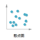
For a scatter plot shows the relationship between different values of the data series, the tool is used to determine the relationship between two variables. Scatter plots, in addition to Quadrant often used in business analysis, the number of reports, papers and ultimately its presence. Twists and turns of the scatter plot may be very intuitive to express the trend data, it is possible to display a particular data point, the data processing is a good method.
Mapping software:
Edraw icon
New "Chart" open sample scatter plots. From the shape of the left drag symbol library software start drawing scattergram.
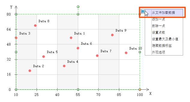
Loading data from the file: can select a data pattern from the example, to copy the data file to be imported, the imported data can not be normally avoid the generation of a graph. And then to the upper right corner of the scatter plot click "Load data from a file."
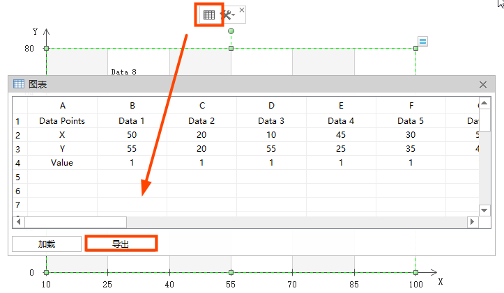
Edit, modify data in the chart: select the entire scattergram, click on the button floating above the graph, as shown below, the data can be modified directly.
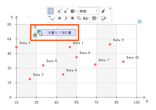
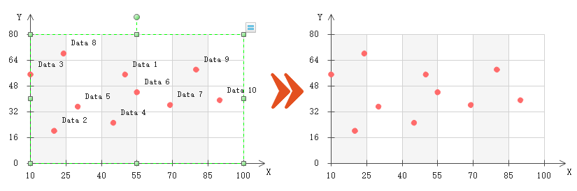
Setting an X-axis, Y-axis position: clicking a certain point, a float will automatically appear button, the mouse will be put up "set the X-axis, Y-axis position."
Hide / Show data labels: Click the top right corner of the picture floating button, select "Show / Hide Data Labels", the data can be hidden or displayed in the chart.
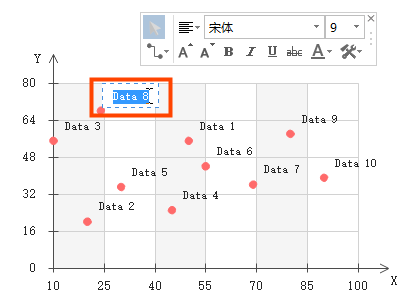
Modify the data labels: In the above and there will be a tag each data point, double-click to edit it.
Add a point: Click the top right corner of the picture floating button to select the "Add a dot."
To delete a point: Click the top right corner of the picture floating button to select "Delete a point."
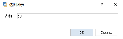
Set Points: Click on the top right of the picture floating button to select "Set points" can be a key set points.
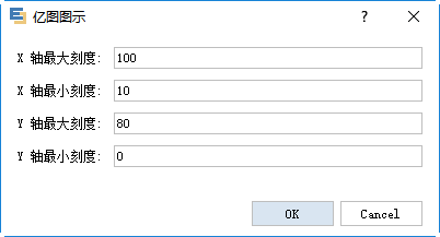
Set axis of maximum and minimum values: Click the Actions menu to set a maximum shaft.
Appearance options:
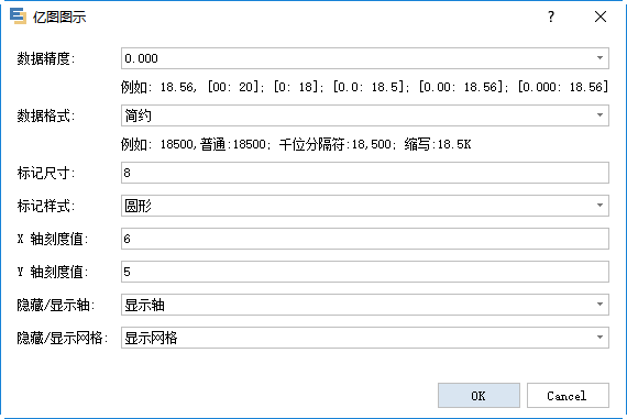
Data Precision: precision range setting data, such as: 18.56, [00:20], [0.0: 18.5] and the like.
Data format: format may be provided for the simple (18.5K), Normal (18,500) or a thousand separator (18,500).
Size markers: to set the size of each dot in the scattergram.
Marker style: style scattergram used to modify each point of the display, for example: circular, square, diamond or triangular.
X-axis scale values: setting the number of the X-axis scale, the greater the value, the more intense the mark, on the contrary, the more sparse.
Y-axis scale values: setting the number of the Y-axis scale, the greater the value, the more intense the mark, on the contrary, the more sparse.
Hide / Show axis: setting display or hide the coordinate axes.
Hide / Show Grid: Hide or show grid lines is provided in FIG.
Other operations:
Modify the mesh fill color: Grid under the default color is gray two colors, modifying, click to select the need to modify the color of the grid, and then select the color to fill in the bottom of the software, or select a fill color on the right software can .
Modify Color coordinate axes: click to select the entire scattergram, the bottom of the display area in the software patch, the "fill" switched to "a line", or directly to the right of the software and select "Line" tool to change the color.
Modify the axes and the grid line style: When you select a chart, click on the right side of the "line" toolbar, modify the "dotted line type."
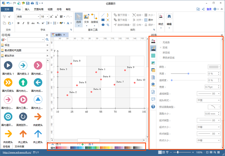
Tips: If you need to modify the style of XY axis alone, just the whole Scatter "ungroup" (Ctrl + Shift + U) , and then set alone on it.