1. mapping function
seaborn.scatterplot(x=None, y=None, hue=None, style=None, size=None, data=None, palette=None, hue_order=None, hue_norm=None, sizes=None, size_order=None, size_norm=None, markers=True, style_order=None, x_bins=None, y_bins=None, units=None, estimator=None, ci=95, n_boot=1000, alpha='auto', x_jitter=None, y_jitter=None, legend='brief', ax=None, **kwargs)
2. The main parameters to explain
Several plotted scattergram semantic packet. The relationship between x and y different subsets of data may be controlled by drawing attributes hue, size, style these three parameters. These parameters are used to identify the control of different subsets visual semantic information, all the three kinds of the semantic type can be used, show three separate dimensions, but this style of drawing or not difficult to explain what effect most of the time. Excessive use of semantic information (for example: using both hue and style for the same variable) for mapping is helpful but also easier to understand.
X, Y : data or vector data inside the variable name, select
the input variable data, must be numeric, data can be transferred directly or reference data column
Hue: data or vector data inside the variable name, category or numerical data lines, selectively
Variables will produce a different color points are grouped may be a category may be a digital
style: data or vector data inside the variable name, category or numerical data lines, selectively
Variables will produce different point markers to classify, can have a numeric type, but this figure will be treated as category
Data: DataFrame Data Type
dataframe it is a variable for each column, each row is a value observed
sizes: lists, dictionaries or tuples, category or numerical data line, optional
When using size, used to decide how to select an object of sizes. It may have been a size that contains a list of values, or a map to the level of variable size of the dictionary sizes. When the size is a digital time, sizes may comprise maximum and minimum size of the tuples, other values are normalized to the range specified tuple
Etc. as well as other parameters specific reference: seaborn0.9 Chinese documents
3. Examples of the following
import pandas as pd
import numpy as np
import matplotlib.pyplot as plt
import seaborn as sns
index = pd.date_range('2000-01-01', periods=100, freq='m', name='date')
data = np.random.randn(100, 4).cumsum(axis=0)
#print(data)
wide_df = pd.DataFrame(data, index, columns=['a', 'b', 'c', 'd'])
wide_df['style'] = np.nan
wide_df['style'][0:50] = 'A'
wide_df['style'][50:100] = 'B'
# print(wide_df.tail())
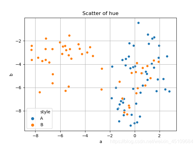
# hue参数,颜色区分数据类别
ax = sns.scatterplot(x='a', y='b', hue='style', data=wide_df)
plt.title('Scatter of hue')
plt.grid()
plt.show()
The image is as follows:
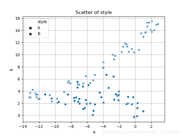
#style参数,不同标记区分数据类别
ax = sns.scatterplot(x='a', y='b', hue='style', data=wide_df)
plt.title('Scatter of style')
plt.grid()
plt.show()
The image is as follows:
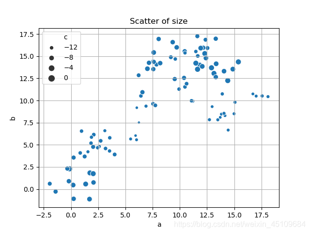
#size参数,不同散点大小区分数据类别
x = sns.scatterplot(x='a', y='b', size='c', data=wide_df)
plt.title('Scatter of size')
plt.grid()
plt.show()
Graphics are as follows:
#多参数运用,区分数据散点类别
ax = sns.scatterplot(x='a', y='b', hue='d', style='style', size='c', data=wide_df)
plt.title('Scatter of All')
plt.grid()
plt.show()
Graphics follows:
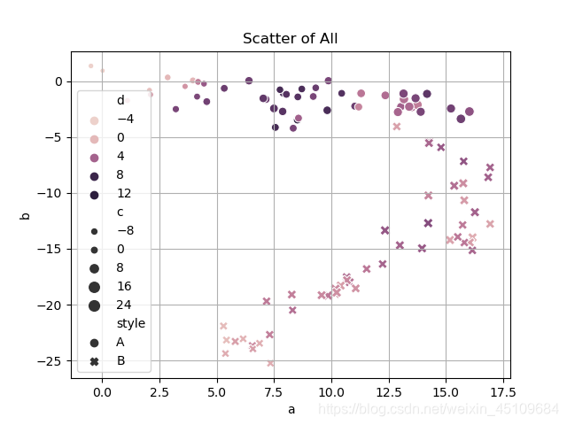
Hue and size parameters are of numeric type, respectively, are divided to five numerical range of values, in a range corresponding to a color and will scatter size, style parameter data is the type of data here, scatter shape to distinguish the type of data which belongs to. There are many other parameters can be applied, if want to know more, you can refer to: [seaborn0.9 Chinese document]
