Tip: After the article is written, the table of contents can be automatically generated. How to generate it can refer to the help document on the right
Article Directory
1. Media Query
1. Easy to understand
Common media queries are 1280, 1440, 1600, 1720, 1920. The law is also very simple, 800 + 160*n. The minimum is 800px (the smallest is mostly used by projectors), and if the screen is not considered for special design, the maximum is 2560px. Let's use the example of changing the background color of different resolutions to get acquainted with media queries.
2. Simple example
An example of a media query to change the background color based on the screen width
  <style>
    html{


      background-color: pink;
    }
    @media screen and (min-width: 800px)  {


      html {


        background-color: skyblue;
      }
    }
    @media screen and (min-width: 1441px) and (max-width: 1920px){


      html {


        background-color: yellow;
      }
    }
    @media screen and (min-width: 1921px){


      html {


        background-color: blue;
      }
    }
  </style>
3. Grammar
@media mediatype and|not|only (media feature) {

    CSS-Code;}
- @media fixed writing
- mediatype media type
- keywords and not only
- media feature media features must be enclosed in parentheses
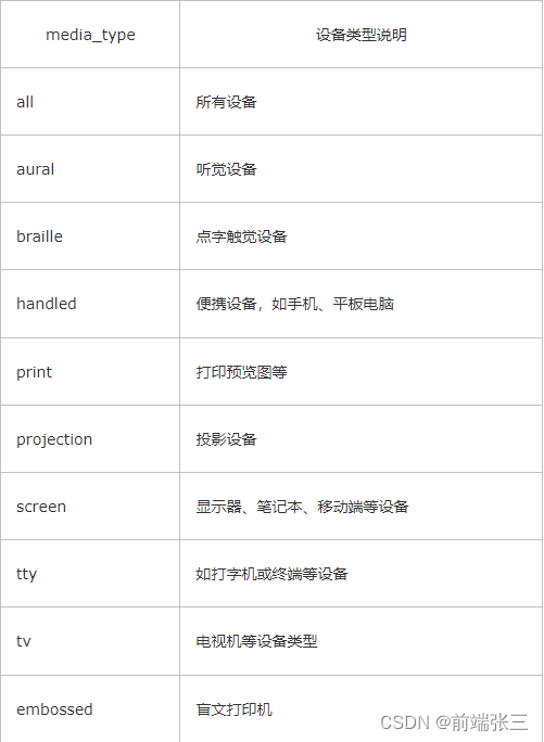
(1) Media type (mediatype)
(2) Keywords
and: multiple media features can be connected together, which is equivalent to the meaning of "and".
not: Exclude a certain media type, which means "not" and can be omitted.
only: Specify a specific media type, which can be omitted.
(3) Media feature (media feature)
Each media type has its own specific characteristics, and different display styles are set according to the media characteristics of different media types. We know three for now. Note that they need to add parentheses to include
min-width、max-width:最小、最大宽
orientation:landscape、orientation:portrait:横屏、竖屏
orientation: portrait (vertical screen, that is, the height of the visible area of the page in the device >= width)
orientation: landscape (horizontal screen, that is, the height of the visible area of the page in the device <= width) The
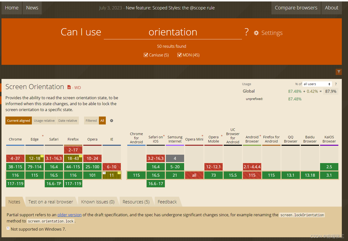
picture below shows the orientation Compatibility, the minimum and maximum values have always been there, and then explain that the compatibility of orientation is also very good, you can use it with confidence. It should be noted that: vertical screen is rarely used, because the default is vertical screen, this actually does not need to be written.
<style>
   @media (orientation: landscape) {


        body {


            background-color: pink;
        }
    }

    @media (orientation: portrait) {


        body {


            background-color: skyblue;
        }
    }
</style>
2. Use sass to adapt to the mobile terminal steps
I won’t say much about installing sass and projects, just talk about ideas
0. The idea of sass + rem
①Set the root element to 100px, then 1rem=100px, and calculate the corresponding ratio in order not to distort. That is, 1rem = screen width/design drawing width 100px.
That is, if the screen is 750px and the width of the given design draft is 750px, then in this case 1rem means 100px; if the screen is 375px and the width of the given design draft is 750px, then in this case 1rem means 50px.
②If you want to make it responsive, you only need to cooperate with @media to calculate the value of html font-size under the corresponding screen. At the same time, due to the large size of the mobile terminal, it is better to use each loop to traverse and set the font-size.
③The value of font-size: the size written in CSS = the size marked in the design draft/100px 1rem
If a box is 100px, and the inner spacing is 16px, then it is width: 1rem; padding: 0.16rem. Since the calculation is based on 100px, the calculation is relatively simple.
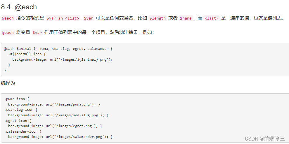
1. The each method (loop) in sass
sass official website: https://www.sass.hk/docs/
2. The each method (loop) in less
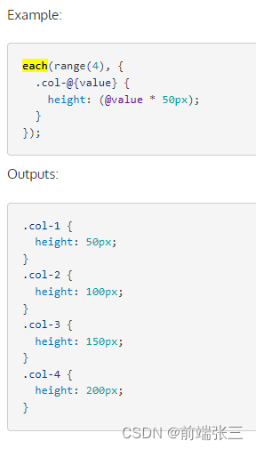
Of course, less also has a traversal method, as shown in the official website example
2. Code
sass code
// 计算rem的基准字体
$base-font-size: 100px;
// 设计图的基准分辨率宽度
$base-width: 750px;
// 需要适配的屏幕宽度列表
$device-widths: 240px, 320px, 360px, 375px, 384px, 411px, 414px, 424px, 480px, 540px, 640px, 720px, 750px, 768px, 800px, 980px,1024px, 1080px, 1152px,1366px, 1440px, 2160px;
// 根据不同设备的屏幕宽度,定义不同的的基准font-size
@each $current-width in $device-widths {


  @media (min-width: $current-width) {


    html {


      font-size: $current-width * $base-font-sizee/$base-width;
    }
  }
}
// How to convert sass to css
@media (min-width: 240px) {


  html {


    font-size: 32px;
  }
}

@media (min-width: 320px) {


  html {


    font-size: 42.66667px;
  }
}

@media (min-width: 360px) {


  html {


    font-size: 48px;
  }
}

@media (min-width: 375px) {


  html {


    font-size: 50px;
  }
}
// ......