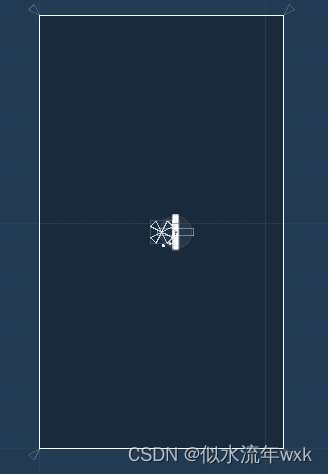
Unity version 2020.1
Problem: The webgl horizontal version of the game is 1920*1080, which is not well adapted to the mobile phone, and it is still displayed on the vertical screen.

Using the official instructions, it is said that it can only be rotated in full-screen mode, which is not easy to use, and it may not achieve the desired effect by rotating directly
solution:
1. The solution I use here is UI adaptation. UGUI uses two sets of UI. It is enough to load different resources according to different platforms. I use Addressable to load resources here. For example, UILogin is loaded on the PC side. mb_UILogin is loaded on the phone
(1) You need to configure the canvas here to adapt Match to between the two

(2) The horizontal version of the UI is used on the PC side, which is the UI with a design resolution of 1920*1080.

(3) The horizontal version of the ui directly under the vertical screen used on the mobile phone,

The reason for this is because I have tried many methods, but none of them work. The method is as follows
1. Turn the camera of the Canvas, because it is already a vertical screen, the camera is turned, and only half of the screen is displayed in the horizontal screen, and the size of the camera does not work. 2. Turn the root
node of the prefab, it is possible, but the alignment button needs to be adjusted. Those buttons such as edge alignment will be messed up.
3. Directly adjust the content of the prefab to be horizontal, and the background image
should be aligned in the middle. 4. The Canvas of the UI will not
work. The unityCanvas of the html is webgl, webgl is developed based on openGL, there is no experience in this area
So the final choice of option 3
2. In addition to the UI, for the adaptation of 3D and 2D cameras in the game scene, the default platform is PC, no operation is required, and if it is determined that it is on a mobile phone, operation is required
The camera size of my game scene here is 5

Unity will calculate the width value of the camera according to the actual aspect ratio of the current screen and the orthographicSize value of the camera, that is
Actual camera width = camera height * screen aspect ratio
For example, the screen pixels of the iPhone 4 are 640*960, and the aspect ratio is 2:3. Assuming that the Pixels To Units value is 100, then if the camera height size is set to 4.8, then the actual width of the camera is calculated according to the formula 6.4, which happens to be the size of the screen. unit width.
Here we need to recalculate the actual width of the camera. If the width and height on the mobile phone are 1080*1920,
Then, it is necessary to reverse the width and height to calculate the camera width, because the camera needs to be rotated 90 degrees
if (UnityCallJs.Instance.GetCurPlatForm() == 1)
{// Camera rotation on the phone
transform.rotation = Quaternion.Euler(0,0,90);
// 屏幕适配
float orthographicSize = GetComponent<Camera>().orthographicSize;
orthographicSize *= (Screen.height / (float)Screen.width);
GetComponent<Camera>().orthographicSize = orthographicSize;
}
Because the orthographicSize is 5 by default, it is calculated by unity in the vertical screen state of the mobile phone. We rotate the camera here, then reverse the width and height to recalculate the value of orthographicSize, and finally get 8.85, which is exactly the same as the horizontal The aspect ratio of the version of the game is the same.