Create a new JS file in the tools folder

Create a method in the JS file
// 如果页面发生改变更改rem得值
function setRem() {
    // 默认使用100px作为基准大小
    const baseSize = 100;
    const baseVal = baseSize / 1920;
    const vW = window.innerWidth; // 当前窗口的宽度
    const rem = vW * baseVal; // 以默认比例值乘以当前窗口宽度,得到该宽度下的相应font-size值
    window.$size = rem / 100;
    document.documentElement.style.fontSize = rem + "px";
  }
Then call this method in the file
  // 初始化
  setRem();
  // 每次窗口发生改变时窗口大小变化时重置 rem
  window.onresize = function() {
    setRem();
  };
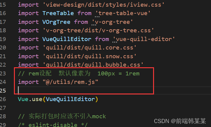
Introduce the modified file in main.js
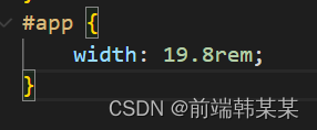
That's OK, let's see the effect