rem 与 em
The relative unit of rem depends on the html font size. And em is also a relative unit, depending on the font size of the parent element
<!DOCTYPE html>
<html lang="en">
<head>
<meta charset="UTF-8">
<meta name="viewport" content="width=device-width, initial-scale=1.0">
<title>Document</title>
<style>
* {
margin: 0;
padding: 0;
}
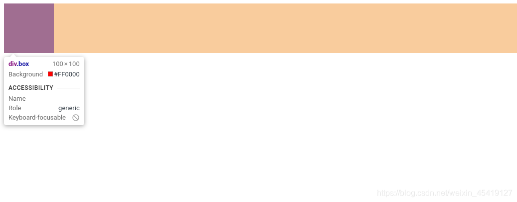
html {
font-size: 16px;
}
.box {
width: 10rem;
height: 10rem;
margin: auto;
background-color: purple;
}
</style>
</head>
<body>
<div class="box">
</div>
</body>
</html>
Media inquiries
媒体查询(Media Query)是CSS3新语法。
Function: Set different styles for different screens
Media query syntax specification
- Pay attention to the @ symbol at the beginning of @media
- mediatype: media type
- Keywords and not only
- media feature must have parentheses
grammar
@media mediatype and|not|only (media feature) {
    CSS-Code;
}
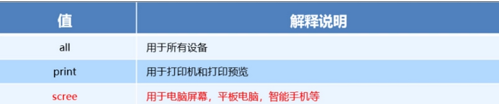
media type
Dividing different terminal devices into different types are called media types.
Keyword
Keywords connect media types and media characteristics as conditions for media queries
- and: Multiple media characteristics can be connected together, which is equivalent to "and".
- not: Exclude a certain media type, which means "not" and can be omitted.
- only: Specify a specific media type, which can be omitted.
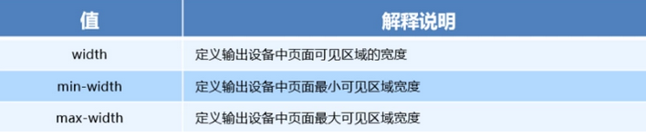
Media characteristics
每种媒体类型具有不同的特性
<!DOCTYPE html>

<html lang="en">

<head>
    <meta charset="UTF-8">
    <meta name="viewport" content="width=device-width, initial-scale=1.0">
    <title>Document</title>
    <style>
        /* body区域在600以下背景为yellow*/

        @media screen and (max-width: 600px) {
            body {
                background-color: yellow;
            }
        }
    </style>
</head>

<body>

</body>

</html>

Cases of media inquiries
<!DOCTYPE html>
<html lang="en">
<head>
<meta charset="UTF-8">
<meta name="viewport" content="width=device-width, initial-scale=1.0">
<title>Document</title>
<style>
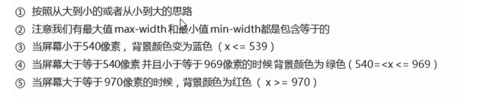
/* 小于540px 背景颜色为蓝色 */
@media screen and (max-width:539px) {
body {
background-color: blue;
}
}
/* 大于540px且小于等于969px的时候,背景颜色为绿色*/
@media screen and (min-width:540px) {
body {
background-color: green;
}
}
/* 大于970px背景颜色为红色*/
@media screen and (min-width:970px) {
body {
background-color: red;
}
}
</style>
</head>
<body>
</body>
</html>

Media query + rem to achieve dynamic changes of elements
<!DOCTYPE html>
<html lang="en">
<head>
<meta charset="UTF-8">
<meta name="viewport" content="width=device-width, initial-scale=1.0">
<title>Document</title>
<style>
* {
margin: 0;
padding: 0;
}
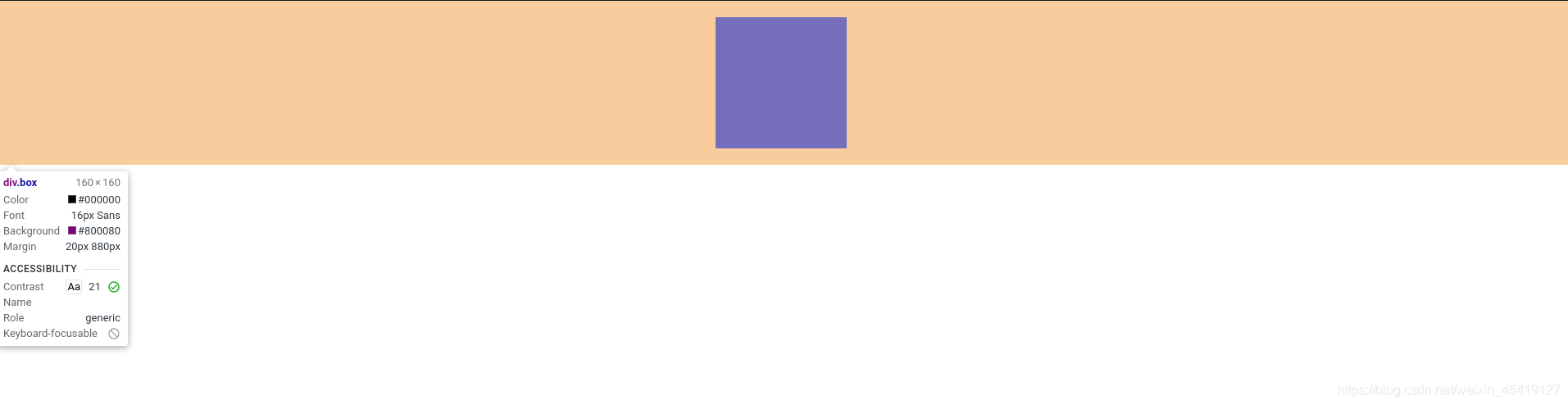
/* 最小屏幕尺寸为320px时 html的字体为50px */
@media screen and (min-width:320px) {
html {
font-size: 50px;
}
}
/* 最小屏幕尺寸为640px时 html的字体为100px */
@media screen and (min-width:640px) {
html {
font-size: 100px;
}
}
.header {
color: red;
font: bold normal 0.5rem normal;
text-align: center;
line-height: 1rem;
background-color: blanchedalmond;
}
</style>
</head>
<body>
<div class="header">header</div>
</body>
</html>

Introducing resources for media queries
Write multiple styles under different screen sizes, and call different styles for different screen sizes
style320
div {
    width: 100%;
    height: 50px;
}

div:nth-of-type(1) {
    background-color: red;
}

div:nth-of-type(2) {
    background-color: blue;
}
style640
div {
    float: left;
    width: 50%;
    height: 25px;
}

div:nth-of-type(1) {
    background-color: red;
}

div:nth-of-type(2) {
    background-color: purple;
}
index
<!DOCTYPE html>
<html>

<head>
    <meta charset="utf-8">
    <title>引入资源</title>
    <style>
        * {
            margin: 0;
            padding: 0;
        }
    </style>
    <!-- min-width:320px -->
    <link rel="stylesheet" href="./style320.css" media="screen and (min-width:320px)">
    <!-- min-width:640px -->
    <link rel="stylesheet" href="./style640.css" media="screen and (min-width:640px)">
</head>

<body>
    <div></div>
    <div></div>
</body>

</html>

Media query summary
- Media queries are written in ascending order
- Media query is composed of media type keywords media characteristics
- Add parentheses for media features
Disadvantages of css
- Write a lot of non-logic code, css redundancy is relatively high.
- It's harder to deal with
- No ability to calculate
less
Less is the preprocessing language of css. It expands the dynamic characteristics of css. It expands some functions on the basis of css grammar, and introduces variable functions to make css computationally capable.
How to install less
① Install nodejs, select the version (14.7.0), website: nodejs.cn/download/
②Check whether the installation is successful, use the cmd command (win10 is window+r, open and run cmd)-enter "node -v" to view the version
③Online installation of Less based on nodejs, just use cmd command "npm install -g less"
④Check if the installation is successful, use the cmd command "lessc -v" to check the version
Note: If vscode wants to compile less, you must use the Easy LESS plugin. Just save the Less file and the CSS file will be automatically generated.
Note: If vscode wants to compile less, you must use the Easy LESS plugin. Just save the Less file and the CSS file will be automatically generated.
less variables
@Variable name: value;
Precautions
- Must be prefixed with @
- Cannot contain special characters
- Cannot start with a number
- Case Sensitive
less file
@color:purple;
@font:20px;
@baseline:50px;
html {
    font-size: @baseline;
}
.box {
    color: @color;
    font-size: @font;
    background-color: red;
    text-align: center;
    height: 1rem;
    line-height: 1rem;
}
Compiled css file
html {
  font-size: 50px;
}
.box {
  color: purple;
  font-size: 20px;
  background-color: red;
  text-align: center;
  height: 1rem;
  line-height: 1rem;
}
html file
<!DOCTYPE html>
<html lang="en">

<head>
    <meta charset="UTF-8">
    <meta name="viewport" content="width=device-width, initial-scale=1.0">
    <title>Document</title>
    <link rel="stylesheet" href="./less.css">
</head>

<body>
    <div class="box">
        hello word
    </div>


</body>

</html>
less nesting
- The style of the child element can be written directly on the parent element
- If there is a link pseudo-class selector, an intersection selector, a pseudo-element selector, use & to connect
less file
// 后代选择器

.box {
    width: 400px;
    height: 400px;
    margin: 20px auto;
    background-color: red;
    p {
        width: 200px;
        height: 200px;
        background-color: rebeccapurple;

    }

}

// 伪类选择器
a {
    display: block;
    width: 200px;
    height: 200px;
    text-align: center;
    line-height: 200px;
    background-color: yellow;
    text-decoration: none;
    &:hover {
        background-color: red;
    }
}
Compiled css file
.box {
  width: 400px;
  height: 400px;
  margin: 20px auto;
  background-color: red;
}
.box p {
  width: 200px;
  height: 200px;
  background-color: rebeccapurple;
}
a {
  display: block;
  width: 200px;
  height: 200px;
  text-align: center;
  line-height: 200px;
  background-color: yellow;
  text-decoration: none;
}
a:hover {
  background-color: red;
}
html file
<!DOCTYPE html>
<html lang="en">

<head>
    <meta charset="UTF-8">
    <meta name="viewport" content="width=device-width, initial-scale=1.0">
    <title>Document</title>
    <link rel="stylesheet" href="./less嵌套.css">
</head>

<body>
    <div class="box">
        <p></p>
    </div>


    <a href="#">百度</a>
</body>

</html>

less operation
- How to write the multiplication sign (*) and division sign (/)
- There is a space in the middle of the operator
- For the operation between the values of two different units, the value of the operation result takes the unit of the first value
- If only one value has a unit between the two values, the result of the operation will take that unit
less file
@baseline:50px;
@border:5px + 1;
html {
    font-size: @baseline;
}

.box {
    width: 80rem/@baseline;
    height:80rem/@baseline;
    border:@border solid red
}
css file
html {
  font-size: 50px;
}
.box {
  width: 1.6rem;
  height: 1.6rem;
  border: 6px solid red;
}
html file
<!DOCTYPE html>
<html lang="en">

<head>
    <meta charset="UTF-8">
    <meta name="viewport" content="width=device-width, initial-scale=1.0">
    <title>Document</title>
    <link rel="stylesheet" href="./operation.css">
</head>

<body>
    <div class="box"></div>
</body>

</html>
Technical solutions
1.less+rem+media query
2.flexible.js+rem
Target of adaptation
Let some elements that cannot be proportionally adapted to the current device when the device size changes.
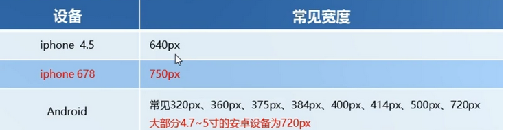
Common size of design draft
rem adaptation scheme
①Assuming the design draft is 750px
②Suppose we divide the entire screen into 15 equal parts (division standards can be 20 or 10 equal parts)
③Each copy is used as the html font size, here is 50px
④Then when the device is 320px, the font size is 320/15, which is 21.33px
⑤Dividing the size of our page elements by different html font sizes will find that their proportions are still the same
⑥For example, we use 750 as the standard design draft. ⑦A page element with 100_100 pixels under the 750 screen is 100/50 converted to rem, which is 2rem_2rem, and the ratio is 1:1
⑧ On the 320 screen, the html font size is 21.33, then 2rem = 42.66px. At this time, the width and height are both 42.66, but the ratio of width and height is still 1:1
⑨But it has been able to achieve the effect of proportional scaling of page element boxes under different screens
to sum up
Rem value of page element = page element value (px) / html font-size font size
<!DOCTYPE html>
<html lang="en">

<head>
    <meta charset="UTF-8">
    <meta name="viewport" content="width=device-width, initial-scale=1.0">
    <title>Document</title>
    <style>
        @media screen and (min-width:320px) {
            html {
                font-size: 21.33px;
            }

        }

        @media screen and (min-width:750px) {
            html {
                font-size: 50px;
            }
        }

        div {
            width: 2rem;
            height: 2rem;
            background-color: red;
        }
    </style>
</head>

<body>
    <div class="box"></div>
</body>

</html>