table of Contents
General conversion and some pitfalls
Start to enter the rem tutorial
Set the font-size of html, then we can start to write an example based on the design draft.
Why use rem
Some previous adaptation methods used js to dynamically calculate the initial-scale value of the viewport.
For example, if the screen is 320 pixels and set to 1, then the screen 375 pixels is 375/320=1.18 and so on.
However, if you force the page zoom directly in this way, it will cause the page image and text to be distorted and blurred.
Px is a relatively fixed unit, the font size is directly fixed, so users cannot zoom according to the browser font size set by themselves. Although both em and rem are relative units, em is relative to the font-size of its parent element. The deeper the level, the more complicated the conversion of em, and the rem is directly relative to the root element, which avoids many hierarchical relationships. The new mobile browser is very compatible with rem and can be used with confidence.
General conversion and some pitfalls
Sometimes we will see that some pages that use rem will first give a style to the root element of the page:
html {font-size: 62.5%; /*10 ÷ 16 × 100% = 62.5%*/}
Why is it 62.5%?
The default font size of most browsers is 16px, so 1rem=16px, which is not convenient for us to convert between px and rem. If 1rem=10px, then 100px=10rem and 25px=0.25rem. This makes it easy to convert a lot, so there is 10/16 above.
If it is a 640 design draft, it needs to be divided by 2 and converted to 320 which is the same width as the iPhone5 screen. So the design draft px unit/2/10 is converted to rem. After that, the media query sets the font-size percentage of each screen size, and the page will adapt according to the root font-size set above.
Do you think everything is perfect when you see it? However, there are two deep pits:
1. I read a lot of information about rem on the Internet, and basically said that the default font size of the browser is 16px, and then directly define font-size: 62.5%. However, rem belongs to the property of css3. The default font size of some early versions of browsers and some domestic browsers is not 16px, so the 10/16 conversion above is not valid, and directly defining font-size: 62.5% for html is not valid.
2. Chrome forces the minimum font size to be 12px. If it is lower than 12px, it will be treated as 12px. Then the above 1rem=10px will become 1rem=12px, and there will be a deviation (the demo below).
Solution: Change 1rem=10px to 1rem=100px (or other scale values that are easy to convert); do not use rem on the PC side.
Then the style of the above page root element should be changed to:
html {font-size: 625%; /*100 ÷ 16 × 100% = 625%*/}
Then use the media query conversion of each resolution summarized by this factory:
@media screen and (min-width:360px) and (max-width:374px) and (orientation:portrait) {
    html { font-size: 703%; }
}
@media screen and (min-width:375px) and (max-width:383px) and (orientation:portrait) {
    html { font-size: 732.4%; }
}
@media screen and (min-width:384px) and (max-width:399px) and (orientation:portrait) {
    html { font-size: 750%; }
}
@media screen and (min-width:400px) and (max-width:413px) and (orientation:portrait) {
    html { font-size: 781.25%; }
}
@media screen and (min-width:414px) and (max-width:431px) and (orientation:portrait){
    html { font-size: 808.6%; }
}
@media screen and (min-width:432px) and (max-width:479px) and (orientation:portrait){
    html { font-size: 843.75%; }
}
At this point, the pit is filled. The design draft px can be directly converted to /100 to get the rem value.
Start to enter the rem tutorial
1. First set the meta tag in the header:
1 <meta name="viewport" content="initial-scale=1,maximum-scale=1, minimum-scale=1">
2. Write the <script> tag in the header
1 <script type="text/javascript">
2   document.documentElement.style.fontSize = document.documentElement.clientWidth / 640*100 + 'px';
3 </script>
Question: Why do I need to set the font-size of Html?
Answer: Here is to set the font-size of the html tag. The red text in the above overview is very clear. When the page element uses the rem unit, it is based on the font-size of the html tag.
Question: Why is clientWidth/640? Why is it multiplied by 100?
answer:
1. Because this is a basic value, think about it in a different direction. Do not multiply by 100 here to avoid misunderstanding.
For example: the width of the design draft is 640px, the width of an element design draft is 50px, and the physical width of the device is 320px, then we should set the width on the page to width:50rem, which is equivalent to the width: 50*(320/640) =25px; It can be correctly calculated here that it is exactly half of the 320px device. In fact, it can be imagined as rem=(320/640).
2. The minimum font of a general browser is 12px. If the html font-size=(320/640)px, which is equivalent to font-size=0.5px, then this value is less than 12px, which will cause some calculation errors and some Strange problem. After *100, the font-size is 50px, which can solve the problem of fonts smaller than 12px.
3. For the convenience of calculation, we multiply the ratio by 100, (320/640)*100, then the corresponding element needs to be divided by 100 (50/100) when setting the value, so that the final output can be guaranteed The value does not change.
Set the font-size of html, then we can start to write an example based on the design draft.
The design draft is 640px, a red box is 320px wide and high, and the text inside is 32px, then the code for this example is below.
<!DOCTYPE html>
<html lang="en">
<head>
    <meta charset="UTF-8">
    <title>Title</title>
    <meta name="viewport" content="width=device-width,initial-scale=1,maximum-scale=1, minimum-scale=1">
    <script type="text/javascript">
        document.documentElement.style.fontSize = document.documentElement.clientWidth / 640*100 + 'px';
    </script>
</head>
<body style="margin: 0 ;padding: 0;font-size: 0.32rem">
<div style="width: 3.2rem;height: 3.2rem ;background: red">
    <span>danny.xie</span>
</div>
</body>
</html>
1. In the case of iphone5, the physical pixel of the device is 320px

1. In the case of iphone6, the physical pixel of the device is 375px
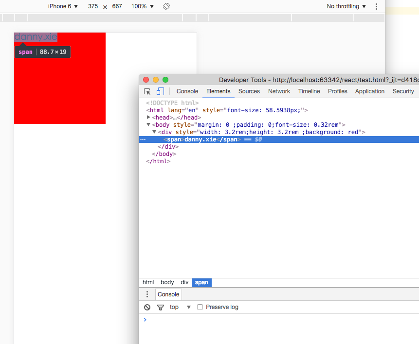
You can see that the font size and the width and height of the red box are consistent with the proportions on the design draft. This is the basic usage of rem to adapt to different devices.