Example of drawing a bar chart
In data visualization, a bar chart is a commonly used chart type for comparing different categories of data values. Python's matplotlib library provides us with convenient and easy-to-use functions to draw bar charts.
1. Basic Bar Chart
First, we show how to draw a basic bar chart. Suppose we have a dataset with ten categories, where each category has two associated data values. We use matplotlib.pyplotthe library to draw this graph.
from matplotlib import pyplot as plt
import random

x = ['one', 'two', 'three', 'four', 'five', 'six', 'seven', 'eight', 'nine', 'ten']

# 设置 y1 和 y2 数组
y1 = []
y2 = []
for j in range(10):
    y1.append(random.randint(10, 30))
    y2.append(random.randint(1, 10))

# 绘制条形图并添加图例
plt.bar(range(len(x)), y1, label='y1')
plt.bar(range(len(x)), y2, label='y2', alpha=0.5)

# 设置 x、y 轴标签和范围
plt.xlabel('x')
plt.ylabel('y')
plt.xlim(-1, len(x))
plt.ylim(0, max(max(y1), max(y2)) + 5)

# 添加 x 轴刻度和轴标签
plt.xticks(range(len(x)), x, rotation=45)

# 添加图例
plt.legend()

plt.show()
The above code draws a basic bar chart, where y1and y2represent two sets of data, corresponding to the values of each category. We used different colors and transparency to differentiate the two sets of data, and added legends to identify the different data.

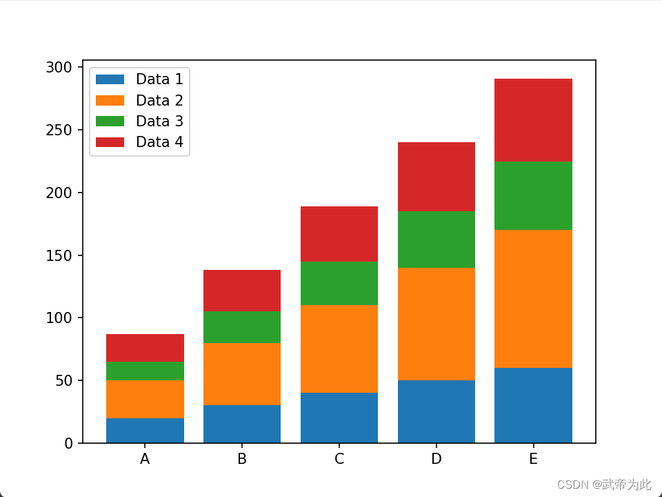
2. Stacked bar chart
Next, we show how to draw a stacked bar chart. Suppose we have four sets of data, and each set of data contains five categories of values. We use matplotlib.pyplotthe library to draw this graph.
import matplotlib.pyplot as plt
import numpy as np

data1 = [20, 30, 40, 50, 60]
data2 = [30, 50, 70, 90, 110]
data3 = [15, 25, 35, 45, 55]
data4 = [22, 33, 44, 55, 66]

labels = ['A', 'B', 'C', 'D', 'E']

plt.bar(labels, data1, label='Data 1')
plt.bar(labels, data2, label='Data 2', bottom=data1)
plt.bar(labels, data3, label='Data 3', bottom=[sum(x) for x in zip(data1, data2)])
plt.bar(labels, data4, label='Data 4', bottom=[sum(x) for x in zip(data1, data2, data3)])
plt.legend()
plt.show()
The above code draws a stacked bar chart, where each group of data is displayed in a stacked manner. We use bottomparameters to specify the starting height of each set of data, thus realizing the stacking effect of the data. The legend shows the labels for each data group, making it easy to compare values across categories.