matplotlib draws histograms, bar and pie charts
matplotlib is a very powerful third-party plotting package for Python that can draw a lot of very beautiful graphics. matplotlib.pyplot provides a Matlab-like functional programming environment. The usual drawing tasks can be completed through matplotlib.pyplot. The process of drawing histograms and pie charts will be recorded below.
1 Draw a histogram
First of all, it is necessary to distinguish clearly the concepts: histogram and bar chart.
- Bar chart: The bar chart represents each category with a long bar, the length of the bar represents the frequency of the category, and the width represents the category.
- Histogram: A histogram is a statistical report graph, which is also a long bar in form, but the histogram uses the area of the bar to represent the frequency, so the height of the bar represents the frequencygroup spacingFrequency group interval , width indicates group interval, and its length and width are meaningful. When the width is the same, the length of the bar is generally used to represent the frequency.
Histograms are generally used to describe equidistant data, and histograms are generally used to describe name (category) data or ordinal data. Intuitively, the bars of the histogram are connected together to represent the mathematical relationship between the data; there are gaps between the bars of the bar graph to distinguish different classes.
| the difference | Frequency distribution histogram | bar chart |
|---|---|---|
| data on the horizontal axis | continuous, is a range | isolated, representing a category |
| between the strips | no gap | There are gaps |
| representation of frequency | Generally, it is expressed by the area of the long bar; when the width is the same, it is expressed by the length | the length of the bar |
1.1 Histogram
import matplotlib.pyplot as plt
import numpy as np
import matplotlib
# 设置matplotlib正常显示中文和负号
matplotlib.rcParams['font.sans-serif']=['SimHei'] # 用黑体显示中文
matplotlib.rcParams['axes.unicode_minus']=False # 正常显示负号
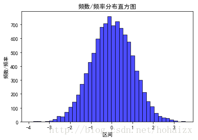
# 随机生成(10000,)服从正态分布的数据
data = np.random.randn(10000)
"""
绘制直方图
data:必选参数,绘图数据
bins:直方图的长条形数目,可选项,默认为10
normed:是否将得到的直方图向量归一化,可选项,默认为0,代表不归一化,显示频数。normed=1,表示归一化,显示频率。
facecolor:长条形的颜色
edgecolor:长条形边框的颜色
alpha:透明度
"""
plt.hist(data, bins=40, normed=0, facecolor="blue", edgecolor="black", alpha=0.7)
# 显示横轴标签
plt.xlabel("区间")
# 显示纵轴标签
plt.ylabel("频数/频率")
# 显示图标题
plt.title("频数/频率分布直方图")
plt.show()The effect of the histogram drawn is as follows:
1.2 Bar Chart
import matplotlib.pyplot as plt
import matplotlib
# 设置中文字体和负号正常显示
matplotlib.rcParams['font.sans-serif'] = ['SimHei']
matplotlib.rcParams['axes.unicode_minus'] = False

label_list = ['2014', '2015', '2016', '2017']    # 横坐标刻度显示值
num_list1 = [20, 30, 15, 35]      # 纵坐标值1
num_list2 = [15, 30, 40, 20]      # 纵坐标值2
x = range(len(num_list1))
"""
绘制条形图
left:长条形中点横坐标
height:长条形高度
width:长条形宽度,默认值0.8
label:为后面设置legend准备
"""
rects1 = plt.bar(left=x, height=num_list1, width=0.4, alpha=0.8, color='red', label="一部门")
rects2 = plt.bar(left=[i + 0.4 for i in x], height=num_list2, width=0.4, color='green', label="二部门")
plt.ylim(0, 50)     # y轴取值范围
plt.ylabel("数量")
"""
设置x轴刻度显示值
参数一:中点坐标
参数二:显示值
"""
plt.xticks([index + 0.2 for index in x], label_list)
plt.xlabel("年份")
plt.title("某某公司")
plt.legend()     # 设置题注
# 编辑文本
for rect in rects1:
    height = rect.get_height()
    plt.text(rect.get_x() + rect.get_width() / 2, height+1, str(height), ha="center", va="bottom")
for rect in rects2:
    height = rect.get_height()
    plt.text(rect.get_x() + rect.get_width() / 2, height+1, str(height), ha="center", va="bottom")
plt.show()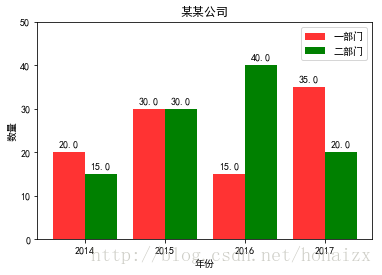
1.3 Horizontal Bar Chart
import matplotlib.pyplot as plt
import matplotlib

matplotlib.rcParams['font.sans-serif'] = ['SimHei']
matplotlib.rcParams['axes.unicode_minus'] = False

price = [39.5, 39.9, 45.4, 38.9, 33.34]
"""
绘制水平条形图方法barh
参数一:y轴
参数二:x轴
"""
plt.barh(range(5), price, height=0.7, color='steelblue', alpha=0.8)      # 从下往上画
plt.yticks(range(5), ['亚马逊', '当当网', '中国图书网', '京东', '天猫'])
plt.xlim(30,47)
plt.xlabel("价格")
plt.title("不同平台图书价格")
for x, y in enumerate(price):
    plt.text(y + 0.2, x - 0.1, '%s' % y)
plt.show()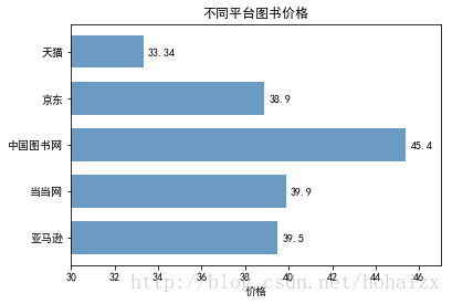
1.4 Stacked Bar Chart
import matplotlib.pyplot as plt
import matplotlib

matplotlib.rcParams['font.sans-serif'] = ['SimHei']
matplotlib.rcParams['axes.unicode_minus'] = False

label_list = ['2014', '2015', '2016', '2017']
num_list1 = [20, 30, 15, 35]
num_list2 = [15, 30, 40, 20]
x = range(len(num_list1))
rects1 = plt.bar(left=x, height=num_list1, width=0.45, alpha=0.8, color='red', label="一部门")
rects2 = plt.bar(left=x, height=num_list2, width=0.45, color='green', label="二部门", bottom=num_list1)
plt.ylim(0, 80)
plt.ylabel("数量")
plt.xticks(x, label_list)
plt.xlabel("年份")
plt.title("某某公司")
plt.legend()
plt.show()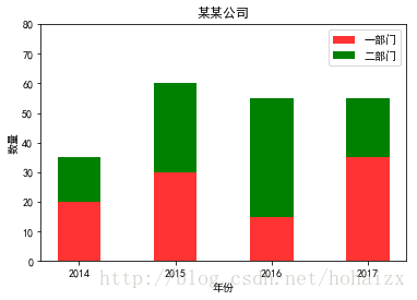
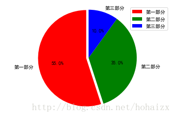
Pie chart
import matplotlib.pyplot as plt
import matplotlib

matplotlib.rcParams['font.sans-serif'] = ['SimHei']
matplotlib.rcParams['axes.unicode_minus'] = False

label_list = ["第一部分", "第二部分", "第三部分"]    # 各部分标签
size = [55, 35, 10]    # 各部分大小
color = ["red", "green", "blue"]     # 各部分颜色
explode = [0.05, 0, 0]   # 各部分突出值
"""
绘制饼图
explode:设置各部分突出
label:设置各部分标签
labeldistance:设置标签文本距圆心位置,1.1表示1.1倍半径
autopct:设置圆里面文本
shadow:设置是否有阴影
startangle:起始角度,默认从0开始逆时针转
pctdistance:设置圆内文本距圆心距离
返回值
l_text:圆内部文本,matplotlib.text.Text object
p_text:圆外部文本
"""
patches, l_text, p_text = plt.pie(size, explode=explode, colors=color, labels=label_list, labeldistance=1.1, autopct="%1.1f%%", shadow=False, startangle=90, pctdistance=0.6)
plt.axis("equal")    # 设置横轴和纵轴大小相等,这样饼才是圆的
plt.legend()
plt.show()