Table of contents
Step 1: Import the echarts.js file
Step 2: Prepare a box to render the diagram
Step 3: Initialize echarts instance object
Step 4: Prepare configuration items
Step 5: Set the configuration item to the echarts instance object
Related configuration explanation:
Common effects of line charts:
Quick start of ECharts
Step 1: Import the echarts.js file
echarts is a js library, of course you have to import this library file first
<script src="js/echarts.min.js"></script>Step 2: Prepare a box to render the diagram
This box is usually the div we are familiar with, and this div determines where the chart is displayed
<div id="main" style="width: 600px;height:400px;"></div>
Step 3: Initialize echarts instance object
In this step, you need to specify the DOM element where the chart will eventually be displayed
var myChart = echarts.init(document.getElementById('main'))Step 4: Prepare configuration items
This step is very critical. Our final effect, whether to display a pie chart or a line chart, is basically determined by the configuration item
var option = {
    xAxis: {
        type: 'category',
        data: ['小明', '小红', '小王']
    },
    yAxis: {
        type: 'value'
    },
    series: [
        {
            name: '语文',
            type: 'bar',
            data: [70, 92, 87],
        }
    ]
}
Step 5: Set the configuration item to the echarts instance object
myChart.setOption(option)
Sample code:
<!DOCTYPE html>
<html lang="en">
<head>
    <meta charset="UTF-8">
    <meta http-equiv="X-UA-Compatible" content="IE=edge">
    <meta name="viewport" content="width=device-width, initial-scale=1.0">
    <title>Document</title>
    <script src="lib/echarts.min.js"></script>
</head>
<body>
    <div style="width: 600px;height:400px"></div>
    <script>
        var mCharts = echarts.init(document.querySelector('div'))
        var option = {
            title:{
                text: '成绩',
                link: 'http://www.baidu.com',
                textStyle: {
                    color: 'red'
                }
            },
            xAxis: {
                type: 'category',
                data: ['小明','小红','小王']
            },
            yAxis: {
                type: 'value'
            },
            series: [
                {
                    name: '语文',
                    type: 'bar',
                    data: [70, 92, 87]
                }
            ]
        }
        mCharts.setOption(option)
    </script>
</body>

</html>
Related configuration explanation:
- xAxis : The x-axis in the Cartesian coordinate system, if the value of the type attribute is category, then you need to configure the data data, representing the presentation on the x-axis
- yAxis : The y-axis in the Cartesian coordinate system. If the type attribute is configured as value, then there is no need to configure data. At this time, the y-axis will automatically go to the series to find data to draw the chart
- series : list of series. Each series determines its own chart type through type, and data sets the data of each series
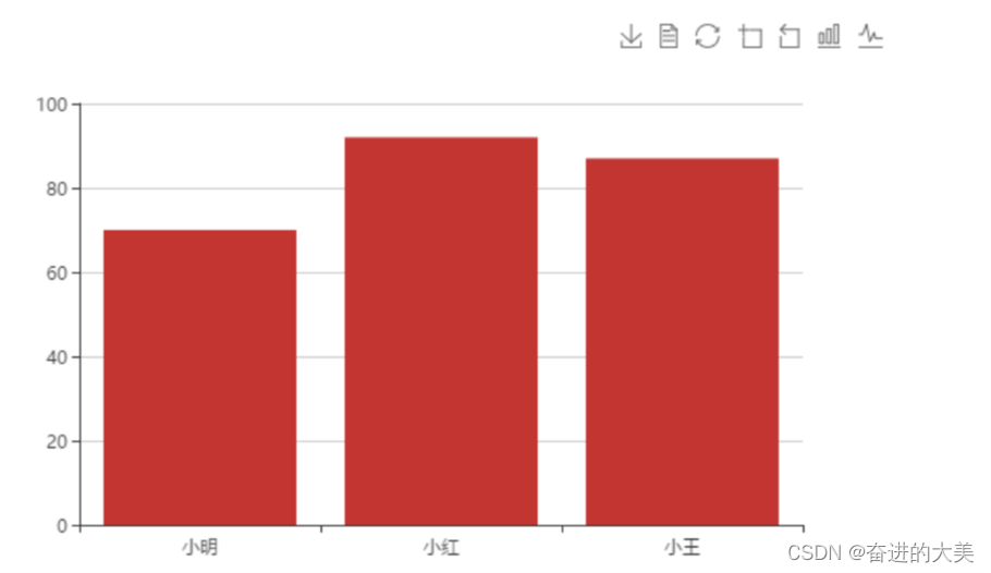
Show results:
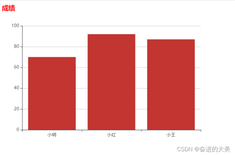
1. Histogram
Common effects:
mark:
- Maximum\minimum markPoint
-
series: [ { ...... markPoint: { data: [ { type: 'max', name: '最大值' }, { type: 'min', name: '最小值' } ] } } ] - Average markLine
series: [
    {
        ......
        markLine: {
            data: [
                {
                    type: 'average', name: '平均值'
                }
            ]
        }
    }
]
show:
- Numerical display label
-
series: [ { ...... label: { show: true, // 是否可见 rotate: 60 // 旋转角度 } } ] - Column width barWidth
-
series: [
    {
        ......
        barWidth: '30%' // 柱的宽度
    }
]
Horizontal histogram:
- For the so-called horizontal histogram, you only need to swap the roles of the x-axis and y-axis. The type of xAxis is set to value, the type of yAxis is set to category, and data is set.
-
var option = {
    xAxis: {
        type: 'value'
    },
    yAxis: {
        type: 'category',
        data: xDataArr
    },
    series: [
        {
            type: 'bar',
            data: yDataArr
        }
    ]
}
Histogram sample code:
-
<!DOCTYPE html>
<html lang="en">
<head>
    <meta charset="UTF-8">
    <meta http-equiv="X-UA-Compatible" content="IE=edge">
    <meta name="viewport" content="width=device-width, initial-scale=1.0">
    <title>Document</title>
    <script src="./lib/echarts.min.js"></script>
</head>
<body>
    <div style="width: 600px; height: 400px"></div>
    <script>
        var mCharts = echarts.init(document.querySelector('div'))
        var xDataArr = ['张三', '李四', '王五', '闰土', '小明', '茅台', '二妞', '大强']
        var yDataArr = [88, 92, 77, 63, 33, 50, 91,96]
        var option = {
            xAxis: {
                type: 'category',
                data: xDataArr
            },
            yAxis: {
                type: 'value'
            },
            series: [
                {
                    name: '语文',
                    type: 'bar',
                    markPoint:{
                        data: [
                            {
                                type: 'max', name: '最大值'
                            },{
                                type: 'min', name: '最小值'
                            }
                        ]
                    },
                    markLine:{
                        data: [
                            {
                                type: 'average', name:'平均值'
                            }
                        ]
                    },
                    label:{
                        show: true,
                        position: 'top',
                        color: 'black'
                    },
                    barWidth:'80%',
                    data: yDataArr
                }
            ]
        }
        mCharts.setOption(option)
    </script>
</body>
</html>
Show results:

General placement:
-
Title: title
var option = {
    title: {
        text: "成绩", // 标题文字
        textStyle: {
            color: 'red' // 文字颜色
        },
        borderWidth: 5, // 标题边框
        borderColor: 'green', // 标题边框颜色
        borderRadius: 5, // 标题边框圆角
        left: 20, // 标题的位置
        top: 20 // 标题的位置
    }
}

-
Prompt box: tooltip
tooltip refers to the prompt box displayed when the mouse is moved into the chart or clicked on the chart
Trigger type: trigger
Optional values are item\axis
Trigger timing: triggerOn
Optional values are mouseOver\click
Format display: formatter
Optional values have string templates/callback functions
1. String template
var option = {
    tooltip: {
        trigger: 'item',
        triggerOn: 'click',
        formatter: '{b}:{c}'
    }
}
// 这个{b} 和 {c} 所代表的含义不需要去记, 在官方文档中有详细的描述
2. Callback function:
var option = {
    tooltip: {
        trigger: 'item',
        triggerOn: 'click',
        formatter: function (arg) {
            return arg.name + ':' + arg.data
        }
    }
}

-
Tool button: toolbox
Toolbox is a toolbar provided by ECharts. It has built-in export image, data view, reset, data area zoom, and dynamic type switching. The five tool toolbar buttons are configured under the feature node
var option = {
    toolbox: {
        feature: {
            saveAsImage: {}, // 将图表保存为图片
            dataView: {}, // 是否显示出原始数据
            restore: {}, // 还原图表
            dataZoom: {}, // 数据缩放
            magicType: { // 将图表在不同类型之间切换,图表的转换需要数据的支持
                type: ['bar', 'line']
            }
        }
    }
}
-
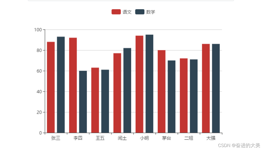
Legend: legend
legend is a legend, used to filter categories, and needs to be used in conjunction with series
- The data in legend is an array
- The value of data in legend needs to be consistent with the name value of a group of data in the series array
var option = {
    legend: {
        data: ['语文', '数学']
    },
    xAxis: {
        type: 'category',
        data: ['张三', '李四', '王五', '闰土', '小明', '茅台', '二妞', '大强']
    },
    yAxis: {
        type: 'value'
    },
    series: [
        {
            name: '语文',
            type: 'bar',
            data: [88, 92, 63, 77, 94, 80, 72, 86]
        },
         {
            name: '数学',
            type: 'bar',
            data: [93, 60, 61, 82, 95, 70, 71, 86]
        }
    ]
} 
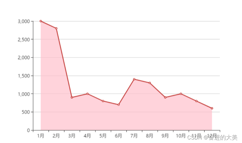
line chart:
It is similar to the implementation of the above histogram, except that the type in the series is set to line
Sample code:
<!DOCTYPE html>
<html lang="en">
<head>
    <meta charset="UTF-8">
    <meta http-equiv="X-UA-Compatible" content="IE=edge">
    <meta name="viewport" content="width=device-width, initial-scale=1.0">
    <title>Document</title>
    <script src="lib/echarts.min.js"></script>
</head>
<body>
    <div style="width: 600px;height:400px"></div>
    <script>
        var mCharts = echarts.init(document.querySelector('div'))
        var xDataArr = ['1月', '2月', '3月', '4月', '5月', '6月', '7月', '8月', '9月','10月', '11月', '12月']
        var yDataArr = [3000, 2800, 900, 1000, 800, 700, 1400, 1300, 900, 1000, 800,600]
        var option = {
            xAxis: {
                type: 'category',
                data: xDataArr
            },
            yAxis: {
                type: 'value'
            },
            series: [
                {
                    name: '语文',
                    type: 'line',
                    data: yDataArr
                }
            ]
        }
        mCharts.setOption(option)
    </script>
</body>

</html>
Show results:
Common effects of line charts:
mark
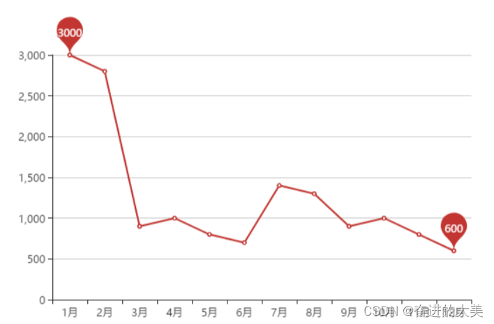
- Maximum/minimum markPoint
var option = {
    series: [
        {
            ......
            markPoint: {
                平均值 markLine
                data: [
                    {
                        type: 'max',
                        name: '最大值'
                    },
                    {
                        type: 'min',
                        name: '最小值'
                    }
                ]
            }
        }
    ]
}
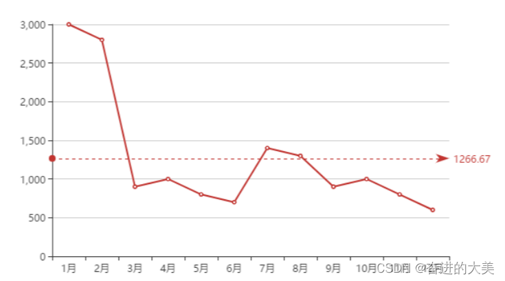
- mean markLine
var option = {
    series: [
        {
            ......
            markLine: {
                data: [
                    {
                        type: 'average',
                        name: '平均值'
                    }
                ]
            }
        }
    ]
}
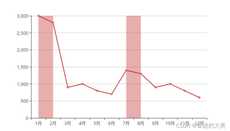
- Label interval markArea
var option = {
    series: [
        {
            ......
            markArea: {
                data: [
                    [
                        {
                            xAxis: '1月'
                        },
                        {
                            xAxis: '2月'
                        }
                    ],
                    [
                        {
                            xAxis: '7月'
                        },
                        {
                            xAxis: '8月'
                        }
                    ]
                ]
            }
        }
    ]
}
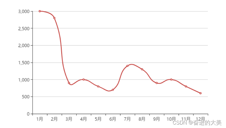
line control
- smooth lines smooth
var option = {
    series: [
        {
            ......
            smooth: true
        }
    ]
}
- style line lineStyle
var option = {
    series: [
        {
            ......
            smooth: true,
            lineStyle: {
                color: 'green',
                type: 'dashed' // 可选值还有 dotted solid
            }
        }
    ]
}

fill style areaStyle
var option = {
    series: [
        {
            type: 'line',
            data: yDataArr,
            areaStyle: {
                color: 'pink'
            }
        }
    ]
}
next to the edge boundaryGap
boundaryGap is set to the x-axis, so that the starting point starts from the 0 coordinate of the x-axis
var option = {
    xAxis: {
        type: 'category',
        data: xDataArr,
        boundaryGap: false
    }
}
Scale, out of 0 value scale
If the difference between each set of data is small and is much larger than 0, then this may happen
var xDataArr = ['1月', '2月', '3月', '4月', '5月', '6月', '7月', '8月', '9月','10月', '11月', '12月']
var yDataArr = [3005, 3003, 3001, 3002, 3009, 3007, 3003, 3001, 3005,3004, 3001, 3009] //此时y轴的数据都在3000附近, 每个数之间相差不多
var option = {
    xAxis: {
        type: 'category',
        data:  xDataArr
    },
    yAxis: {
        type: 'value'
    },
    series: [
        {
            type: 'line',
            data: yDataArr
        }
    ]
}
The effect is as follows:
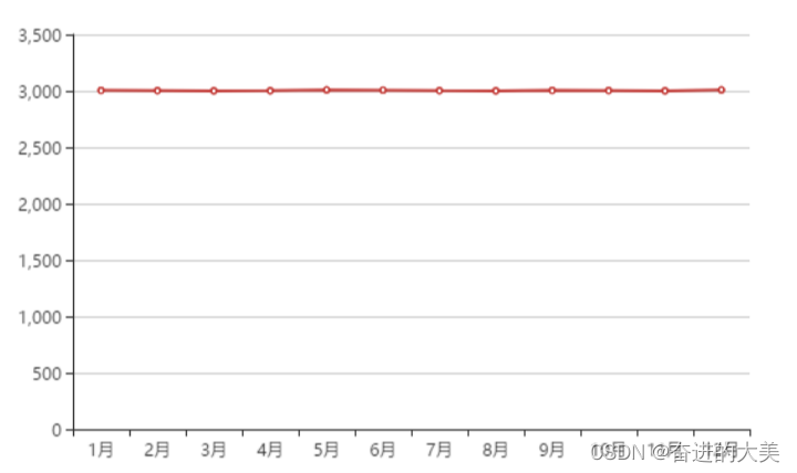
This is obviously not the effect we want, so we can configure the scale to get rid of the 0 value ratio
- scale configuration
scale should be configured for the y axis
var option = {
    yAxis: {
        type: 'value',
        scale: true
    }
}

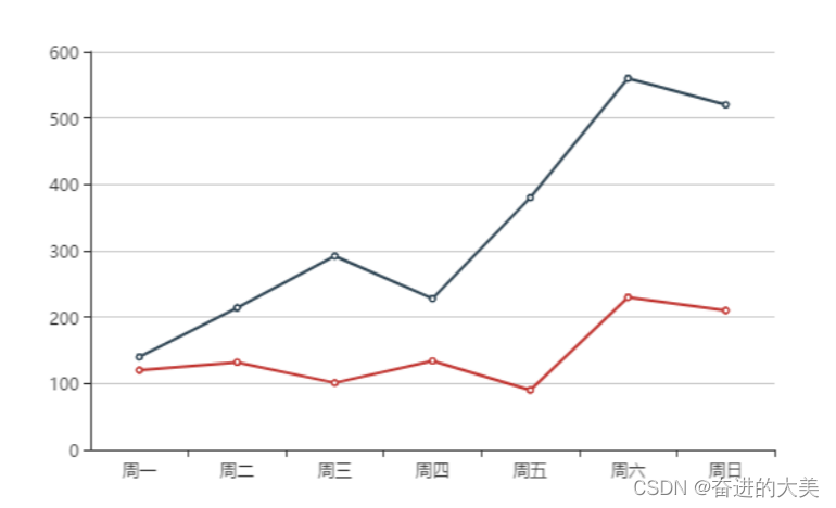
stacked chart
Stacked chart means that after the series on the same category axis are configured with the same stack value, the value of the latter series will be added to the value of the previous series
If there are two or more line charts in one chart, without using the stack configuration, the effect is as follows:
<script>
    var mCharts = echarts.init(document.querySelector("div"))
    var xDataArr = ['周一', '周二', '周三', '周四', '周五', '周六', '周日']
    var yDataArr1 = [120, 132, 101, 134, 90, 230, 210]
    var yDataArr2 = [20, 82, 191, 94, 290, 330, 310]
    var option = {
        xAxis: {
            type: 'category',
            data: xDataArr
        },
        yAxis: {
            type: 'value',
            scale: true
        },
        series: [
            {
                type: 'line',
                data: yDataArr1
            },
            {
                type: 'line',
                data: yDataArr2
            }
        ]
    }
    mCharts.setOption(option)
</script>
After using the stacked plot
var option = {
    series: [
        {
            type: 'line',
            data: yDataArr1,
            stack: 'all' // series中的每一个对象配置相同的stack值, 这个all可以任意写
        },
        {
            type: 'line',
            data: yDataArr2,
            stack: 'all' // series中的每一个对象配置相同的stack值, 这个all可以任意写
        }
    ]
}
The starting point of the y-axis of the blue line is no longer the y-axis, but the point corresponding to the red line. So it is equivalent to drawing blue on the basis of the red line. Stacking based on the previous chart
pie chart
- The data of the pie chart is an array formed by dictionaries consisting of name and value
- Pie charts do not need to configure xAxis and yAxis
sample code
<!DOCTYPE html>
<html lang="en">
<head>
    <meta charset="UTF-8">
    <meta http-equiv="X-UA-Compatible" content="IE=edge">
    <meta name="viewport" content="width=device-width, initial-scale=1.0">
    <title>Document</title>
    <script src="./lib/echarts.min.js"></script>
</head>
<body>
    <div class='container' style="width:600px; height:400px">
    </div>
    <script>
        var mCharts = echarts.init(document.querySelector('.container'))
        var pieData = [
            {
                value: 11231,
                name: "淘宝",
            },
            {
                value: 22673,
                name: "京东"
            },
            {
                value: 6123,
                name: "唯品会"
            },
            {
                value: 8989,
                name: "1号店"
            },
            {
                value: 6700,
                name: "聚美优品"
            }
        ]

        option = {
            series:{
                type:'pie',
                data:pieData
            }
        }
        mCharts.setOption(option)
    </script>
</body>
</html>
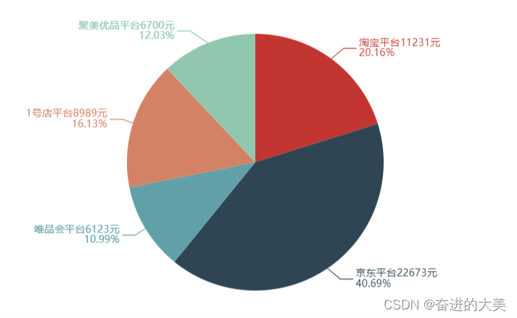
Common effects of pie charts:
-
display value
label.show : display text
label.formatter : formatted text
var option = {
    series: [
        {
            type: 'pie',
            data: pieData,
            label: {
                show: true,
                formatter: function (arg) {
                    return arg.data.name + '平台' + arg.data.value + '元\n' +
                    arg.percent + '%'
                }
            }
        }
    ]
}
-
selected effect
selectedMode: 'multiple' : Selected mode, indicating whether to support multiple selections, the default is off;
Boolean and string are supported, and the value of string can be 'single' and 'multiple', respectively indicating single or multiple selection
selectedOffset: 30 : the offset distance of the selected sector
var option = {
    series: [
        {
            type: 'pie',
            data: pieData,
            selectedMode: 'multiple',
            selectedOffset: 30
        }
    ]
}

-
ring
radius The radius of the pie chart.
Can be of the following types:
- number : Directly specify the outer radius value.
- string : For example, '20%' , indicating that the outer radius is 20% of the size of the viewable area (the smaller of the height and width of the container).
- Array.: The first item of the array is the inner radius, and the second item is the outer radius. Through Array, the pie chart can be set as a donut chart
var option = {
    series: [
        {
            type: 'pie',
            data: pieData,
            radius: ['50%', '70%']
        }
    ]
}

-
Nightingale Diagram:
The Nightingale diagram refers to the fact that the radius of each fan varies with the size of the data. The larger the value, the larger the radius of the fan
roseType:'radius'
var option = {
    series: [
        {
            type: 'pie',
            data: pieData,
            label: {
                show: true,
                formatter: function (arg) {
                    return arg.data.name + '平台' + arg.data.value + '元\n' +arg.percent +
                    '%'
                }
            },
            roseType: 'radius'
        }
    ]
}