Flexbox布局是由W3C在09年提出的在Web端取代CSS盒子模型的一种布局方式。
ReactNative实现了Flexbox布局的大部分功能。
Flexbox布局所使用的属性,基本可以分为两大类:
- 决定子组件排列规则的属性,例如:flexDirection , flexWrap, justifyContent, alignItems等。
- 决定自身的显示规则的属性,例如:alignSelf, flex等
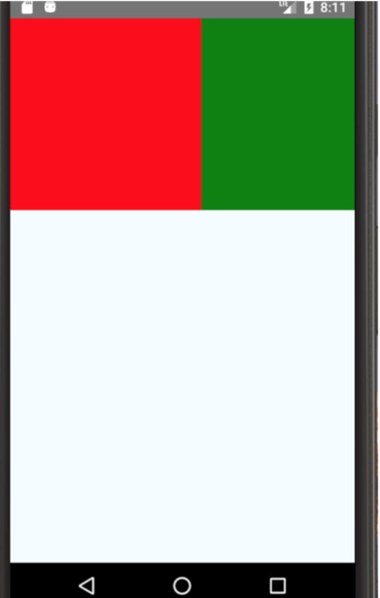
[1] flexDirection
设置子组件的排列顺序,默认column(纵向排列),其他row(横向排列)
代码:
type Props = {};
export default class App extends Component<Props> {
  render() {
    return (
      <View style={styles.container}>
          <View style={styles.view1}></View>
          <View style={styles.view2}></View>
      </View>
    );
  }
}

const styles = StyleSheet.create({
  container: {
    flex: 1,
    //justifyContent: 'center',
    //alignItems: 'center',
    flexDirection: 'row', //这里显式声明为row,将横向排列,否则默认纵向排列
    backgroundColor: '#F5FCFF',
  },
  welcome: {
    fontSize: 20,
    textAlign: 'center',
    margin: 10,
  },
  instructions: {
    textAlign: 'center',
    color: '#333333',
    marginBottom: 5,
  },
  view1: {
    height: 150,
    width: 150,
    backgroundColor: 'red'
  },
  view2: {
    height: 150,
    width: 150,
    backgroundColor: 'green'
  }
});
如图:

[2]flexWrap
设置是否换行,默认值nowrap(不换行),其他wrap
当我们将两个子View的宽换为200时,绿框将溢出屏幕,而只显示一半
  view1: {
    height: 200,
    width: 200,
    backgroundColor: 'red'
  },
  view2: {
    height: 200,
    width: 200,
    backgroundColor: 'green'
如图:
将container样式改为wrap, 溢出的绿框将会另起一行。

[3] justifyContent
justifyContent 属性表示该组件的子组件横向排列的其父容器的哪个位置。
取值有:flex-start, flex-end, center, space-between, space-around
  container: {
    flex: 1,
    //justifyContent: 'center',
    //alignItems: 'center',
    flexDirection: 'row',
    flexWrap: 'wrap',
    justifyContent: 'space-around', //修改的这一行
    backgroundColor: '#F5FCFF',
  },
flex-start:贴左
flex-end: 贴右
center: 子组件群横向居中
space-between:空白在子组件中间
space-around:空白在子组件周围(每个子组件的两边)
[4] alignItems
属性表示该组件的子组件纵向排列的其父容器的哪个位置。
取值:flex-start, flex-end, center, baseline, stretch
center: 子组件群父容器的纵向向居中
flex-start:贴父容器顶
flex-end: 贴父容器底
baseline:现象与flex-start一致(待补)
stretch: 现象与flex-start一致(待补)
[5] alignSelf
表明某个特定组件的排列情况
取值:flex-start, flex-end, center, stretch
center: 当前组件基于父组件的布局后进行居中(父布局时横向排列,则纵向居中;横向排列,则纵向居中)
flex-start:当前组件基于父组件的布局后进行贴左(同上)
flex-end:当前组件基于父组件的布局后进行贴右(同上)
[6] flex
flex属性可以让组件动态的去计算和配置自己所占用的空间大小,取值是数值
代码:
  container: {
    flex: 1, //这个父布局的flex必须要,它代表的是它在其父布局的比重,没有将是一片空白
    backgroundColor: '#F5FCFF',
  },
  welcome: {
    fontSize: 20,
    textAlign: 'center',
    margin: 10,
  },
  instructions: {
    textAlign: 'center',
    color: '#333333',
    marginBottom: 5,
  },
  view1: {
    flex: 1,
    backgroundColor: 'red'
  },
  view2: {
    flex: 1,
    backgroundColor: 'green'
  }
结果:

可以看出flex,类似与Android 的weight(比重),将父布局的子布局的flex元素取出对比来计算出其实际大小。
当将绿色组件的flex属性改为2时,绿组件占父布局的三分之二,可见flex越大,所占父布局的空间越大