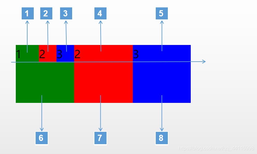
思路:
就是对其中图案的分解与拼装。
方案一:
分解成8个小块
实现
//index.wxml
<view class="section">
  <view class="section__title">flex-direction: row</view>
  <view class="flex-wrp" style="flex-direction:row;">
    <view class="flex-item bc_green1">1</view>
    <view class="flex-item bc_red2">2</view>
    <view class="flex-item bc_blue3">3</view>
    <view class="flex-item bc_red">2</view>
    <view class="flex-item bc_blue">3</view>
  </view>
   <view class="flex-wrp" style="flex-direction:row;">
    <view class="flex-item bc_green">1</view>
    <view class="flex-item bc_red3"></view>
    <view class="flex-item bc_blue4"></view>
  </view>
</view>
//index.wxss
@import "../lib/weui.wxss";

.page-section{
  margin-bottom: 20rpx;
}
.flex-wrp {display: flex;}
.bc_green1 {background: green;width:50px; height: 20px;}
.bc_red2 {background: red;width:25px; height: 20px;}
.bc_blue3 {background: blue;width:25px; height: 20px;}
.bc_red {background: red;width:100px; height: 20px;}
.bc_blue {background: blue;width:100px; height: 20px;}
.bc_red3 {background: red;width:100px; height: 80px;}
.bc_blue4 {background: blue;width:100px; height: 80px;}
.bc_green {background: green;width:100px; height: 80px;}
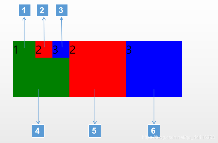
方案二:
只用六个方块拼接
实现
//index.wxml
<view class="section">
  <view class="section__title">flex-direction: row</view>
  <view class="flex-wrp" style="flex-direction:row;">
      <view class="flex-wrp" style="flex-direction:column;">
         <view class="flex-wrp" style="flex-direction:row;">
           <view class="flex-item bc_green">1</view>
           <view class="flex-item bc_red">2</view>
           <view class="flex-item bc_blue">3</view>
         </view>
        <view class="flex-item bc_green1">1</view>
      </view>
    <view class="flex-item bc_red1">2</view>
    <view class="flex-item bc_blue1">3</view>
  </view>
</view>
//index.wxss
@import "../lib/weui.wxss";

.page-section{
  margin-bottom: 20rpx;
}
.flex-wrp {display: flex;}
.bc_green {background: green;width:40px; height: 30px;}
.bc_red {background: red;width:30px; height: 30px;}
.bc_blue {background: blue;width:30px; height: 30px;}
.bc_green1 {background: green;width:100px; height: 70px;}
.bc_red1 {background: red;width:100px; height: 100px;}
.bc_blue1 {background: blue;width:100px; height: 100px;}
方案三
利用浮动
//index.wxml
<view class="section">
  <view class="section__title">flex-direction: row</view>
    <view class="flex-wrp" style="flex-direction:row;">
           <view class="flex-item bc_green">1
              <view class="flex-item bc_blue_float">3</view>
              <view class="flex-item bc_red_float">2</view>
           </view>
           <view class="flex-item bc_red1">2</view>
           <view class="flex-item bc_blue1">3</view>
    </view>
</view>
//index.wxss
@import "../lib/weui.wxss";

.page-section{
  margin-bottom: 20rpx;
}
.flex-wrp {display: flex;}
.bc_green {background: green;width:100px; height: 100px;}
.bc_red_float {background: red;width:30px; height: 30px;float:right;}
.bc_blue_float {background: blue;width:30px; height: 30px;float:right;}
.bc_red1 {background: red;width:100px; height: 100px;}
.bc_blue1 {background: blue;width:100px; height: 100px;}
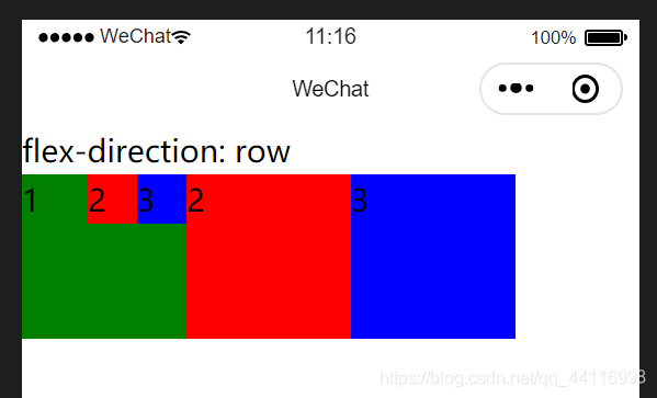
最终效果