之前我们在使用vue进行 h5 表单录入的过程中,遇到了Android软键盘弹出,覆盖 h5页面 输入框 问题,在此进行回顾并分享给大家:
系统:Android
条件:当输入框在可视区底部或者偏下的位置
触发条件:输入框获取焦点,弹出软键盘
表现:软键盘 覆盖 h5页面中的输入框
问题分析:
1.发现问题:当前页面中box为flex布局,内容为上下固定高,中间自适应(中间区域内容过多会出现滚动条,input框在wrapper的底部),input获取焦点,手机键盘弹出,input未上移到可视区内,怀疑是flex布局导致。
h5页面 测试代码如下:
<html lang="en">

   <head>      <meta name="viewport" content="width=device-width, initial-scale=1, maximum-scale=1">      <meta http-equiv="Content-type" content="text/html; charset=utf-8"/>        <style>            html,body{

               width:100%;

               height:100%;

               margin:0;

               padding:0;

           }            .box{

               display:flex;

               flex-direction:column;

               width:100%;

               height:100%;

           }            .header{

               height:50px;

               width:100%;

               background:#368CDA;

               text-align:center;

               line-height:50px;

               font-size:20px;

               color:#fff;

           }            .wrapper{

               flex:1;

               overflow:auto;

               width:100%;

           }            .content {

               margin:0;

               padding:0;

           }            .content li{

               margin:0;

               padding:0;

               list-style:none;

               height:150px;

               background:#FFCC99;

               text-align:center;

               line-height:150px;

               font-size:20px;

               color:#fff;

           }            .content li:nth-child(2n){

               background:#CC99CC
   }
                 .t-input{

               width:300px;

               height:50px;

               border:1px solid #FF0000;

           }            .footer{

               width:100%;

               height:48px;

               background: #368CDA;

               text-align:center;

               line-height:48px;

               font-size:18px;

               color:#fff;

           }
  </style>
  </head>
  <body>
        <div class="box">
 <div class="header">头部</div>
     <div class="wrapper">
 <ul class="content">
   <li>内容区</li>
   <li>内容区</li>
    <li>内容区</li>
   <li>内容区</li>
    <li>内容区</li>
   </ul>
  <input type="text" class="t-input" placeholder="输入框">
    </div>
  <div class="footer">保存</div>
      </div>
   </body>

</html>
2.修改布局:去除box中的flex布局,将wrapper、footer通过position:absolute的方式定位在页面中,发现input依旧不上移,判定与flex布局无关,代码修改如下:
<style>
  .box{ /*display:flex; flex-direction:column;*/
  width:100%;
  height:100%;
  position:relative;    }
  .wrapper{/*flex:1; */
  overflow:auto;
  width:100%;
  // 通过同时设置top、bototm,撑开wrapper,使之占屏幕除header和footer外的剩余高
  position:absolute;
  top:50px;
  bottom:48px;
}
.footer{ width:100%;        height:48px;        background: #368CDA;        text-align:center;        line-height:48px;        font-size:18px;        color:#fff;        position:absolute;        bottom:0;    }
</style>
3.真机模拟:进行真机与电脑连接调试,打开chrome的chrome://inspect,(如下图所示),发现键盘未弹出时html高度为512px,键盘弹出后html的高度为288px(减少区域的为软键盘区域),怀疑是否是因为html、body设置了height:100%的自适应布局后,高度跟随屏幕的可用高度改变而改变导致的。
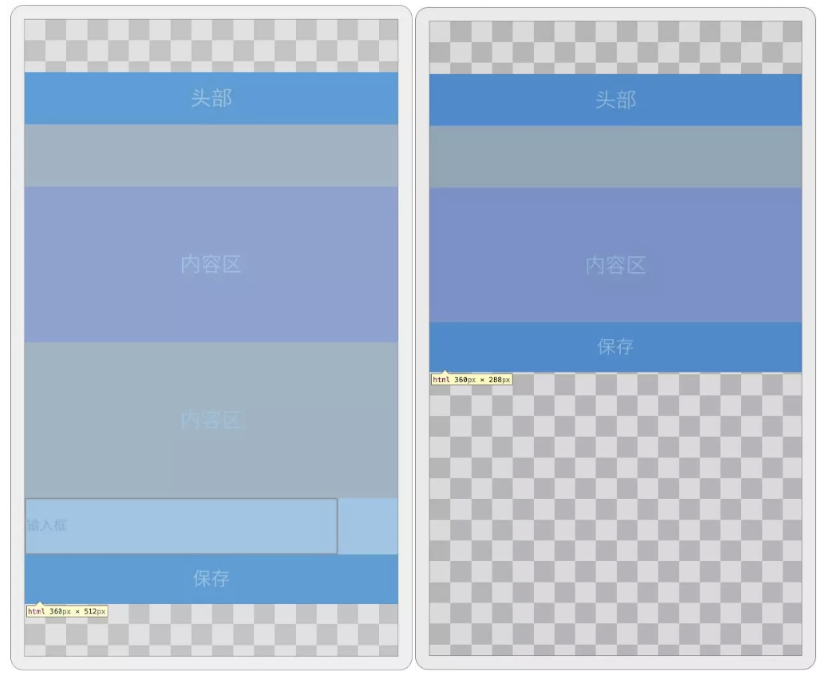
4.代码调试:去除body的height:100%,给body添加一个正好能让软键盘弹出后遮住输入框的高度,body高度 = 288(软键盘出现后html高度)+50(输入框高度)+48(保存按钮高度) ,发现键盘弹出遮挡着input后,input框会自动上移到可视区内,问题定位成功。
解决方案:
方案1 页面渲染完成后,通过JS动态获取屏幕可视区高度(注:屏幕旋转后,需重新获取屏幕高度并赋值),并将其赋值到body的height,这样body的高度一直都是屏幕的高度,当软键盘弹出后,会将body向上推(因为body有了固定高度,不会再继承html的自适应高度),使输入框置到可视区内,代码如下:
document.body.style.height = window.screen.availHeight +'px';
方案2 我们可以借助元素的 scrollIntoViewIfNeeded() 方法,这个方法执行后如果当前元素在可视区中不可见,则会滚动浏览器窗口或容器元素,最终让它可见,如果当前元素在可视区中,这个方法什么也不做,代码如下:
window.addEventListener('resize', () => {

   if (document.activeElement.tagName == 'INPUT') {

       //延迟出现是因为有些 Android 手机键盘出现的比较慢         window.setTimeout(() => {

           document.activeElement.scrollIntoViewIfNeeded();

    }, 100);

} });