基本实例
独的表单控件会被自动赋予一些全局样式。所有设置了 .form-control 类的
<input>、<textarea>和<select>元素都将被默认设置宽度属性为 width: 100%;。 将 label 元素和前面提到的控件包裹在 .form-group 中可以获得最好的排列。不要将表单组和组件中的输入框组混合使用不要将表单组直接和输入框组混合使用。建议将输入框组嵌套到表单组中使用。
<form>
  <div class="form-group">
    <label for="username">Username</label>
    <input type="text" class="form-control" id="username" placeholder="username">
  </div>
  <div class="form-group">
    <label for="exampleInputPassword1">Password</label>
    <input type="password" class="form-control" id="exampleInputPassword1" placeholder="Password">
  </div>
<form>
内联表单
1、为
<form>元素添加 .form-inline 类可使其内容左对齐并且表现为 inline-block 级别的控件。只适用视口(viewport)至少在 768px 宽度时(视口宽度再小的话就会使表单折叠)。
2、在 Bootstrap 中,输入框和单选/多选框控件默认被设置为 width: 100%; 宽度。在内联表单Bootstrap 将这些元素的宽度设置为 width: auto.
3、一定要添加 label 标签如果你没有为每个输入控件设置 label 标签,屏幕阅读器将无法正确识别。对于这些内联表单,你可以通过为 label 设置.sr-only类将其隐藏。还有一些辅助技术提供label标签的替代方案,比如 aria-label、aria-labelledby 或 title 属性。
<!--组件在同一行,label被隐藏-->
<form class="form-inline">
  <div class="form-group">
    <label class="sr-only" for="exampleInputEmail3">Email address</label>
    <input type="email" class="form-control" id="exampleInputEmail3" placeholder="Email">
  </div>
  <div class="form-group">
    <label class="sr-only" for="exampleInputPassword3">Password</label>
    <input type="password" class="form-control" id="exampleInputPassword3" placeholder="Password">
  </div>
<form>
水平排列的表单
通过为表单添加
.form-horizontal类,并联合使用 Bootstrap 预置的栅格类,可以将 label 标签和控件组水平并排布局。这样做将改变 .form-group 的行为,使其表现为栅格系统中的行(row),因此就无需再额外添加 .row 了。
<form class="form-horizontal">
	<div class="form-group">
	    <label for="inputEmail3" class="col-sm-2 control-label">Email</label><!--control-label的文本采用右对齐方式-->
	    <div class="col-sm-10">
	      <input type="email" class="form-control" id="inputEmail3" placeholder="Email">
	    </div>
	  </div>
	  <div class="form-group">
	    <label for="inputPassword3" class="col-sm-2 control-label">Password</label>
	    <div class="col-sm-10">
	      <input type="password" class="form-control" id="inputPassword3" placeholder="Password">
	    </div>
	</div>
<form>
静态控件
如果需要在表单中将一行纯文本和 label 元素放置于同一行,为
元素添加 .form-control-static 类即可。
<form class="form-horizontal">
  <div class="form-group">
    <label class="col-sm-2 control-label">Email</label>
    <div class="col-sm-10">
      <p class="form-control-static">[email protected]</p>
    </div>
  </div>
<form>
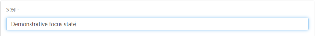
焦点状态
将某些表单控件的默认 outline 样式移除,然后对 :focus 状态赋予 box-shadow 属性。
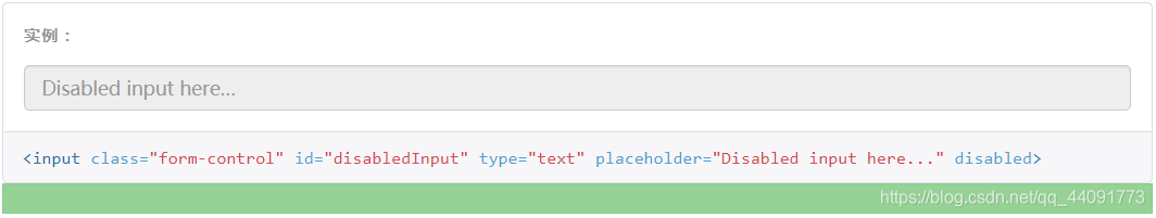
禁用状态
为输入框设置
disabled属性可以禁止其与用户有任何交互(焦点、输入等)。被禁用的输入框颜色更浅,并且还添加了 not-allowed 鼠标状态。
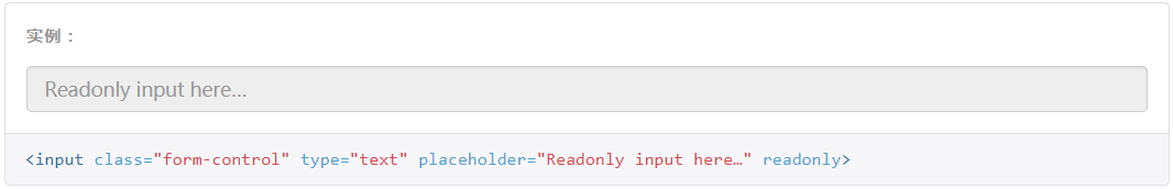
只读状态
为输入框设置
readonly属性可以禁止用户修改输入框中的内容。处于只读状态的输入框颜色更浅(就像被禁用的输入框一样),但是仍然保留标准的鼠标状态。
Help text
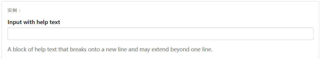
<label class="sr-only" for="inputHelpBlock">Input with help text</label>
<input type="text" id="inputHelpBlock" class="form-control" aria-describedby="helpBlock">
...
<span id="helpBlock" class="help-block">A block of help text that breaks onto a new line and may extend beyond one line.</span>
校验状态
Bootstrap 对表单控件的校验状态,如 error、warning 和 success 状态,都定义了样式。使用时,添加
.has-warning、.has-error或.has-success类到这些控件的父元素即可。任何包含在此元素之内的 .control-label、.form-control 和 .help-block 元素都将接受这些校验状态的样式。
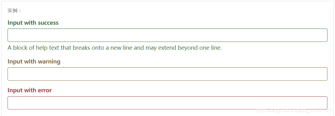
<div class="form-group has-success">
  <label class="control-label" for="inputSuccess1">Input with success</label>
  <input type="text" class="form-control" id="inputSuccess1" aria-describedby="helpBlock2">
  <span id="helpBlock2" class="help-block">A block of help text that breaks onto a new line and may extend beyond one line.</span>
</div>
添加额外的图标
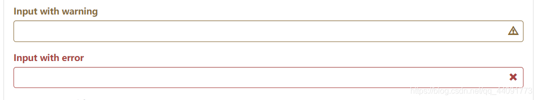
<div class="form-group has-success has-feedback">
  <label class="control-label" for="inputSuccess2">Input with success</label>
  <input type="text" class="form-control" id="inputSuccess2" aria-describedby="inputSuccess2Status">
  <span class="glyphicon glyphicon-ok form-control-feedback" aria-hidden="true"></span><!--form-control-feedback 会使图标镶嵌在右侧-->
  <span id="inputSuccess2Status" class="sr-only">(success)</span>
</div>
<!--其他类似-->
动态显示图标
如下图右侧的√
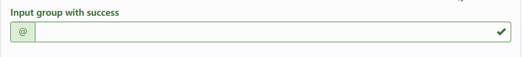
这里需要用到两个类.has-feedback 在父类使用用来控制显示,.form-control-feedback在元素中使用用来排列图标在右侧
<div class="form-group has-success has-feedback">
  <label class="control-label" for="inputGroupSuccess1">Input group with success</label>
  <div class="input-group">
    <span class="input-group-addon">@</span>
    <input type="text" class="form-control" id="inputGroupSuccess1" aria-describedby="inputGroupSuccess1Status">
  </div>
  <span class="glyphicon glyphicon-ok form-control-feedback" aria-hidden="true"></span>
  <span id="inputGroupSuccess1Status" class="sr-only">(success)</span>
</div>
控件尺寸
1、通过
.input-lg类似的类可以为控件设置高度,通过.col-lg-*类似的类可以为控件设置宽度。
2、水平排列的表单组的尺寸:通过添加.form-group-lg或.form-group-sm类,为.form-horizontal包裹的 label 元素和表单控件快速设置尺寸。
<form class="form-horizontal">
  <div class="form-group form-group-lg">
    <label class="col-sm-2 control-label" for="formGroupInputLarge">Large label</label>
    <div class="col-sm-10">
      <input class="form-control" type="text" id="formGroupInputLarge" placeholder="Large input">
    </div>
  </div>
