微信小程序开发学习笔记[4]
目录
五、swiper、swiper-item滑块容器视图的使用【组图轮播】
一、组件view的使用
view是视图容器,可以存放其他的标签。view是一个块级元素,一个占一行,与div类似。
<!--pages/view/view.wxml-->
<view class="main">
    <view class="item v1"></view>
    <view class="item v2"></view>
    <view class="item v3"></view>
</view>
/* pages/view/view.wxss */
.main{
width: 100%;
height: 1000rpx;
background-color: #EFEFFE
}
.item{
width: 200rpx;
height: 100px;
margin: 10rpx 10rpx;
}
.v1{
background-color: red;
}
.v2{
background-color: blue;
}
.v3{
background-color: yellow;
}
二、容器组件常用的布局属性
| 属性 | 属性说明 |
|---|---|
| flex-direction | 设置主轴方向,确定弹性子元素排列方式。row,row-reverse,column,column-reverse |
| flex-wrap | 当弹性子元素超出弹性容器范国时是否换行。nowrap,wrap,wrap-reverse |
| justify-content | 主轴上的对齐方式。flex-start[左对齐],flex-end,center,space-between,space-around |
| align-items | 侧轴上的对齐。flex-start,flex-end,center,baseline,stretch |
| align-content | 侧轴上有空白时且有多行时,侧轴的对齐方式。flex-start,flex-end,center,space-between,space-around,stretch |
弹性盒子:盒子中的内容会自动自适应大小排列放置。
如何将一个容器变成弹性盒子?只需在WXSS文件中添加 display:flex;添加display:flex后,默认主轴方向为row横向。
改变主轴方向:
/* pages/view/view.wxss */
.main{
    width: 100%;
    height: 1000rpx;
    background-color: #EFEFFE;
    /*设置为弹性盒子*/
    display:flex;
    /*改变主轴方向为垂直方向逆向*/
    flex-direction: column-reverse;
}
三、子元素属性
| 属性 | 属性说明 |
|---|---|
| order | 控制弹性容器里子元素的顺序 |
| flex-grow | 控制弹性子元素的扩展比率 |
| flex-shrink | 设置弹性子元素的收缩比率 |
| align-self | 允许独立的弹性子元素覆盖弹性容器的默认对齐设置(align-items) |
通过order属性修改子元素的顺序:
.v1{
    background-color: red;
    order:2;
}
.v2{
    background-color: blue;
    order: 1
}
.v3{
    background-color: yellow;
    order:3;
}通过flex-grow来扩展:比率即各自比重所占的权重
.v1{
    background-color: red;
    order:2;
    flex-grow: 1;
}
.v2{
    background-color: blue;
    flex-grow: 2;
    order: 1;
}
四、scroll-view的使用
| Attribute | Type | Default Value | Attribute Specification |
|---|---|---|---|
| scroll-x | Boolean | false | 允许横向滚动 |
| scroll-y | Boolean | false | 允许纵向滚动 |
| upper-threshold | Number | 50 | 距顶部/左边多远时(单位px),触发scrolltoupper事件 |
| lowwe-threshold | Number | 50 | 距底部/右边多远时(单位px),触发scrolltolower事件 |
| scroll-top | Number | 设置竖向滚动条位置 | |
| scroll-left | Number | 设置横向滚动条位置 | |
| scroll-into-view | String | 值应为某子元素id(id不能以数字开头)。设置哪个方向可滚动,则在哪个方向滚动到该元素 | |
| bindscrolltoupper | EventHandle | 滚动到顶部/左边,会触发scrolltoupper事件 | |
| bindscrolltolower | EventHandle | 滚动到顶部/左边,会触发scrolltolower事件 | |
| bindscroll | EventHandle | 滚动时触发,event.detail={scrollLeft,scrollTop,scrollHeight,scrolWidth,deltax,delta} |
请勿在scroll-view中使用textarea、map、canvas、video 组件。
scroll-into-view的优先级高于scroll-top
在滚动scroll-view时会阻止页面回弹,所以在scroll-view中滚动,是无法触发onPullDownRefresh
例子:垂直滚动
// pages/scrollview/scrollview.js
Page({

    /**
     * 页面的初始数据
     */
    data: {
        scrollTop:50
    },
    toUpper:function(){
        console.log ("toUpper is called....");
    },
    toLower:function(){
        console.log("toLower is called...");
    },
/* pages/scrollview/scrollview.wxss */
.main{
width: 100%;
height: 1000rpx;
background-color: #EFEFFE;
}
.item{
width: 400rpx;
height: 400px;
margin: 10rpx 10rpx;
}
.v1{
background-color: red;
}
.v2{
background-color: blue;
}
.v3{
background-color: yellow;
}<!--pages/scrollview/scrollview.wxml-->
<view class="main">
<scroll-view scroll-y="true" bindscrolltoupper="toUpper" bindscrolltolower="toLower" scroll-top="{{scrollTop}}" style="height:400rpx">
<view class="item v1"></view>
<view class="item v2"></view>
<view class="item v3"></view>
</scroll-view>
</view>例子2:通过点击按钮来控制
Page({

    data: {
        scrollTop:50
    },
    toUpper:function(){
        console.log ("toUpper is called....");
    },
    toLower:function(){
        console.log("toLower is called...");
    },
    setScollTop:function(){
        this.setData({scrollTop:this.data.scrollTop+200})
    },
<view>
<button bindtap="setScollTop">设置scroll-top属性</button>
</view>演示scroll-into-view:
<!--pages/scrollview/scrollview.wxml-->
<view class="main">
    <scroll-view scroll-y="true" bindscrolltoupper="toUpper" bindscrolltolower="toLower" scroll-top="{{scrollTop}}" style="height:400rpx" scroll-into-view="{{scrollIntoView}}">
    <view class="item v1" id="red"></view>
    <view class="item v2" id="green"></view>
    <view class="item v3" id="yellow"></view>
    </scroll-view>
</view>


<view>
    <button bindtap="setScrollIntoView">设置scroll-into-view</button>
</view>
// pages/scrollview/scrollview.js
var views=["red","green","yellow","red"]
Page({
/**
* 页面的初始数据
*/
data: {
scrollTop:50,
scrollIntoView:"red"
},
setScrollIntoView:function(){
for(var i=0;i<views.length;i++){
if(views[i] == this.data.scrollIntoView){
console.log(views[i]);
this.setData({
scrollIntoView:views[i+1]
})
break;
}
}
},
五、swiper、swiper-item滑块容器视图的使用【组图轮播】
| Attribute | Type | Default Value | Attribute Specification |
|---|---|---|---|
| indicator-dots | Boolean | false | 是否显示面板指示点 |
| autoplay | Boolean | false | 是否自动切换 |
| interval | Number | 5000 | 自动切换时间间隔 |
| duration | Number | 500 | 滑动动画时长 |
| vertical | Boolean | false | 滑动方向是否为纵向 |
| bindchange | EventHandle | current 改变时会触发 change事件,event.detail= {current:current,source:source} |
请勿在scroll-view中使用textarea、map、canvas、video组件
scroll-into-view的优先级高于scroll-top
在滚动scroll-view时会阻止页面回单,所以在scroll-view中滚动,是无法触发onPullDownRefresh
若要使用下拉刷新,请使用页面的滚动,而不是scroll-view,这样也能通过点击顶部状态栏回到页面顶部
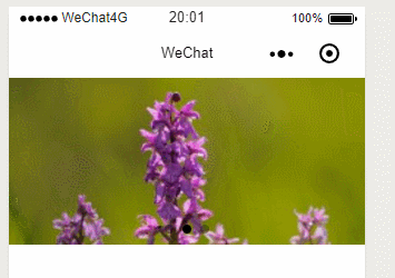
<!--pages/swiper/swiper.wxml-->
<swiper indicator-dots='{{indicatorDots}}' autoplay='{{autoplay}}' interval='{{interval}}' duration='{{duration}}' vertical='{{vertical}}'>
    <swiper-item>
        <image src="../../images/yueji.png"></image>
    </swiper-item>
    <swiper-item>
        <image src="../../images/ziluolan.png"></image>
    </swiper-item>
    <swiper-item>
        <image src="../../images/taohua.png"></image>
    </swiper-item>
</swiper>
// pages/swiper/swiper.js
Page({

    /**
     * 页面的初始数据
     */
    data: {
        indicatorDots:true,
        autoplay:true,
        interval:2000
    },
六、其他组件介绍
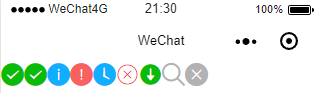
6.1、icon组件
| Attribute | Type | Default value | Attribute specication |
| type | String | icon的类型,有效值:success,success no circle,info,warn,waiting,cancel,download,search,clear | |
| size | Number | 23 | icon的大小,单位px |
| color | Color | icon的颜色同css的颜色 |
<!--pages/icon/icon.wxml-->
<!--使用循环将图表都读取出来 -->
<icon wx:for="{{types}}" type="{{item}}">

</icon>
// pages/icon/icon.js
Page({
data: {
types:["success","success no circle","info","warn","waiting","cancel","download","search","clear"]
},
6.2、text组件
text不是容器,这是与view的区别。
| Attribute | Type | Default Value | Attribute Specification |
|---|---|---|---|
| selectable | Boolean | false | 文本是否可选 |
| decode | Boolean | false | 是否解码 |
decode可以解析的有 ;<;>&:&apos;&ensp;&emsp;
除了文本节点以外的其他节点都无法长按选中。
<!--pages/text/text.wxml-->
<text selectable='true'>pages/text/text.wxml</text>
6.3、image组件
| Attribute | Type | Default Value | Attribute Specification |
|---|---|---|---|
| src | String | 图片资源地址 | |
| mode | String | scaleToFill | 图片剪切缩放模式 |
| binderror | HandEvent | 当错误发生时,发布到AppService的事件名,事件对象event.detail={errMsg:'something wrong} | |
| bindload | HandEvent | 当图片载入完毕时,发布到AppService的事件名,事件对象event.detail={height:'图片高度px',width:'图片宽度px} |
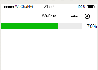
6.4、progress进度条
| Attribute | Type | Default Value | Attribute Specification |
|---|---|---|---|
| percent | Float | 0-100百分比 | |
| show-info | Boolean | false | 是否在进度条右侧显示百分比 |
| stroke-width | Number | 6 | 进度条的宽度,单位px |
| color | color | #09BB07 | 进度条颜色 |
| active | Boolean | false | 进度条从左往右的动画 |
| active-mode | String | backwards | backwards:动画从头播;forwards:动画从上次结束点接着播 |
<!--pages/progress/progress.wxml-->
<progress percent='70' show-info='true' stroke-width='17px' color='#09BB07' active='true' active-mode='backwards'></progress>