一.水平居中
1.单个元素水平居中
.box {
	display: flex;
	justify-content: center;   /*水平居中*/
}
2.多个h1元素水平居中
<!--html代码-->
<div class="box">
	<h1>flex弹性布局justify-content属性实现元素水平居中</h1>
	<h1>flex弹性布局justify-content属性实现元素水平居中</h1>
	<h1>flex弹性布局justify-content属性实现元素水平居中</h1>
</div>
css
.box {
display: flex;
justify-content: center;
width: 100%;
background: #0099cc
}
h1 {
font-size: 1rem;
padding: 1rem;
border: 1px dashed #FFF;
color: #FFF;
font-weight: normal;
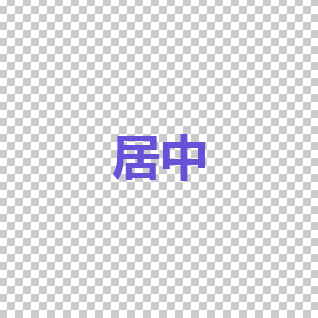
}效果图

二.垂直居中
1.单个h1标签垂直居中
.box {
	display: flex;
	align-items:center;   /*垂直居中*/
}
2.多个h1标签并排垂直居中
<!DOCTYPE html>
<html lang="en">
<head>
<meta charset="UTF-8">
<title>Document</title>
</head>
<style>
.box {
display: flex;
width: 980px;
height: 30rem;
align-items: center;
background: #6161d1
}
h1 {
font-size: 1rem;
padding: 1rem;
border: 1px dashed#FFF;
color: #FFF
}
</style>
<body>
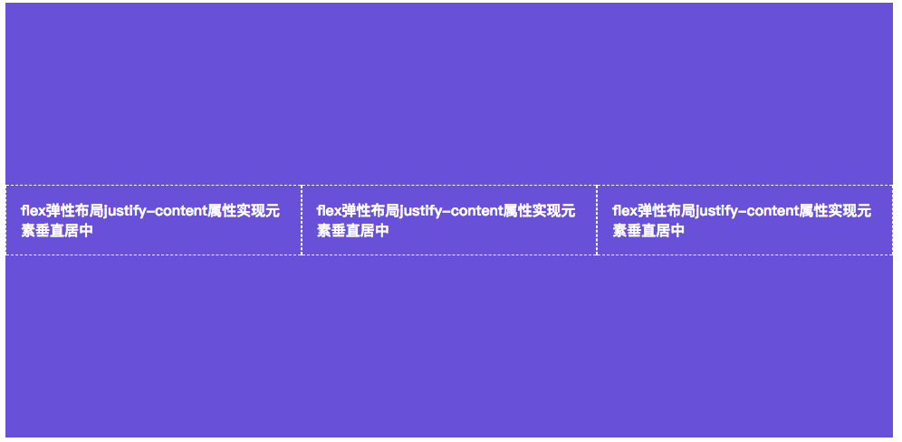
<div class="box">
<h1>flex弹性布局justify-content属性实现元素垂直居中</h1>
<h1>flex弹性布局justify-content属性实现元素垂直居中</h1>
<h1>flex弹性布局justify-content属性实现元素垂直居中</h1>
</div>
</body>
总结:
常用代码:
display: flex;
align-items: center;      /*垂直居中*/
justify-content:center;   /*水平居中*/