固定宽高div垂直居中方法
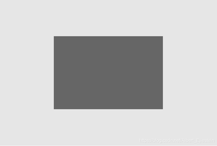
css:
<style>
  html *{
    margin: 0;
    padding: 0;
  }

  .fixed.father{
    position: relative;
    width: 600px;
    height: 400px;
    background-color: #e6e6e6;
  }

  .fixed .son{
    width: 300px;
    height: 200px;
    background-color: #666;

    position: absolute;
    top: 50%;
    left: 50%;
    margin-top: -100px;
    margin-left: -150px;
  }
</style>
html:
<body>
  <div class="fixed father">
    <div class="son"></div>
  </div>
</body>
不固定宽高div垂直居中方法
使用translate:子元素translate-translate没有设置高度,使用translateY在垂直高度居中,父元素设置text-align:center使子元素水平居中。
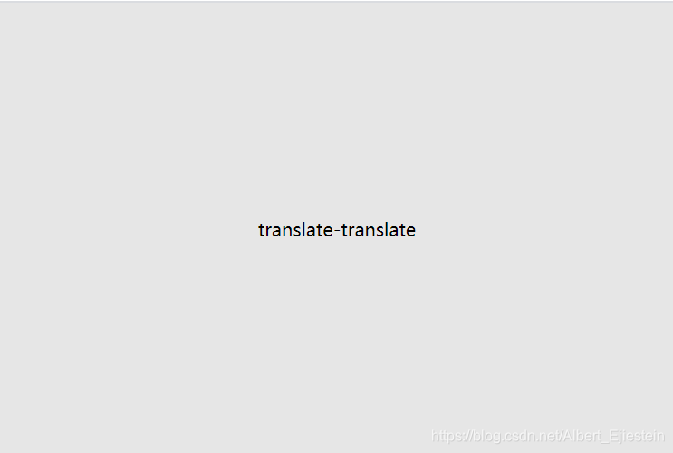
css:
.translate.father{
  width: 600px;
  height: 400px;
  background-color: #e6e6e6;
  text-align: center;
}

.translate.father div{
  position: relative;
  top: 50%;
  transform: translateY(-50%);
}
html:
<div class="translate father">
  <div>translate-translate</div>
</div>
使用flex布局:水平方向justify-content:center,垂直方向:align-item:center。但垂直方向需要设置高度为父元素高度。

css:
.flex.father{
  width: 600px;
  height: 400px;
  background-color: #e6e6e6;
}
.flex .son{
  height: 100%;
  display: flex;
  justify-content: center;
  align-items: center;
}
html:
<div class="flex father">
  <div class="son">flex布局</div>
</div>
使用position布局:设置子元素position为fixed或者absolute,left,right,top,bottom为0,然后margin:auto
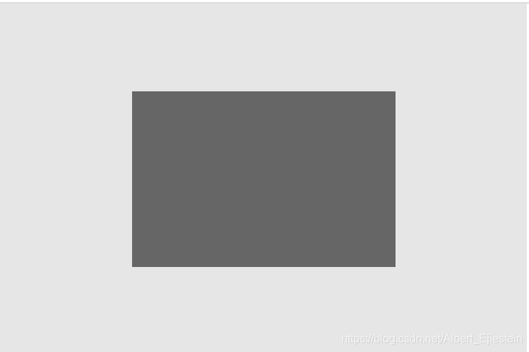
css:
.position.father{
  position: relative;
  width: 600px;
  height: 400px;
  background-color: #e6e6e6;
}

.position .son{
  position: absolute;
  left: 0;
  right: 0;
  top: 0;
  bottom: 0;
  width: 50%;
  height: 50%;
  margin: auto;
  background-color: #666;
}
html:
<div class="position father">
  <div class="son"></div>
</div>
background-color: #666;
}
html:
```html
<div class="position father">
  <div class="son"></div>
</div>
