Customization
Customizing your IMGUI Controls:自定义IMGUI控件
通过 GUIStyles微调你的控件的外观,比如字体的颜色,字体的大小等,当你创建一个控件时,如果你没有声明自己的GUIStyles,unity使用默认的style.
如果你有很多个GUIStyles,你可以使用 GUISkin. GUISkin只不过是一个GUIStyles.的集合
How Styles change the look of your GUI Controls
Control 定义内容 content, the Style定义外观 .这可以定义一个外观像Button的 Toggle
The difference between Skins and Styles:
skin和style的区别就是:GUISkins是GUIStyles的集合,Styles定义GUI控件的外观。如果您想使用Style,则不必使用Skin
Working with Styles
GUI Control 函数的最后一个参数用来给定义的 GUIStyle去显示控件的外观 Control. 如果这个参数没被传值2,unity使用默认的style,它通过传递控件类型的名字作为一个字符串值. 比如: GUI.Button() 使用 “button” , GUI.Toggle() 使用 “toggle” style, 您可以通过将其指定为最后一个参数来覆盖控件的默认GUIStyle。这样单独的修改是作为一个字符串,来覆盖原来的style,如果你想要自定义一个GUIstyle,需要传递的是GUIstyle变量的名字
// C#
using UnityEngine;
using System.Collections;
public class GUITest : MonoBehaviour {
void OnGUI () {
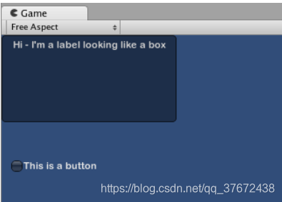
// Make a label that uses the "box" GUIStyle.
GUI.Label (new Rect (0,0,200,100), "Hi - I'm a label looking like a box", "box");
// Make a button that uses the "toggle" GUIStyle
GUI.Button (new Rect (10,140,180,20), "This is a button", "toggle");
}
} 
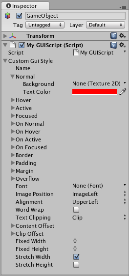
Making a public variable GUIStyle
当你声明一个共有的 GUIStyle 变量, 所有的 Style 将会在属性面板上显示出来 Inspector
// C#
using UnityEngine;
using System.Collections;

public class GUITest : MonoBehaviour {

    public GUIStyle customButton;

    void OnGUI ()
    {
        // Make a button. We pass in the GUIStyle defined above as the style to use
        GUI.Button (new Rect (10,10,150,20), "I am a Custom Button", customButton);
    }
}
Working with Skins
Creating a new GUISkin
To create a GUISkin, select Assets->Create->GUI Skin. 会创建一个GUIskin,并能够在属性面板上编辑它
Applying the skin to a GUI
// C#
using UnityEngine;
using System.Collections;

public class GUITest : MonoBehaviour {

    public GUISkin mySkin;

    void OnGUI () {
        // 声明要使用的skin
        GUI.skin = mySkin;

        // Make a button. This will get the default "button" style from the skin assigned to mySkin.
        GUI.Button (new Rect (10,10,150,20), "Skinned Button");
    }

}
通过 GUI.skin = null;放弃使用自定义skin,而是使用原生态skin
// C#
using UnityEngine;
using System.Collections;

public class GUITest : MonoBehaviour {

    public GUISkin mySkin;
    private bool toggle = true;

    void OnGUI () {
        // Assign the skin to be the one currently used.
        GUI.skin = mySkin;

        // Make a toggle. This will get the "button" style from the skin assigned to mySkin.
        toggle = GUI.Toggle (new Rect (10,10,150,20), toggle, "Skinned Button", "button");

        // Assign the currently skin to be Unity's default.
        GUI.skin = null;

        // Make a button. This will get the default "button" style from the built-in skin.
        GUI.Button (new Rect (10,35,150,20), "Built-in Button");
    }

}
Changing GUI Font Size
// C# example
using UnityEngine;

using System.Collections;

public class Fontsize : MonoBehaviour
{
    void OnGUI ()
    {
        //Set the GUIStyle style to be label
        GUIStyle style = GUI.skin.GetStyle ("label");

        //Set the style font size to increase and decrease over time
        style.fontSize = (int)(20.0f + 10.0f * Mathf.Sin (Time.time));

        //Create a label and display with the current settings
        GUI.Label (new Rect (10, 10, 200, 80), "Hello World!");
    }

}
上面所示的是动态修改原生态skin的lable字体大小,它是指定了一种控件,而不是应用到所有控件,当然,修改字体大小的方式有很多种
MGUI Layout Modes
Fixed Layout vs Automatic Layout
IMGUI system有两种布局方式: Fixed and Automati,固定布局和自动布局. GUI使用的是固定布局,就是你自己定义控件的大小,如果要使用 Automatic Layout, 通过 GUILayout 而不是 GUI 创建控件. 这两种布局方式可以在 OnGUI() 中同时使用.
固定布局是因为你知道内容的大小,所以能声明一个盛的下的布局,自动布局可以自动扩展,比如:如果你根据保存的游戏文件创建了许多不同的按钮,你并不知道到底会绘制多少个按钮。在这种情况下,自动布局可能更有意义。这取决于你的游戏设计以及你想如何呈现你的界面。
在使用时有两个关键的区别 Automatic Layout:
- GUILayout is used instead of GUI
- No Rect() function is required for Automatic Layout Controls
// C#
using UnityEngine;
using System.Collections;

public class GUITest : MonoBehaviour {

    void OnGUI () {
        // Fixed Layout
        GUI.Button (new Rect (25,25,100,30), "I am a Fixed Layout Button");

        // Automatic Layout
        GUILayout.Button ("I am an Automatic Layout Button");
    }

}
Arranging Controls
分组方式:. Fixed Layout固定布局中,使用Groups来打组. Automatic Layout自动布局中,使用Areas, Horizontal Groups, and Vertical Groups打组
Fixed Layout - Groups
固定布局下,使用 GUI.BeginGroup() and GUI.EndGroup() 来打组,. 所有在组内的控件,是一个整体,它们基于组的左上角排列,而不是屏幕的左上角,所以定义位置的时候是根据group的位置来定义,group位置点为0.0,如果你修改了组的位置,则所有组内的控件也会随之更改
例如,很容易在屏幕上集中多个控件
// C#
using UnityEngine;
using System.Collections;

public class GUITest : MonoBehaviour {

    void OnGUI () {
        // Make a group on the center of the screen
        GUI.BeginGroup (new Rect (Screen.width / 2 - 50, Screen.height / 2 - 50, 100, 100));
        // All rectangles are now adjusted to the group. (0,0) is the topleft corner of the group.

        //这里定义的位置是根据group的位置来的
        GUI.Box (new Rect (0,0,100,100), "Group is here");
        GUI.Button (new Rect (10,40,80,30), "Click me");

        // End the group we started above. This is very important to remember!
        GUI.EndGroup ();
    }

}
也可以嵌套group
// C#
using UnityEngine;
using System.Collections;

public class GUITest : MonoBehaviour {

    // background image that is 256 x 32
    public Texture2D bgImage;

    // foreground image that is 256 x 32
    public Texture2D fgImage;

    // a float between 0.0 and 1.0
    public float playerEnergy = 1.0f;

    void OnGUI () {
        // Create one Group to contain both images
        // Adjust the first 2 coordinates to place it somewhere else on-screen
        GUI.BeginGroup (new Rect (0,0,256,32));

        // Draw the background image
        GUI.Box (new Rect (0,0,256,32), bgImage);

            // Create a second Group which will be clipped
            // We want to clip the image and not scale it, which is why we need the second Group
            GUI.BeginGroup (new Rect (0,0,playerEnergy * 256, 32));

            // Draw the foreground image
            GUI.Box (new Rect (0,0,256,32), fgImage);

            // End both Groups
            GUI.EndGroup ();

        GUI.EndGroup ();
    }

}
Automatic Layout - Areas
Areas是自动布局里面的打组方法Automatic Layout,和固定布局里的Groups 很像 Fixed Layout Groups in functionality
Automatic Layout 不需要在屏幕上定义存放控件的区域. 控件会自动对其区域的左上角. 您还可以创建手动定位的区域。一个区域内的GUILayout控件将放置在该区域的左上角。在区域内部的控件,比如button,toggle会自拉伸宽度,适应区域的宽度
// C#
using UnityEngine;
using System.Collections;

public class GUITest : MonoBehaviour {

    void OnGUI () {
        GUILayout.Button ("I am not inside an Area");
        GUILayout.BeginArea (new Rect (Screen.width/2, Screen.height/2, 300, 300));
        GUILayout.Button ("I am completely inside an Area");
        GUILayout.EndArea ();
    }

}
Automatic Layout - Horizontal and Vertical Groups
当使用自动布局时,默认情况下,控件会从上到下依次出现。在很多情况下,您需要更好地控制控件的放置位置和它们的排列方式。如果使用自动布局模式,则可以选择水平和垂直组
通过GUILayout.BeginHorizontal(), GUILayout.EndHorizontal(), GUILayout.BeginVertical(), and GUILayout.EndVertical().
任何在 Horizontal Group 内部的控件,会水平放置.
// C#
using UnityEngine;
using System.Collections;

public class GUITest : MonoBehaviour {

    private float sliderValue = 1.0f;
    private float maxSliderValue = 10.0f;

    void OnGUI()
    {
        // Wrap everything in the designated GUI Area
        GUILayout.BeginArea (new Rect (0,0,200,60));

        // Begin the singular Horizontal Group
        GUILayout.BeginHorizontal();

        // Place a Button normally
        if (GUILayout.RepeatButton ("Increase max\nSlider Value"))
        {
            maxSliderValue += 3.0f * Time.deltaTime;
        }

        // Arrange two more Controls vertically beside the Button
        GUILayout.BeginVertical();
        GUILayout.Box("Slider Value: " + Mathf.Round(sliderValue));
        sliderValue = GUILayout.HorizontalSlider (sliderValue, 0.0f, maxSliderValue);

        // End the Groups and Area
        GUILayout.EndVertical();
        GUILayout.EndHorizontal();
        GUILayout.EndArea();
    }

}
Using GUILayoutOptions to define some controls
使用GUILayoutOptions重写自动布局的参数Automatic Layout parameters.
还记得在上面的区域示例中,按钮将其宽度扩展到100%的区域宽度吗?如果我们想的话,可以覆盖它。
// C#
using UnityEngine;
using System.Collections;

public class GUITest : MonoBehaviour {

    void OnGUI () {
        GUILayout.BeginArea (new Rect (100, 50, Screen.width-200, Screen.height-100));
        GUILayout.Button ("I am a regular Automatic Layout Button");
        GUILayout.Button ("My width has been overridden", GUILayout.Width (95));
        GUILayout.EndArea ();
    }

}
Extending IMGUI
有许多方法可以利用和扩展IMGUI系统来满足您的需求。可以混合和创建控件,并且您可以充分利用这些控件来决定如何处理GUI中的用户输入。
Compound Controls:绑定
如果你需要两个控件总是同时出现,比如一个slider,需要一个文字说明,表明该slider是用来干啥的. 你可以为每个 GUI.HorizontalSlider()添加一个GUI.Label() ,或者把这两个打成组,捆绑在一起Compound Control
// C#
using UnityEngine;
using System.Collections;

public class GUITest : MonoBehaviour {

    private float mySlider = 1.0f;

    void OnGUI () {
        mySlider = LabelSlider (new Rect (10, 100, 100, 20), mySlider, 5.0f, "Label text here");
    }

    float LabelSlider (Rect screenRect, float sliderValue, float sliderMaxValue, string labelText) {
        GUI.Label (screenRect, labelText);

        // <- Push the Slider to the end of the Label
        screenRect.x += screenRect.width;

        sliderValue = GUI.HorizontalSlider (screenRect, sliderValue, 0.0f, sliderMaxValue);
        return sliderValue;
    }

}
Static Compound Controls
Static,把方法声明称静态的,这样不同的脚本也可以调用
// C#
using UnityEngine;
using System.Collections;

public class CompoundControls : MonoBehaviour {

    public static float LabelSlider (Rect screenRect, float sliderValue, float sliderMaxValue, string labelText) {
        GUI.Label (screenRect, labelText);

        // <- Push the Slider to the end of the Label
        screenRect.x += screenRect.width;

        sliderValue = GUI.HorizontalSlider (screenRect, sliderValue, 0.0f, sliderMaxValue);
        return sliderValue;
    }

}
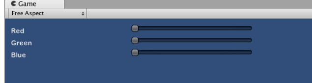
拓展:
// C#
using UnityEngine;
using System.Collections;

public class GUITest : MonoBehaviour {

    public Color myColor;

    void OnGUI () {
        myColor = RGBSlider (new Rect (10,10,200,10), myColor);
    }

    Color RGBSlider (Rect screenRect, Color rgb) {
        rgb.r = GUI.HorizontalSlider (screenRect, rgb.r, 0.0f, 1.0f);

        // <- Move the next control down a bit to avoid overlapping
        screenRect.y += 20;
        rgb.g = GUI.HorizontalSlider (screenRect, rgb.g, 0.0f, 1.0f);

        // <- Move the next control down a bit to avoid overlapping
        screenRect.y += 20;

        rgb.b = GUI.HorizontalSlider (screenRect, rgb.b, 0.0f, 1.0f);
        return rgb;
    }
}

// C#
using UnityEngine;
using System.Collections;

public class GUITest : MonoBehaviour {

    public Color myColor;

    void OnGUI () {
        myColor = RGBSlider (new Rect (10,10,200,30), myColor);
    }

    Color RGBSlider (Rect screenRect, Color rgb) {
        rgb.r = CompoundControls.LabelSlider (screenRect, rgb.r, 1.0f, "Red");

        // <- Move the next control down a bit to avoid overlapping
        screenRect.y += 20;
        rgb.g = CompoundControls.LabelSlider (screenRect, rgb.g, 1.0f, "Green");

        // <- Move the next control down a bit to avoid overlapping
        screenRect.y += 20;

        rgb.b = CompoundControls.LabelSlider (screenRect, rgb.b, 1.0f, "Blue");

        return rgb;
    }

}
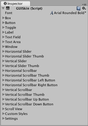
GUI Skin (IMGUI System)
GUISkins 是GUIStyles的集合
To create a GUISkin, select Assets->Create->GUI Skin from the menubar.
| Horizontal Slider Thumb | The Style to use for all Horizontal Slider Thumb Buttons |
| Vertical Slider | The Style to use for all Vertical Slider bars |
| Vertical Slider Thumb | The Style to use for all Vertical Slider Thumb Buttons |
| Horizontal Scrollbar | The Style to use for all Horizontal Scrollbars |
| Horizontal Scrollbar Thumb | The Style to use for all Horizontal Scrollbar Thumb Buttons |
| Horizontal Scrollbar Left Button | The Style to use for all Horizontal Scrollbar scroll Left Buttons |
| Horizontal Scrollbar Right Button | The Style to use for all Horizontal Scrollbar scroll Right Buttons |
| Vertical Scrollbar | The Style to use for all Vertical Scrollbars |
| Vertical Scrollbar Thumb | The Style to use for all Vertical Scrollbar Thumb Buttons |
| Vertical Scrollbar Up Button | The Style to use for all Vertical Scrollbar scroll Up Buttons |
| Vertical Scrollbar Down Button | The Style to use for all Vertical Scrollbar scroll Down Buttons |
| Custom 1–20 | Additional custom Styles that can be applied to any Control |
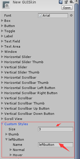
| Custom Styles | An array of additional custom Styles that can be applied to any Control |
| Settings | Additional Settings for the entire GUI |
| Double Click Selects Word | If enabled, double-clicking a word will select it |
| Triple Click Selects Line | If enabled, triple-clicking a word will select the entire line |
| Cursor Color | Color of the keyboard cursor |
| Cursor Flash Speed | The speed at which the text cursor will flash when editing any Text Control |
| Selection Color | Color of the selected area of Text |
Applying GUISkins
To apply a GUISkin to your GUI, you must use a simple script to read and apply the Skin to your Controls.
    // Create a public variable where we can assign the GUISkin
    var customSkin : GUISkin;

    // Apply the Skin in our OnGUI() function
    function OnGUI () {
        GUI.skin = customSkin;

        // Now create any Controls you like, and they will be displayed with the custom Skin
        GUILayout.Button ("I am a re-Skinned Button");

        // You can change or remove the skin for some Controls but not others
        GUI.skin = null;

        // Any Controls created here will use the default Skin and not the custom Skin
        GUILayout.Button ("This Button uses the default UnityGUI Skin");
    }
在某些情况下,您希望有两个具有不同样式的相同控件。因此,创建一个新皮肤并重新分配它是没有意义的。相反,在皮肤中使用一种自定义样式。为自定义样式提供一个名称,您可以将该名称用作单个控件的最后一个参数。
    // One of the custom Styles in this Skin has the name "MyCustomControl"
    var customSkin : GUISkin;

    function OnGUI () {
        GUI.skin = customSkin;

        // We provide the name of the Style we want to use as the last argument of the Control function
        GUILayout.Button ("I am a custom styled Button", "MyCustomControl");

        // We can also ignore the Custom Style, and use the Skin's default Button Style
        GUILayout.Button ("I am the Skin's Button Style");
    }
GUI Style (IMGUI System)
GUI Styles are a collection of custom attributes for use with UnityGUI. A single GUI Style defines the appearance of a single UnityGUI Control
.
A GUI Style in the Inspector
If you want to add style to more than one control, use a GUI Skin instead of a GUI Style. For more information about UnityGUI, please read the GUI Scripting Guide.
Please Note: This page refers to part of the IMGUI system, which is a scripting-only UI
system. Unity has a full GameObject-based UI system which you may prefer to use. It allows you to design and edit user interface elements as visible objects in the scene view
. See the UI System Manual for more information.
Properties
| Property: | Function: |
|---|---|
| Name | The text string that can be used to refer to this specific Style |
| Normal | Background image & Text Color of the Control in default state |
| Hover | Background image & Text Color when the mouse is positioned over the Control |
| Active | Background image & Text Color when the mouse is actively clicking the Control |
| Focused | Background image & Text Color when the Control has keyboard focus |
| On Normal | Background image & Text Color of the Control in enabled state |
| On Hover | Background image & Text Color when the mouse is positioned over the enabled Control |
| On Active | Properties when the mouse is actively clicking the enabled Control |
| On Focused | Background image & Text Color when the enabled Control has keyboard focus |
| Border | Number of pixels on each side of the Background image that are not affected by the scale of the Control’ shape |
| Padding | Space in pixels from each edge of the Control to the start of its contents. |
| Margin | The margins between elements rendered in this style and any other GUI Controls. |
| Overflow | Extra space to be added to the background image. |
| Font | The Font used for all text in this style |
| Image Position | The way the background image and text are combined. |
| Alignment | Standard text alignment options. |
| Word Wrap | If enabled, text that reaches the boundaries of the Control will wrap around to the next line |
| Text Clipping | If Word Wrap is enabled, choose how to handle text that exceeds the boundaries of the Control |
| Overflow | Any text that exceeds the Control boundaries will continue beyond the boundaries |
| Clip | Any text that exceeds the Control boundaries will be hidden |
| Content Offset | Number of pixels along X and Y axes that the Content will be displaced in addition to all other properties |
| X | Left/Right Offset |
| Y | Up/Down Offset |
| Fixed Width | Number of pixels for the width of the Control, which will override any provided Rect() value |
| Fixed Height | Number of pixels for the height of the Control, which will override any provided Rect() value |
| Stretch Width | If enabled, Controls using this style can be stretched horizontally for a better layout. |
| Stretch Height | If enabled, Controls using this style can be stretched vertically for a better layout. |
