一、前言
本文总结了css不定宽高水平垂直居中的5种方法,考虑到兼容性,用到css3的方法多用手机端,手机端ie可以不用考虑。
各方法原理我在代码里都有注释。
二、方法总结
html结构为:
其中添加textarea主要是为了演示子元素宽高变化时,能否保持居中。
  <div class="father">
      <div class="child">
          <textarea>子元素宽高不确定</textarea>
      </div>
  </div>
css实现方法分别是:
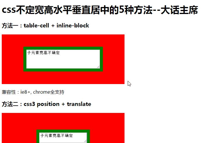
- 方法一:table-cell + inline-block
- 兼容性:ie8+, chrome全支持
- 方法二:css3 position + translate
- 兼容性:ie9+, chrome全支持
- 缺点:采用了绝对定位,子元素不能撑开父元素,正式使用要加各种前缀(-webkit-,-ms-等)
- 方法三:css3 box布局
- 兼容性:ie10+, chrome ?
- 缺点:兼容性较差,但比flex好,特别是是手机版,正式使用要加各种前缀(-webkit-,-ms-等)
- 方法四:css3 flex布局
- 兼容性:ie10+, chrome 21+
- 缺点:兼容性较差,是box的替代方案,正式使用要加各种前缀(-webkit-,-ms-等)
- 方法五:css3 grid布局
- 兼容性:ie不支持, chrome 52+
- 缺点:兼容性差,正式使用要加各种前缀(-webkit-,-ms-等)
三、效果
四、源码
<!DOCTYPE html>
<head>
    <meta charset="UTF-8">
    <title>与时俱进,css不定宽高垂直居中的5种方法</title>
</head>
<style>
/* 公用样色 */
.father{
    padding:10px;
    background-color:red;
}
.child{
    padding:10px;
    background-color:green;
}
textarea{
    vertical-align: top;
}
p{
    clear:both;
}

/* 方法一:table-cell + inline-block */
#demo1 .father{
    width:400px;
    height:150px;
    text-align: center; /*水平居中*/
    display: table-cell; /*垂直居中*/
    vertical-align: middle;
}
#demo1 .child{
    display: inline-block;
}

/* 方法二:css3 position + translate */
#demo2 .father{
    width:400px;
    height:150px;
    position: relative;
}
#demo2 .child{
    position: absolute;
    left:50%;
    top:50%;
    -webkit-transform:translate(-50%,-50%);
       -moz-transform:translate(-50%,-50%);
        -ms-transform:translate(-50%,-50%);
         -o-transform:translate(-50%,-50%);
            transform:translate(-50%,-50%); /* 使用-50%偏移方法居中 */
}

/* 方法三:css3 box布局 */
#demo3 .father{
    min-width:400px;
    min-height:150px;
    float: left; /* 使元素具有伸缩属性,子元素能撑开父元素 */

    display: -webkit-box;
    display: -moz-box;
    display: -ms-flexbox;
    display: box; /*box弹性布局*/
    -webkit-box-pack: center;
       -moz-box-pack: center;
        -ms-flex-pack: center;
            box-pack: center; /*水平居中*/
    -webkit-box-align: center;
       -moz-box-align: center;
        -ms-flex-align: center;
            box-align: center; /* 垂直居中*/
}

/* 方法四:css3 flex布局 */
#demo4 .father{
    min-width:400px;
    min-height:150px;
    float: left; /* 使元素具有伸缩属性,子元素能撑开父元素 */

    display: -webkit-flex;
    display: -moz-box;
    display: -ms-flexbox;
    display: flex; /*flex弹性布局*/
    -webkit-justify-content: center;
       -moz-box-pack: center;
        -ms-flex-pack: center;
            justify-content: center; /*主轴居中(这里相当于水平居中)*/
    -webkit-align-items: center;
       -moz-box-align: center;
        -ms-flex-align: center;
            align-items: center; /*子元素交叉轴居中*/
}

/* 方法五:css3 grid布局 */
#demo5 .father{
    min-width:400px;
    min-height:150px;
    float: left; /* 使元素具有伸缩属性,子元素能撑开父元素 */

    display:grid; /*grid网格布局*/
    -webkit-justify-content: center;
       -moz-box-pack: center;
        -ms-flex-pack: center;
            justify-content: center; /*主轴居中(这里相当于水平居中)*/
    -webkit-align-items: center;
       -moz-box-align: center;
        -ms-flex-align: center;
            align-items: center; /*子元素交叉轴居中*/
}
#demo5 .child{
    display: inline-block;
}

</style>
<body>

    <h3>方法一:table-cell + inline-block</h3>
    <div id="demo1">
        <div class="father">
            <div class="child">
                <textarea>子元素宽高不确定</textarea>
            </div>
        </div>
    </div>
    <p>
        兼容性:ie8+, chrome全支持
    </p>

    <h3>方法二:css3 position + translate</h3>
    <div id="demo2">
        <div class="father">
            <div class="child">
                <textarea>子元素宽高不确定</textarea>
            </div>
        </div>
    </div>
    <p>
        兼容性:ie9+, chrome全支持<br/>
        缺点:采用了绝对定位,子元素不能撑开父元素,正式使用要加各种前缀(-webkit-,-ms-等)
    </p>

    <h3>方法三:css3 box布局</h3>
    <div id="demo3">
        <div class="father">
            <div class="child">
                <textarea>子元素宽高不确定</textarea>
            </div>
        </div>
    </div>
    <p>
        兼容性:ie10+, chrome ?<br/>
        缺点:兼容性较差,但比flex好,特别是是手机版,正式使用要加各种前缀(-webkit-,-ms-等)
    </p>

    <h3>方法四:css3 flex布局</h3>
    <div id="demo4">
        <div class="father">
            <div class="child">
                <textarea>子元素宽高不确定</textarea>
            </div>
        </div>
    </div>
    <p>
        兼容性:ie10+, chrome 21+<br/>
        缺点:兼容性较差,是box的替代方案,正式使用要加各种前缀(-webkit-,-ms-等)
    </p>

    <h3>方法五:css3 grid布局</h3>
    <div id="demo5">
        <div class="father">
            <div class="child">
                <textarea>子元素宽高不确定</textarea>
            </div>
        </div>
    </div>
    <p>
        兼容性:ie不支持, chrome 52+<br/>
        缺点:兼容性差,正式使用要加各种前缀(-webkit-,-ms-等)
    </p>

</body>
</html>
