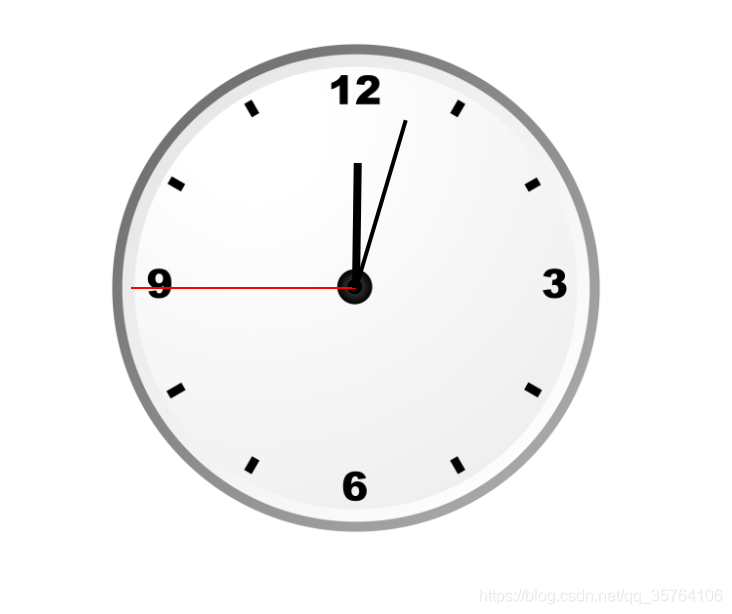
效果图
代码
<!DOCTYPE html>
<html lang="zh">
<head>
<meta charset="UTF-8">
<meta name="viewport" content="width=device-width, initial-scale=1.0">
<title>Document</title>
<style>
.clock {
width: 400px;
height: 400px;
border-radius: 50%;
margin: 0 auto;
margin-top: 100px;
position: relative;
background-image: url(./clock.png);
background-size: contain;
}
.sec-wrapper,
.min-wrapper,
.hour-wrapper {
position: absolute;
top: 0;
bottom: 0;
left: 0;
right: 0;
margin: auto;
}
.sec,
.min,
.hour {
position: absolute;
left: 0;
right: 0;
margin: auto;
}
.sec-wrapper {
width: 90%;
height: 90%;
animation: run 60s infinite steps(60);
}
.sec {
width: 2px;
height: 50%;
background-color: red;
}
.min-wrapper {
width: 70%;
height: 70%;
animation: run 3600s infinite;
}
.min {
width: 3px;
height: 50%;
background-color: black;
}
.hour-wrapper {
width: 50%;
height: 50%;
animation: run 43200s infinite;
}
.hour {
width: 6px;
height: 50%;
background-color: black;
}
@keyframes run {
from {
transform: rotateZ(0deg);
}
to {
transform: rotateZ(360deg);
}
}
</style>
</head>
<body>
<div class="clock">
<div class="sec-wrapper">
<div class="sec"></div>
</div>
<div class="min-wrapper">
<div class="min"></div>
</div>
<div class="hour-wrapper">
<div class="hour"></div>
</div>
</div>
</body>
</html>
