先放上一段我写的相关代码(可能有一定冗杂代码,请见谅)
<!DOCTYPE html>
<html lang="en">
<head>
<meta charset="UTF-8">
<meta name="viewport" content="width=device-width, initial-scale=1.0">
<title>Document</title>
<style>
body {
background: blue;
perspective: 600px;
transform-style: preserve-3d;
}
#main {
width: 400px;
height: 600px;
background-image: linear-gradient(to right, #457911 50%, green 50%);
background-size: 20px 20px;
margin: 20px auto;
overflow: hidden;
transition: 2s;
transform: rotateX(170deg);
position: relative;
}
#main .shang {
width: 380px;
height: 290px;
border: 1px white solid;
margin: 9px;
margin-bottom: 0px;
}
#main .xia {
width: 380px;
height: 290px;
border: 1px white solid;
margin: 9px;
margin-top: 0px;
}
#main .shang .box1 {
width: 190px;
height: 120px;
border: 1px white solid;
border-top: none;
margin: 0px auto;
}
#main .box1 .box2 {
width: 70px;
height: 50px;
border: 1px white solid;
border-top: none;
margin: 0px auto;
}
#main .crecle1 {
width: 70px;
height: 35px;
border: 1px white solid;
border-radius: 0px 0px 35px 35px;
border-top: none;
margin: 0px auto;
}
#main .crecle2 {
width: 70px;
height: 35px;
border: 1px white solid;
border-radius: 35px 35px 0px 0px;
border-bottom: none;
margin: 100px auto;
}
#main .xia .box3 {
width: 190px;
height: 120px;
border: 1px white solid;
border-bottom: none;
margin: 0px auto;
}
#main .xia .box4 {
width: 70px;
height: 50px;
border: 1px white solid;
border-bottom: none;
margin: 70px auto;
}
#main .crecle3 {
width: 70px;
height: 35px;
border: 1px white solid;
border-radius: 0px 0px 35px 35px;
border-top: none;
margin: 0px auto;
}
#main .crecle4 {
width: 70px;
height: 35px;
border: 1px white solid;
border-radius: 35px 35px 0px 0px;
border-bottom: none;
margin: 100px auto;
margin-bottom: 0px;
}
#main .meixi {
width: 50px;
height: 50px;
background: red;
position: absolute;
left: 100px;
top: 100px;
font-size: 24px;
color: white;
transform: translateY(-200px);
transition: 3s;
}
#main .qiandan {
width: 50px;
height: 50px;
background: green;
position: absolute;
left: 100px;
bottom: 100px;
font-size: 24px;
color: white;
transform: translatey(200px);
transition: 3s;
}
#main .dema {
width: 50px;
height: 50px;
background: pink;
position: absolute;
right: 100px;
top: 100px;
font-size: 24px;
color: white;
transform: translateX(200px);
transition: 3s;
}
#main .eyu {
width: 50px;
height: 50px;
background: yellow;
position: absolute;
right: 100px;
bottom: 100px;
font-size: 24px;
color: white;
transform: translateX(200px);
transition: 3s;
}
#main:hover {
transform: rotateX(0deg) rotateZ(90deg);
}
#main:hover .meixi {
transform: translateY(0px);
}
#main:hover .qiandan {
transform: translateY(0px);
}
#main:hover .dema {
transform: translateX(0px);
}
#main:hover .eyu {
transform: translateX(0px);
}
</style>
</head>
<body>
<div id="main">
<div class="shang">
<div class="box1">
<div class="box2"></div>
</div>
<div class="crecle1"></div>
<div class="crecle2"></div>
</div>
<div class="xia">
<div class="crecle3"></div>
<div class="crecle4"></div>
<div class="box3">
<div class="box4"></div>
</div>
</div>
<div class="meixi">梅西</div>
<div class="qiandan">乔丹</div>
<div class="dema">德玛</div>
<div class="eyu">鳄鱼</div>
</div>
</body>
</html>
加下来咋们再看下代码的效果图:
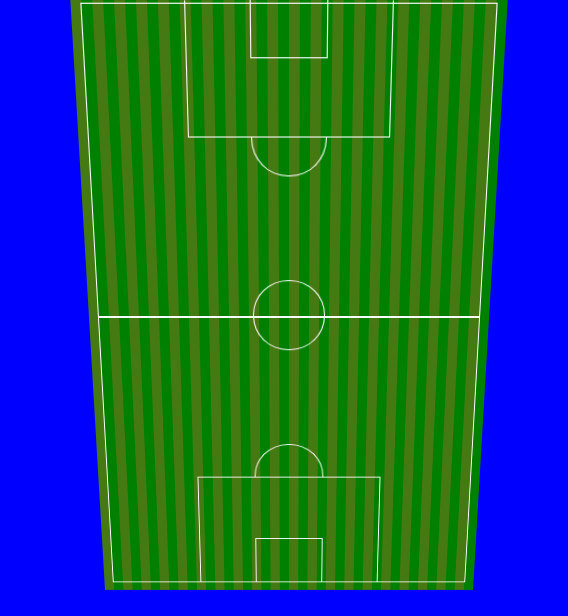
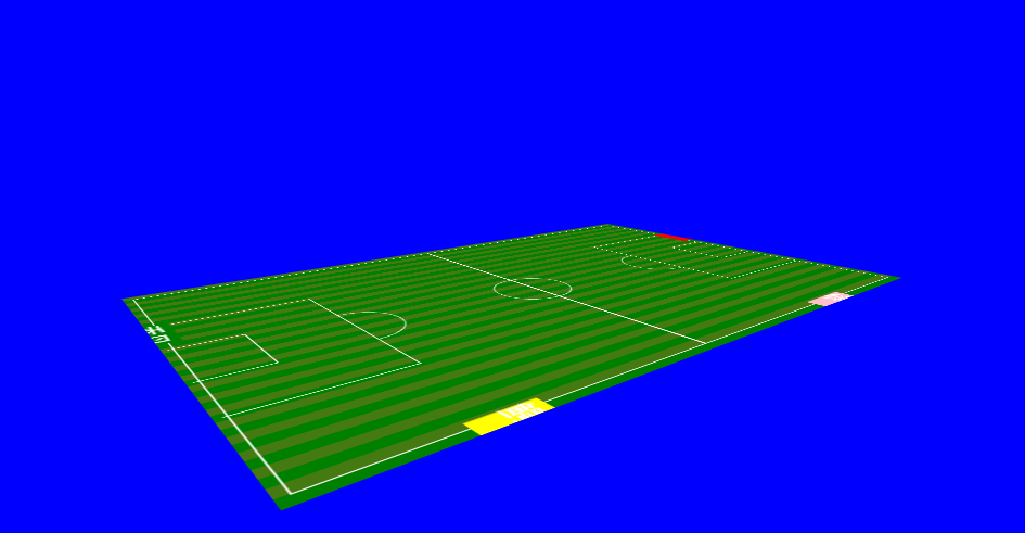
在逆战班的学习中,通过效果图,咋们可以看出,把鼠标放入图标可以实现一个足球场基于X轴的旋转变化,并且实现了2d效果到3d效果的转变
这其中应用到的比较重要的CSS 属性则是transform:rotateX(),这个属性是实现整个平面的一个旋转运动,另外需要扩展了解到的则是不止是这一个,还有transform:rotateY();transform:rotateZ(),分别是基于图片的Y轴和Z轴,这个设计到一个3d立体的XYZ轴的理解问题,相当于是一个几何的立体效果,需要一定的空间想象能力。另外一个要看到这个3d效果则是需要添加一个景深的属性
perspective:.. 后面跟的是具体的像素单位,是一个大远小近的问题,数据越大则是观看的距离越远,越近则是离图越近,这是一个相对的,相当于可以把这个属性理解为一个3d眼睛,他代替了你的观察视角,通过这个视角咋们在看到图片旋转得到的3d效果。另外一个则是
扩展:transform-style: preserve-3d;是一个3d的立体空间必须要添加到的,我的这代代码中不需要用到,因为他是没有厚度的,从这个角度来看的话,也是很好理解的,也就是说当你是一个立方体,比如一个正方体,旋转木马之类的,有一定宽高,还有厚度也就是位移的Z轴才需要添加到这个元素。
transform:translate代表的是一个平面或者物体的位移,有XYZ三个方向
transform:scale 代表的是一个平面或者物体的缩小放大增厚,分别是XYZ三个方向
transform:skew代表的是一个平面或者物体的斜切,有XYZ三个方向,也就是物体或者平面的倾斜问题
最后总结则是,需要结合后代选择器,:hover,通过鼠标的移入来实现一个具体的变化,当然也可以通过animation来实现,这些我下个博客来具体阐述animation的原理以及效果