图形初阶
创建和保存图形
plot(mtcars$wt, mtcars$mpg)
abline(lm(mtcars$mpg~mtcars$wt))
title("Regression of MPG on Weight")
保存为pdf
pdf("mygraph.pdf")
plot(mtcars$wt, mtcars$mpg)
abline(lm(mtcars$mpg~mtcars$wt))
title("Regression of MPG on Weight")
dev.off()
除了pdf()外,还可以使用函数png(), jpeg(), bmp(), tiff()等将图形保存为其他格式
创建新图形窗口
dev.new()


图形参数的修改
·一个例子
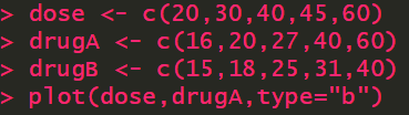
dose <- c(20,30,40,45,60)
drugA <- c(16,20,27,40,60)
drugB <- c(15,18,25,31,40)
plot(dose,drugA,type="b")
type="b" 表示画点图
修改图形参数的方法
①通过par()函数修改
②在绘图函数中直接设置
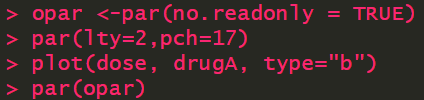
使用实心三角形和虚线绘图
opar <-par(no.readonly = TRUE)
par(lty=2,pch=17)
plot(dose, drugA, type="b")
par(opar)
plot(dose, drugA, type="b", lty=2, pch=17)
符号和线条参数
颜色参数
n <-10
mycolors <-rainbow(n)
pie(rep(1,n), labels=mycolors, col=mycolors)
指定文本属性参数
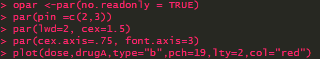
图形尺寸与边界尺寸参数
opar <-par(no.readonly = TRUE)
par(pin =c(2,3))
par(lwd=2, cex=1.5)
par(cex.axis=.75, font.axis=3)
plot(dose,drugA,type="b",pch=19,lty=2,col="red")


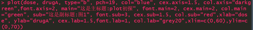
设置坐标轴和文本标注
plot(dose, drugA, type="b", pch=19, col="blue",
     cex.axis=1.5, col.axis="darkgreen",font.axis=2,
     main="这是主标题:plot初探", font.main=2, cex.main=2, col.main="green",
     sub="这是副标题:图1", font.sub=3, cex.sub=1.5, col.sub="red",
     xlab="dose", ylab="drugA", cex.lab=1.5,font.lab=1,col.lab="grey20",
     xlim=c(0,60),ylim=c(0,70))
添加次刻度线
添加参考线
plot(dose, drugA, type="b")
abline(h=c(40), v=c(40), lty=2, col="blue")
添加图例
opar <-par(no.readonly = TRUE)
par(lwd=2, cex=1.5, font.lab=2)
plot(dose, drugA, type="b", pch=15, lty=1, col="red", ylim=c(0,60), main="DrugA vs. DrugB", xlab="Drug dosage", ylab="Drug response")
abline(h=c(30), lwd=1.5, lty=2, col="gray")
library(Hmisc)
minor.tick(nx=3, ny=3, tick.ration=0.5)
minor.tick(nx=3, ny=3, tick.ratio=0.5)
lines(dose,drugB, type="b", pch=17, col="blue", lty=2)
legend("topleft", inset=.05, title="Drug Type", c("A","B"),lty=c(1,2), pch=c(15,17), col=c("red","blue"))
par(opar)
文本标注
plot(mtcars$wt, mtcars$mpg, main="Mileage vs. Car Weight", xlab="Weight", ylab="Mileage", pch=18, col="blue")
text(mtcars$wt, mtcars$mpg, row.names(mtcars), cex=0.6, pos=4, col="red")


图形的组合
opar <-par(no.readonly = TRUE)
par(mfrow=c(2,2))
plot(mtcars$wt, mtcars$mpg, main="Scatterplot of WT vs MPG")
plot(mtcars$wt, mtcars$disp, main="Scatterplot of wt vs disp")
hist(mtcars$wt, main="Histogram of wt")
boxplot(mtcars$wt, main="Boxplot of wt")
par(opar)
layout(matrix(c(1,1,2,3),2,2,byrow=T))
hist(mtcars$wt)
hist(mtcars$mpg)
hist(mtcars$disp)
layout(matrix(c(1,1,2,3),2,2,byrow=T),widths=c(3,1),heights=c(1,2))
hist(mtcars$wt)
hist(mtcars$mpg)
hist(mtcars$disp)


数据管理
创建数据框示例
#创建leadership数据框
manager <-c(1,2,3,4,5)
data <-c("10/24/08","10/28/08","10/1/08","10/12/08","5/1/09")
country <-c("US","US","UK","UK", "UK")
gender <-c("M","F","F","M","F")
age <-c(32,45,25,39,39)
q1 <-c(5,3,3,3,2)
q2 <-c(4,5,5,3,2)
q3 <-c(5,2,5,4,1)
q4 <-c(5,5,2,NA,2)
q5 <-c(5,5,2,NA,1)
leadership <-data.frame(manager,data,country,gender,age,q1,q2,q3,q4,q5,stringAsFactor = FALSE)
变量
在数据框中创建新的变量
#method1
mydata<-data.frame(x1=c(2,2,6,4),x2=c(3,4,2,8))
mydata$sumx<-mydata$x1+mydata$x2
mydata$meanx<-(mydata$x1+mydata$x2)/2
#method2
attach(mydata)
mydata$sumx<-x1+x2
mydata$meanx<-(x1+x2)/2
#method3
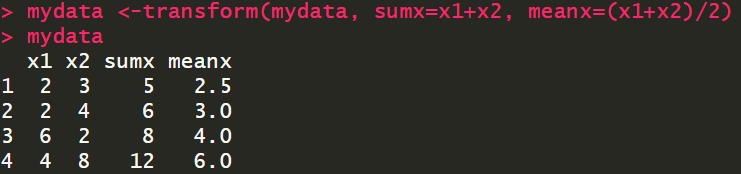
mydata <-transform(mydata, sumx=x1+x2, meanx=(x1+x2)/2)
变量的重编码
leadership$age[leadership$age==99]<-NA
leadership$agecat[leadership$age>75]<-"Elder"
leadership$agecat[leadership$age>=55 & leadership$age<=75]<-"Middle Aged"
leadership$agecat[leadership$age<55]<-"Young"
更为紧凑的代码形式
leadership <-within(leadership,{
                     agecat<-NA
                     agecat[age>75]<-"Elder"
                     agecat[age>=55 & age<=75]<-"Middle Aged"
                     agecat[age<55]<-"Young"})
变量重命名
缺失值
is.na(leadership[,6:10])
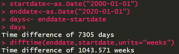
日期值


数据排序
数据集的合并
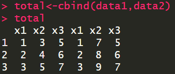
data1<-data.frame(x1=c(1,2,3),x2=c(3,4,5),x3=c(5,6,7))
data2<-data.frame(x1=c(1,2,3),x2=c(7,8,9),x3=c(5,6,7))
total<-merge(data1,data2,by="x3")
数据集取子集——剔除变量
myvars<-names(leadership)%in%c("q3","q4")
newdata<-leadership[!myvars]
数据集取子集-选入观测
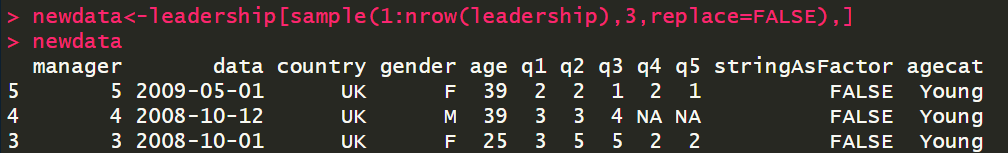
随机抽样
newdata<-leadership[sample(1:nrow(leadership),3,replace=FALSE),]
使用SQL语句操作数据框
library(sqldf)
newdf <- sqldf("select * from mtcars where carb=1 order by mpg", row.names=TRUE)