from openpyxl import Workbook
from openpyxl.chart import(
AreaChart,
Reference,
Series,
)
wb = Workbook()
ws = wb.active
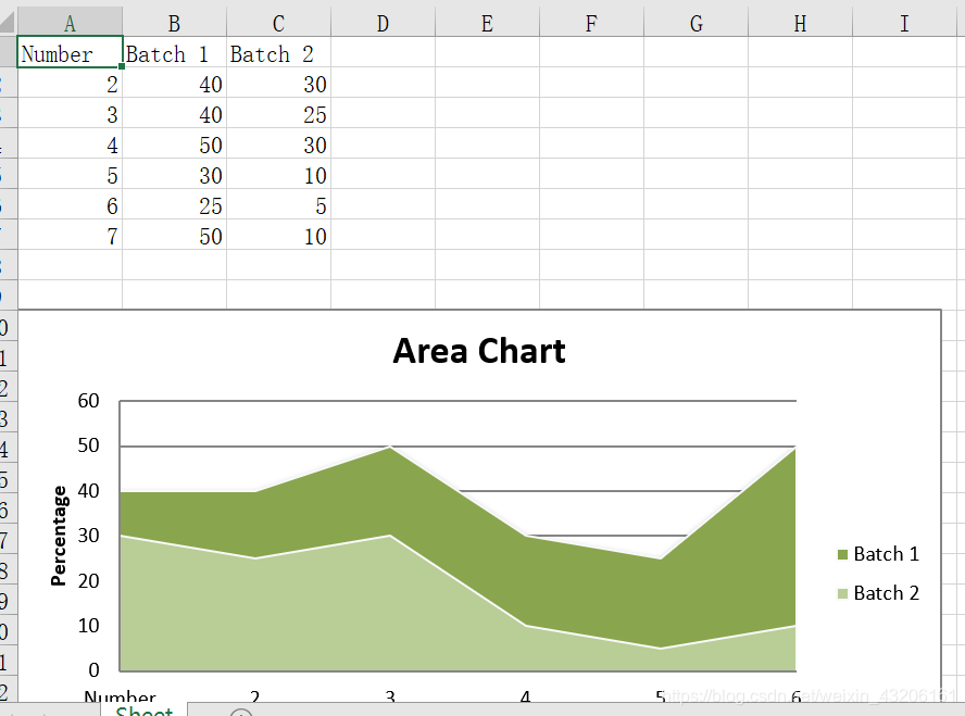
rows = [
['Number','Batch 1','Batch 2'],
[2, 40, 30],
[3, 40, 25],
[4, 50, 30],
[5, 30, 10],
[6, 25, 5],
[7, 50, 10],
]
for row in rows:
ws.append(row)
chart = AreaChart()
chart.title = "Area Chart"
chart.style = 13
chart.x_axis.title = 'Test'
chart.y_axis.title = 'Percentage'
cats = Reference(ws, min_col=1, min_row=1, max_row=7)
data = Reference(ws, min_col=2, min_row=1,max_col=3, max_row=7)
chart.add_data(data,titles_from_data=True)
chart.set_categories(cats)
ws.add_chart(chart,"A10")
wb.save("area.xlsx")
https://blog.csdn.net/weixin_43206161
