效果图:
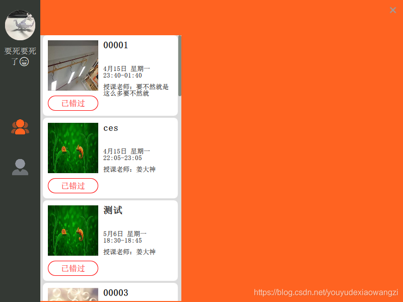
左侧的导航栏和右上角的关闭按钮只是普通的样式,中间的列表就是ListView,
https://doc.qt.io/qt-5/qml-qtquick-listview.html
CourseItem.qml 列表的每个item的显示
import QtQuick 2.0
import QtQuick.Layouts 1.1

Item{
    id:delegateItem
    property var courseInfo: null
    signal enterClicked(var param);//生命signal,父组件才能响应

    height: 164
    Rectangle{
        width: courseList.width
        height: 160
        x:0
        y:2
        color: delegateItem.ListView.isCurrentItem?"#e7e7ee":"#ffffff"
        radius: 8

        MouseArea {
            anchors.fill: parent// enterButton.y后面的mouseArea会覆盖前面的mouseArea,所以全覆盖的mousearea不能放到最后写
            onClicked:{
                delegateItem.ListView.view.currentIndex = index
            }
        }

        Image{
            id:teacherProfile
            x:10
            y:10
            width: 100
            height: 100
            source: courseInfo.teacher_profile
        }

        Text {
            id:courseContent
            text: courseInfo.course_content
            wrapMode: Text.WordWrap
            font.pointSize: 14
            font.bold: true
            width: parent.width - teacherProfile.width - 30
            height: 40
            x:teacherProfile.x + teacherProfile.width + 10
            y:10
        }
        Text {
            id:stateInfo
            text: courseInfo.state_info
            wrapMode: Text.WordWrap
            font.pointSize: 10
            width: parent.width - teacherProfile.width - 30
            x:teacherProfile.x + teacherProfile.width + 10
            y:courseContent.y + courseContent.height + 10
        }
        Text {
            id:teacherInfo
            text: courseInfo.teacher_info
            wrapMode: Text.WordWrap
            font.pointSize: 10
            width: parent.width - teacherProfile.width - 30
            x:teacherProfile.x + teacherProfile.width + 10
            y:stateInfo.y + stateInfo.height + 10
        }
        Rectangle{
            id: enterButton
            property color buttonColor: "#666666"
            x:10
            y:120
            width: 100
            height: 30
            radius: height
            border.color: buttonColor

            Text {
                anchors.centerIn: parent
                id: enter
                text: qsTr("进入课堂")
                font.pointSize: 12
                color: parent.buttonColor
            }
            MouseArea{
                id:enterButtonArea
                anchors.fill: parent
                hoverEnabled: true
                cursorShape:Qt.PointingHandCursor

                onClicked: {
                    emit: enterClicked(courseInfo.course_schedule_id) //触发事件
                    console.log('item clicked')
                }
            }
        }
    }
    Component.onCompleted: {
        if(4 == courseInfo.course_schedule_status){
            enter.text = "已结束"
        }else if(16 == courseInfo.course_schedule_status){
            enterButtonArea.cursorShape = Qt.ArrowCursor
            enterButton.buttonColor = "red"
            enter.text = "已错过"
        } else if (1 == courseInfo.live_valid){
        }
    }
}// end item
VScrollBar.qml 列表的垂直滚动条
import QtQuick 2.0

Rectangle {
    property var theList: null

    id: scrollbar
    height: parent.height
    x: parent.width - width;
    y:0
    radius: width
    clip:true
    // 按钮
    Rectangle {
        id: button
        x: 0
        y: theList.visibleArea.yPosition * scrollbar.height
        width: parent.width
        height: theList.visibleArea.heightRatio * scrollbar.height;
        color: "#818b81"
        radius: width
        clip: true
        // 鼠标区域
        MouseArea {
            id: mouseArea
            anchors.fill: button
            drag.target: button
            drag.axis: Drag.YAxis
            drag.minimumY: 0
            drag.maximumY: scrollbar.height - button.height
            // 拖动
            onMouseYChanged: {
                theList.contentY = button.y / scrollbar.height * theList.contentHeight
            }
        }
    }

}
listView 列表
    Rectangle{
        width: 280
        height: parent.height - 72
        x:navigatorWidth
        y:70
        color: "#dcdcdc"

        ListView{
            id:courseList
            x:5
            y:0
            width: parent.width - x - scrollBar.width - 2
            height: parent.height
            model: json_course    //一个字符串解析成的json对象,对象中的数组赋值给ListView的model
            highlightFollowsCurrentItem: true
            highlight: highLight
            clip: true
            focus: true

            Component.onCompleted: {
                console.log('course model completed')
            }
            delegate: Component{
                CourseItem{ //首字母大写,直接使用另一个qml文件的名字当组件
                    courseInfo:json_course[index]
                    onEnterClicked: { //响应子组件中的emit触发的signal
                        console.log('click response')
                    }
                }
            }//end delegate
        }//end listview
        // 滚动条
        VScrollBar {
            id:scrollBar
            theList:courseList
            width:6
            color:parent.color
        }//end scroll bar
    }
简介:
1.数据来源:
本来以为注册自定义的继承自QObject的class就可以直接用,结果好像还有点麻烦,无意json可以像js语法一样直接使用,正好数据来自后台,后台返回的又是json格式的数据,于是就直接拿来用了。如果没有测试数据,可以自己写点测试一下
扫描二维码关注公众号,回复:
9186287 查看本文章

json_course = JSON.parse("[{\"name\":\"Joy33333\",\"age\":30},{\"name\":\"James33333\",\"age\":36}]")2.选中行:
QListWidget中有很多默认效果,比如点击后高亮,而listview中所有item都是默认的,需要自己实现当前行的设置delegateItem.ListView.view.currentIndex = index3.滚动条,虽然qml中的listview支持滚动,甚至支持拉拽,但是桌面程序用惯了,滚动的时候没有滚动条也怪怪的,于是自能自己实现滚动条的显示了,
4.滚动时item越界,或者显示到一半就不见了
clip:true,和QListWidget一样
5.使用了子组件后,发现父组件qml文件中的修改不能马上生效
解决方法1:去掉勾选shadow build
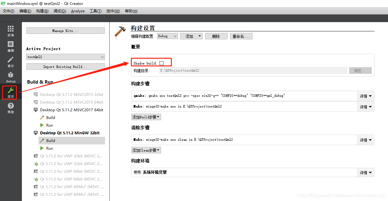
解决方法2:
据说在.pro文件中添加一行配置:UI_DIR=./UI可以生效
