接触过自定义控件的开发者一看,笑了,立马关了网页。但是…你真的知道怎么绘制居中文本吗?
我不会?开玩笑,不就是:X=控件宽度/2 - 文本宽度/2;Y=控件高度/2 + 文本宽度/2
好吧,那我试一下。
1.自定义控件基本步骤
- 自定义View的属性
- 在View的构造方法中获得我们自定义的属性
- #重写onMesure #
- 重写onDraw
OK,简单,直接干起来。
1. 自定义View的属性
按照最简单的来,属性有:文本,文本颜色,文本大小。
我们在 /value/attrs.xml 中这么写:
<?xml version="1.0" encoding="utf-8"?>
<resources>

    <attr name="text" format="string" />
    <attr name="textColor" format="color" />
    <attr name="textSize" format="dimension" />

    <!-- RTextView -->
    <declare-styleable name="RTextView">
        <attr name="text" />
        <attr name="textColor" />
        <attr name="textSize" />
    </declare-styleable>

</resources>
2. 在View的构造方法中获得我们自定义的属性
    /**
     * 基本属性
     */
    private String mText = "Loading";
    private int mTextColor;
    private int mTextSize;

    /**
     * 画笔,文本绘制范围
     */
    private Rect mBound;
    private Paint mPaint;

    public RTextView(Context context) {
        this(context, null);
    }

    public RTextView(Context context, AttributeSet attrs) {
        super(context, attrs);

        /*
         * 获取基本属性
         */
        TypedArray a = context.obtainStyledAttributes(attrs,
                R.styleable.RTextView);
        mText = a.getString(R.styleable.RTextView_text);
        mTextSize = a.getDimensionPixelSize(R.styleable.RTextView_textSize, 20);
        mTextColor = a.getColor(R.styleable.RTextView_textColor, Color.BLACK);
        a.recycle();

        /*
         * 初始化画笔
         */
        mBound = new Rect();
        mPaint = new Paint();
        mPaint.setAntiAlias(true);
        mPaint.setStyle(Style.FILL);
        mPaint.setTextSize(mTextSize);
        mPaint.getTextBounds(mText, 0, mText.length(), mBound);

    }
代码超级简单,就是在构造方法中获取自定义的属性。
3. #重写onMesure
诶,这个有点不一样哦。简单说一下吧。我们在使用控件的时候一般会设置宽高。
设置类型有:wrap_content,match_parent,100dp(明确值)
自定义控件时,
如果设置了 明确的宽高(100dp),系统帮我们测量的结果就是我们设置的实际值;
如果是 wrap_content 或者 match_parent 系统帮我们测量的结果就是 match_parent。
所以当设置为 wrap_content 的时候我们需要 重写onMesure 方法重新测量。
重写之前了解 MeasureSpec 的 specMode,一共分为三种类型:
EXACTLY:一般表示设置了 明确值,或者 match_parent ;
AT_MOST:表示子控件限制在一个最大值内,一般为 wrap_content;
UNSPECIFIED:表示子控件像多大就多大,很少使用
@Override
    protected void onMeasure(int widthMeasureSpec, int heightMeasureSpec) {
        int width = onMeasureR(0, widthMeasureSpec);
        int height = onMeasureR(1, heightMeasureSpec);
        setMeasuredDimension(width, height);
    }
/**
* 计算控件宽高
*
* @param attr属性
* [0宽,1高]
* @param oldMeasure
* @author Ruffian
*/
public int onMeasureR(int attr, int oldMeasure) {
int newSize = 0;
int mode = MeasureSpec.getMode(oldMeasure);
int oldSize = MeasureSpec.getSize(oldMeasure);
switch (mode) {
case MeasureSpec.EXACTLY:
newSize = oldSize;
break;
case MeasureSpec.AT_MOST:
case MeasureSpec.UNSPECIFIED:
float value;
if (attr == 0) {
value = mBound.width();
// value = mPaint.measureText(mText);
// 控件的宽度 + getPaddingLeft() + getPaddingRight()
newSize = (int) (getPaddingLeft() + value + getPaddingRight());
} else if (attr == 1) {
value = mBound.height();
// FontMetrics fontMetrics = mPaint.getFontMetrics();
// value = Math.abs((fontMetrics.descent - fontMetrics.ascent));
// 控件的高度 + getPaddingTop() + getPaddingBottom()
newSize = (int) (getPaddingTop() + value + getPaddingBottom());
}
break;
}
return newSize;
}方法很简单,获取宽高的模式,如果是明确值,或者match_parent,直接获取原始值返回。
如果是 wrap_content,计算宽高:控件的宽高 + 左右(上下)内边距
4. 重写onDraw
好了关键的时候来了,绘制文字。
根据文章开头那些老鸟的方法:X=控件宽度/2 - 文本宽度/2;Y=控件高度/2 + 文本宽度/2
    @Override
    protected void onDraw(Canvas canvas) {

        mPaint.setColor(mTextColor);

        /*
         * 控件宽度/2 - 文字宽度/2
         */
        float startX = getWidth() / 2 - mBound.width() / 2;

        /*
         * 控件高度/2 + 文字高度/2,绘制文字从文字左下角开始,因此"+"
         */
        float startY = getHeight() / 2 + mBound.height() / 2;

        // 绘制文字
        canvas.drawText(mText, startX, startY, mPaint);

        mPaint.setColor(Color.RED);
        mPaint.setStrokeWidth(5);
        // 中线,做对比
        canvas.drawLine(0, getHeight() / 2, getWidth(), getHeight() / 2, mPaint);
    }
xml文件调用方式
<LinearLayout xmlns:android="http://schemas.android.com/apk/res/android"
    xmlns:tools="http://schemas.android.com/tools"
    xmlns:custom="http://schemas.android.com/apk/res-auto"
    android:layout_width="match_parent"
    android:layout_height="match_parent"
    android:orientation="vertical" >

    <TextView
        android:layout_width="wrap_content"
        android:layout_height="wrap_content"
        android:layout_marginLeft="2dp"
        android:layout_marginTop="2dp"
        android:background="#ADD597"
        android:text="@string/text"
        android:textSize="25sp" />

    <cn.r.android.view.RTextView
        android:layout_width="wrap_content"
        android:layout_height="wrap_content"
        android:layout_marginLeft="2dp"
        android:layout_marginTop="2dp"
        android:background="#ADD597"
        custom:text="@string/text"
        custom:textColor="#000000"
        custom:textSize="25sp" />

</LinearLayout>
注意:这里宽高设置为wrap_content,并且没有padding
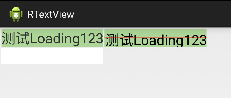
好了,根据那些老鸟的方法写出来了,那么运行一下看看结果。
为了更好的查看效果,加上原生TextView做对比
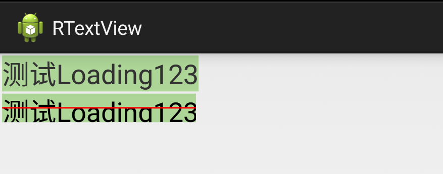
很明显可以看出自定义的宽度小了,高度也不够,宽高文字都不能完整的绘制。
获取很多人看到这个会觉得奇怪,以前没有发现这种效果,因为这里宽高设置为wrap_content,并且没有padding,如果设置了padding或许很难看出这些细微的效果,因此很多开发者以为这就是满意的效果了。
2.绘制水平,垂直居中文本
之前我也以为绘制文本嘛,再简单不过的啦,深入研究一下才发现,哎哟,有文章哦。
OK,说一下解决思路吧。上图所示,宽高都出现了问题,都偏小了。这里宽度问题比较容易解决,高度才比较麻烦。
2.1宽度偏小
宽度偏小是因为文字测量出现了误差,
原始方式,这是一种粗略的文字宽度计算
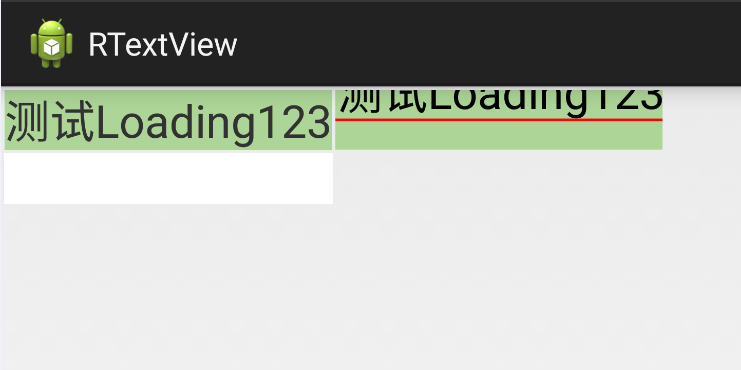
value = mBound.width();改进,这是比较精确的测量文字宽度的方式
value = mPaint.measureText(mText);开发者可以自行打印对比一下 mBound.width(); 和 mPaint.measureText(mText); 的值。
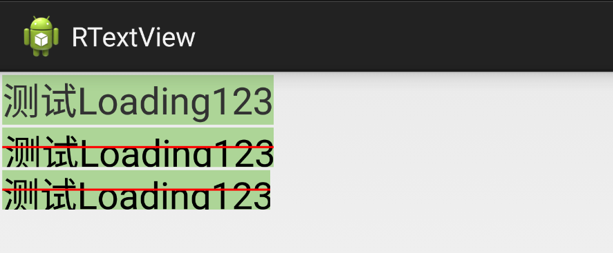
上图中,第1个是原生TextView,第2个是修改的过的,第三个是没有修改的,明显看到宽度已经和原生一样,而且最后一个文字也完整绘制出来了。第三个可以对比
2.2高度偏小
高度偏小就比较麻烦了。不是一行代码可以解决的了
先了解一下Android是怎么样绘制文字的,这里涉及到几个概念,分别是文本的top,bottom,ascent,descent,baseline。
看下面的图(摘自网络):
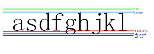
解释一下这张图片。(摘自网络)
Baseline是基线,在Android中,文字的绘制都是从Baseline处开始的,Baseline往上至字符“最高处”的距离我们称之为ascent(上坡度),Baseline往下至字符“最低处”的距离我们称之为descent(下坡度);
leading(行间距)则表示上一行字符的descent到该行字符的ascent之间的距离;
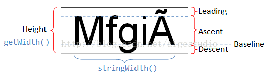
top和bottom文档描述地很模糊,其实这里我们可以借鉴一下TextView对文本的绘制,TextView在绘制文本的时候总会在文本的最外层留出一些内边距,为什么要这样做?因为TextView在绘制文本的时候考虑到了类似读音符号,下图中的A上面的符号就是一个拉丁文的类似读音符号的东西:
Baseline是基线,Baseline以上是负值,以下是正值,因此 ascent,top是负值, descent和bottom是正值。
OK,知道了这几个概念之后就开始想想要怎么修改了。
我们先修改高度偏小的问题
原始代码,
value = mBound.height();修改后代码
FontMetrics fontMetrics = mPaint.getFontMetrics();
value = Math.abs((fontMetrics.bottom - fontMetrics.top));
结合图一,bottom和top相减的绝对值就是view的高度height。注意:Baseline以上是负值,以下是正值
OK,高度和宽度大小和原生的大小一样了,那么现在怎么使得文字垂直居中呢?
查阅了网上资料和测试了多次的结果得出一个计算 Y 值的计算公式:
FontMetricsInt fm = mPaint.getFontMetricsInt();

int startY = getHeight() / 2 - fm.descent + (fm.bottom - fm.top) / 2;

int startY = getHeight() / 2 - fm.descent + (fm.descent - fm.ascent)/ 2;
getHeight():控件的高度
getHeight()/2-fm.descent:意思是将整个文字区域抬高至控件的1/2
+ (fm.bottom - fm.top) / 2:(fm.bottom - fm.top)其实就是文本的高度,意思就是将文本下沉文本高度的一半
- 执行:getHeight()/2-fm.descent , 将整个文字区域抬高至控件的1/2
- 执行: + (fm.bottom - fm.top) / 2 , 将文本下沉文本高度的一半
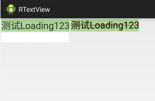
为什么是:(fm.bottom - fm.top) ;而不是:(fm.descent - fm.ascent)
第一张是原生TextView,第二张是(fm.bottom - fm.top),第三张是(fm.descent - fm.ascent)。
从效果图看,第三种才是真正意义上的居中,不是吗?但是第二种是和原生TextView最接近的,为什么呢?经过测试你会知道,如果单纯是汉字或者数字第三种的效果或者会比较好,但是如果其他的语言,就比如上图的英文来看,第二种是比较好的。不能排除其他国家的语言,或者一些带音标的拼音之类的呢?
所以根据实际需求来确定使用哪一个,推荐第二种:(fm.bottom - fm.top)