Flutter-Button的使用说明
1、几种Button
在flutter中,一共有七种类型的button;分别是一下几种:
1、a filled button whose material elevates when pressed.
2、FlatButton, a material design button without a shadow.
3、DropdownButton, a button that shows options to select from.
4、FloatingActionButton, the round button in material applications.
5、IconButton, to create buttons that just contain icons.
6、InkWell, which implements the ink splash part of a flat button.
7、OutLineButton
2、RaisedButton,凸起按钮
2.1 RaisedButton定义
一般使用凸起按钮来增加平面布局的尺寸,比如在很长很繁忙的内容列表中,或者在很宽的空间中;
RaisedButton({
    Key key,
    @required VoidCallback onPressed,//点击按钮回调,
    VoidCallback onLongPress,//长按回调
    ValueChanged<bool> onHighlightChanged,//点击按钮高亮显示回调,按下返回true,抬起返回false
    ButtonTextTheme textTheme,//设置按钮文字主题
    Color textColor,//设置按钮文字颜色
    Color disabledTextColor,//设置按钮处于disable时按钮颜色
    Color color,//设置按钮背景色
    Color disabledColor,//设置按钮处于disable时的背景色
    Color focusColor,
    Color hoverColor,
    Color highlightColor,//设置按钮按下时的颜色
    Color splashColor,//设置按钮抬起时的波纹效果颜色
    Brightness colorBrightness,//dark时,按钮按下抬起时不会有波纹效果,light时会有波纹效果
    double elevation,//设置按钮阴影大小,值越大阴影越大
    double focusElevation,
    double hoverElevation,
    double highlightElevation,//设置按钮按下时的阴影大小
    double disabledElevation,//设置按钮处于disable时的阴影大小
    EdgeInsetsGeometry padding,//设置文字与按钮边框的边距
    ShapeBorder shape,//设置按钮边框样式
    Clip clipBehavior = Clip.none,//切割按钮方式
    FocusNode focusNode,
    bool autofocus = false,
    MaterialTapTargetSize materialTapTargetSize,//在无其他约束条件下调整按钮大小
    Duration animationDuration,//设置动画时长
    Widget child,
 })
2.2 RaisedButton简单使用
Widget _RaisedButton() {
return Center(
  child: Column(
    mainAxisSize: MainAxisSize.max,
    children: <Widget>[
      const RaisedButton(
        onPressed: null,
        child: Text('Disabled Button', style: TextStyle(fontSize: 20)),
      ),
      const SizedBox(height: 30),
      RaisedButton(
        onPressed: () {},
//            focusColor: Colors.redAccent,
//          hoverColor: Colors.redAccent,
//          highlightColor: Colors.white,
//            splashColor: Colors.blue,
//          colorBrightness: Brightness.light,
      elevation: 20,
        child: const Text('Enabled Button', style: TextStyle(fontSize: 20,
        color: Colors.redAccent
        )),
//            padding: EdgeInsets.all(10),
        shape: RoundedRectangleBorder(side: BorderSide(color: Colors.redAccent), borderRadius: BorderRadius.circular(10)),
        materialTapTargetSize: MaterialTapTargetSize.shrinkWrap,
        animationDuration: Duration(seconds: 6),
      ),
      const SizedBox(height: 30),
      RaisedButton(
        onPressed: () {},
        textColor: Colors.white,
        padding: const EdgeInsets.all(0.0),
        child: Container(
          decoration: const BoxDecoration(
            gradient: LinearGradient(
              colors: <Color>[
                Color(0xFF0D47A1),
                Color(0xFF1976D2),
                Color(0xFF42A5F5),
              ],
            ),
          ),
          padding: const EdgeInsets.all(10.0),
          child:
          const Text('Gradient Button', style: TextStyle(fontSize: 20)),
        ),
      ),
    ],
  ),
);
}
代码运行效果如下:
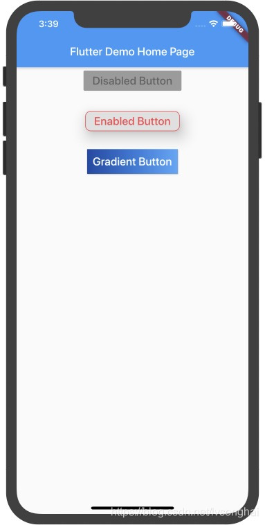
**重要说明:**按钮在没有实现onPressed方法或者onLongPress方法的时候,按钮处于disable状态。
3、FlatButton扁平按钮
3.1 FlatButton定义
FlatButton是一种扁平按钮,没有阴影效果,没有边框。由于FlatButton里面的很多属性定于与RaisedButton属性类似,就不再写注释。
FlatButton({
    Key key,
    @required VoidCallback onPressed,//点击回调
    VoidCallback onLongPress,//长按回调
    ValueChanged<bool> onHighlightChanged,点击按钮高亮显示回调,按下返回true,抬起返回false
    ButtonTextTheme textTheme,////设置按钮文字主题
    Color textColor,//文字颜色
    Color disabledTextColor,
    Color color,
    Color disabledColor,
    Color focusColor,
    Color hoverColor,
    Color highlightColor,
    Color splashColor,
    Brightness colorBrightness,
    EdgeInsetsGeometry padding,
    ShapeBorder shape,
    Clip clipBehavior = Clip.none,
    FocusNode focusNode,
    bool autofocus = false,
    MaterialTapTargetSize materialTapTargetSize,
    @required Widget child,
})
3.2FlatButton的简单使用
Widget _FlatButton() {
    return Center(
      child: Column(
        mainAxisSize: MainAxisSize.max,
        children: <Widget>[
          const FlatButton(
            onPressed: null,
            color: Colors.redAccent,
            child: Text('Disabled Button', style: TextStyle(fontSize: 20)),
          ),
          const SizedBox(height: 30),
          FlatButton(
            onPressed: () {},
            child: const Text('Enabled Button', style: TextStyle(fontSize: 20,
                color: Colors.redAccent
            )),
            shape: RoundedRectangleBorder(side: BorderSide(color: Colors.redAccent), borderRadius: BorderRadius.circular(10)),
            materialTapTargetSize: MaterialTapTargetSize.shrinkWrap,
          ),
          const SizedBox(height: 30),
          FlatButton.icon(
              onPressed: (){},
              icon: Icon(Icons.settings),
              label: Text('Flat Button icon')
          )
        ],
      ),
    );
}
运行下能看到如下效果:
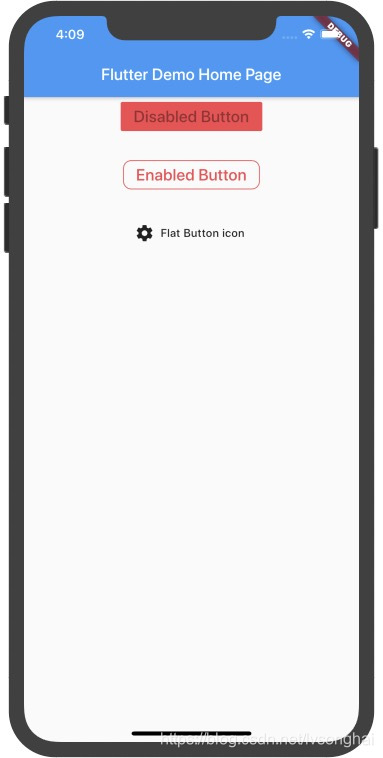
运行起来后看到会有带图标的按钮,这个使用的是FlatButton.icon这个Widget。
4、DropdownButton下拉按钮
4.1 DropdownButton定义
DropdownButton({
    Key key,
    @required this.items,//需要选择的一组数据
    this.selectedItemBuilder,//被选择的Item
    this.value,//被选择的内容
    this.hint,//当按钮初始化时,没选择任何内容时候展示的默认值
    this.disabledHint,//按钮diaable状态时的默认值
    @required this.onChanged,//下拉框中的按钮被点击响应
    this.elevation = 8,//打开菜单时,菜单的z坐标位置
    this.style,//设置按钮文字类型
    this.underline,//设置下划线
    this.icon,//设置显示图标
    this.iconDisabledColor,//设置disable状态下图标颜色
    this.iconEnabledColor,//设置正常状态下图标颜色
    this.iconSize = 24.0,//设置图标大小
    this.isDense = false,//调整按钮高度,true时,按钮高度减少一半
    this.isExpanded = false,//设置下拉是否拉伸
    this.itemHeight = kMinInteractiveDimension,//设置每一行的高度
    this.focusColor,
    this.focusNode,
    this.autofocus = false,
})
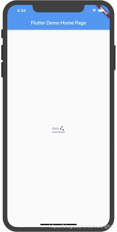
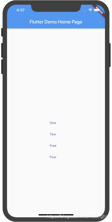
4.2 DropdownButton的简单使用
Widget _dropdownButton() {
    String dropdownValue = 'One';
    return Center(
      child: DropdownButton<String>(
        icon: Icon(Icons.scatter_plot),
        iconSize: 24,
        hint: Text('data'),
        elevation: 30,
        style: TextStyle(
            color: Colors.deepPurple
        ),
        underline: Container(
          height: 2,
          color: Colors.deepPurpleAccent,
        ),
        onChanged: (String newValue) {
          setState(() {
            dropdownValue = newValue;
          });
        },
        items: <String>['One', 'Two', 'Free', 'Four']
            .map<DropdownMenuItem<String>>((String value) {
          return DropdownMenuItem<String>(
            value: value,
            child: Text(value),
          );
        })
            .toList(),
      ),
    );
}
运行效果如下所示:
5、FloatingActionButton悬浮按钮
5.1 FloatingActionButton定义
在每个屏幕上推荐使用一个悬浮按钮
FloatingActionButton({
    Key key,
    this.child,
    this.tooltip,//长按按钮时的提示语
    this.foregroundColor,//设置图标和文字的展示颜色
    this.backgroundColor,//设置背景色
    this.focusColor,
    this.hoverColor,
    this.splashColor,
    this.heroTag = const _DefaultHeroTag(),//一个路由中存在多个FloatingActionButton,用它来区分,否则会抛出异常
    this.elevation,
    this.focusElevation,
    this.hoverElevation,
    this.highlightElevation,
    this.disabledElevation,
    @required this.onPressed,
    this.mini = false,
    this.shape,
    this.clipBehavior = Clip.none,
    this.focusNode,
    this.autofocus = false,
    this.materialTapTargetSize,
    this.isExtended = false,
})
5.2 FloatingActionButton使用
Scaffold(
  appBar: AppBar(
    // Here we take the value from the MyHomePage object that was created by
    // the App.build method, and use it to set our appbar title.
    title: Text(widget.title),
  ),
  body: _dropdownButton(),
  floatingActionButton: FloatingActionButton(
    onPressed: () {
      // Add your onPressed code here!
    },
    child: Icon(Icons.navigation),
    backgroundColor: Colors.black,
    tooltip: 'djhfkafkjkadf',
    splashColor: Colors.red,
      elevation:10
//        foregroundColor: Colors.redAccent,
  ),
//      floatingActionButton: FloatingActionButton(
//        onPressed: _incrementCounter,
//        tooltip: 'Increment',
//        child: Icon(Icons.add),
//      ), // This trailing comma makes auto-formatting nicer for build methods.
);
6、IconButton
IconButton图标按钮,常用于只需要展示一个图标按钮的情况
7、OutLineButton
线框按钮,默认情况下带有一个边框,这种情况下设置按钮的color属性是没有效果的
8、ButtonBar
在里面可以展示一组button按钮
