Android Material(一)
1. MaterialTextField
implementation 'com.google.android.material:material:1.1.0-alpha09'
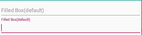
1. 默认效果
<com.google.android.material.textfield.TextInputLayout
        android:layout_width="match_parent"
        android:layout_height="60dp"
        android:hint="Filled Box(default)">
        <com.google.android.material.textfield.TextInputEditText
            android:layout_width="match_parent"
            android:layout_height="match_parent"/>
    </com.google.android.material.textfield.TextInputLayout>
效果
2. Dense Text Fields
<com.google.android.material.textfield.TextInputLayout
        style="@style/Widget.MaterialComponents.TextInputLayout.FilledBox.Dense"
        android:layout_width="match_parent"
        android:layout_height="60dp"
        android:hint="Filled Box dense">
        <com.google.android.material.textfield.TextInputEditText
            android:layout_width="match_parent"
            android:layout_height="match_parent"/>
    </com.google.android.material.textfield.TextInputLayout>
显示效果与1相同,只是文本字段高度略短。使用这个style,AppTheme要设置为Theme.MaterialComponents (or a descendant).
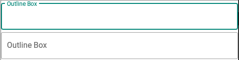
3. Outline Box Text Fields
<com.google.android.material.textfield.TextInputLayout
        style="@style/Widget.MaterialComponents.TextInputLayout.OutlinedBox"
        android:layout_width="match_parent"
        android:layout_height="60dp"
        android:hint="Outline Box">
        <com.google.android.material.textfield.TextInputEditText
            android:layout_width="match_parent"
            android:layout_height="match_parent"/>
    </com.google.android.material.textfield.TextInputLayout>
效果
4.End Icon Modes
<com.google.android.material.textfield.TextInputLayout
    style="@style/Widget.MaterialComponents.TextInputLayout.OutlinedBox"
    android:layout_width="match_parent"
    android:layout_height="60dp"
    android:hint="Password"
    app:endIconMode="password_toggle"
    app:endIconTint="@color/colorPrimary">
    <com.google.android.material.textfield.TextInputEditText
        android:layout_width="match_parent"
        android:layout_height="match_parent"/>
</com.google.android.material.textfield.TextInputLayout>
效果

对于自定义图标,我们使用endIconDrawable属性
对于自定义图标,我们可以使用setEndIconOnClickListener回调来监听点击和执行操作。
5. Shaped Text Fields
<style name="Cut" parent="ShapeAppearance.MaterialComponents.MediumComponent">
    <item name="cornerFamily">cut</item>
    <item name="cornerSize">12dp</item>
</style>

<style name="Rounded" parent="ShapeAppearance.MaterialComponents.SmallComponent">
    <item name="cornerFamily">rounded</item>
    <item name="cornerSize">16dp</item>
</style>
在shapeAppearance属性中设置上述样式
<com.google.android.material.textfield.TextInputLayout
    style="@style/Widget.MaterialComponents.TextInputLayout.OutlinedBox"
    app:shapeAppearance="@style/Cut"
    android:layout_width="match_parent"
    android:layout_height="60dp"
    android:hint="Cut"
    >
    <com.google.android.material.textfield.TextInputEditText
        android:layout_width="match_parent"
        android:layout_height="match_parent"/>
</com.google.android.material.textfield.TextInputLayout>
<com.google.android.material.textfield.TextInputLayout
    app:shapeAppearance="@style/Rounded"
    style="@style/Widget.MaterialComponents.TextInputLayout.OutlinedBox"
    android:layout_width="match_parent"
    android:layout_height="60dp"
    android:hint="Rounded"
    >
    <com.google.android.material.textfield.TextInputEditText
        android:layout_width="match_parent"
        android:layout_height="match_parent"/>
</com.google.android.material.textfield.TextInputLayout>
2. BottomAppBar
implementation 'com.android.support:appcompat-v7:28.0.0-alpha1'
implementation 'com.android.support:design:28.0.0-alpha1'
implementation 'com.android.support:support-v4:28.0.0-alpha1'
<androidx.coordinatorlayout.widget.CoordinatorLayout
    android:layout_width="match_parent"
    android:layout_height="match_parent">

    <com.google.android.material.floatingactionbutton.FloatingActionButton
        android:layout_width="wrap_content"
        android:layout_height="wrap_content"
        app:layout_anchor="@id/bottomAppBar"/>
    <com.google.android.material.bottomappbar.BottomAppBar
        android:id="@+id/bottomAppBar"
        android:layout_width="match_parent"
        android:layout_height="?attr/actionBarSize"
        android:layout_gravity="bottom"
        app:backgroundTint="@color/colorPrimary"
        app:popupTheme="@style/ThemeOverlay.AppCompat.Light"
        app:theme="@style/ThemeOverlay.AppCompat.Dark.ActionBar"
        app:fabAlignmentMode="center"
        app:menu="@menu/bottom_menu"/>
</androidx.coordinatorlayout.widget.CoordinatorLayout>
BottomAppBar必须在Coordinatorlayout下。
app:fabAttached="true"用于附加FloatingActionButton。在FloatingActionButton中,您必须将设置app:layout_anchor为BottomAppBar ID。此外,您可以设置以下属性:app:fabAlignmentMode:在BottomAppBar中设置FloatingActionButton的位置。默认情况下,它居中。app:fabCradleDiameter:设置切口圆弧的直径。app:fabCradleVerticalOffset:设置FloatingActionButton与圆弧切除的垂直距离。app:menu用于设置菜单资源文件。您也可以通过编程方式进行。
3. MaterialButton
MaterialButton是Button上的新Material Design主题。它延伸AppCompatButton。它直接提供了材质主题,而无需添加样式/主题。
<android.support.design.button.MaterialButton
            android:id="@+id/materialButton"
            android:layout_width="wrap_content"
            android:layout_height="wrap_content"
            android:padding="18dp"
            android:layout_gravity="center"
            android:textColor="#fff"
            android:text="Material Button"
            app:backgroundTint="@color/colorPrimary"/>
默认情况下,背景色与相同colorAccent。
app:backgroundTint 用于设置新颜色。
app:icon 用于设置除Button文本之外的可绘制图标。
app:iconTint用于设置图标的颜色。app:iconPadding设置填充。app:rippleColor:用于设置单击按钮时的波纹颜色。app:strokeColor:用于设置按钮上的边框颜色。app:strokeWidth:用于设置边框的宽度。app:cornerRadius用于设置拐角处的半径。
