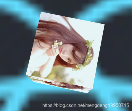
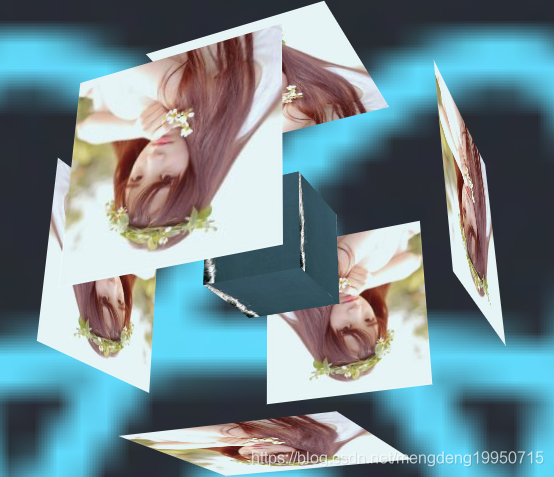
1.效果
2. index.html
<!DOCTYPE html>
<!DOCTYPE html>
<html lang="en">
<head>
	<meta charset="utf-8">
	<title>Document</title>
	<link rel="stylesheet" type="text/css" href="style.css">
</head>
<body>
	<div class="box">
		<div class="box1">
			<div class="font"></div>
			<div class="back"></div>
			<div class="top"></div>
			<div class="bottom"></div>
			<div class="left"></div>
			<div class="right"></div>

			<i class="i-font"></i>
			<i class="i-back"></i>
			<i class="i-top"></i>
			<i class="i-bottom"></i>
			<i class="i-left"></i>
			<i class="i-right"></i>

		</div>
	</div>
</body>
</html>
3 style.css
body{
	background: url(img/3.png);
	background-size: cover;

	margin: 0;
	padding: 0;

}

.box{
	position: absolute;
	top: 50%;
	left: 50%;
	transform: translate(-50%,-50%);
	perspective: 900px;
}

.box1{
	width: 200px;
	height: 200px;
	transform-style: preserve-3d;
	transform: rotateX(0deg) rotateY(0deg);
	animation: dh 20s linear infinite;

}

.box .box1 div{
	width: 100%;
	height: 100%;
	position: absolute;
	font-size: 20px;
	line-height: 200px;
	text-align: center;
	color: white;
	transition: 0.6s;

}

.box .box1 .font{
	background: url(img/s1.jpg);
	transform: translateZ(100px);
}

.box .box1 .back{
	background: url(img/s1.jpg);
	transform: translateZ(-100px) rotateY(180deg);
}

.box .box1 .right{
	background: url(img/s1.jpg);
	transform: rotateY(90deg) translateZ(100px);
}

.box .box1 .left{
	background: url(img/s1.jpg);
	transform: rotateY(-90deg) translateZ(100px);
}

.box .box1 .top{
	background: url(img/s1.jpg);
	transform: rotateX(90deg) translateZ(100px);
}

.box .box1 .bottom{
	background: url(img/s1.jpg);
	transform: rotateX(-90deg) translateZ(100px);
}


/*悬浮效果*/

.box .box1:hover .font{
	background: url(img/s1.jpg);
	transform: translateZ(200px);
}

.box .box1:hover .back{
	background: url(img/s1.jpg);
	transform: translateZ(-200px) rotateY(180deg);
}

.box .box1:hover .right{
	background: url(img/s1.jpg);
	transform: rotateY(90deg) translateZ(200px);
}

.box .box1:hover .left{
	background: url(img/s1.jpg);
	transform: rotateY(-90deg) translateZ(200px);
}

.box .box1:hover .top{
	background: url(img/s1.jpg);
	transform: rotateX(90deg) translateZ(200px);
}

.box .box1:hover .bottom{
	background: url(img/s1.jpg);
	transform: rotateX(-90deg) translateZ(200px);
}


/*形成魔方并且旋转*/
@keyframes dh{
	0%{transform: rotateX(0deg) rotateY(0deg)}
	100%{transform: rotateX(360deg) rotateY(360deg);}
}

.box .box1 i{
	position: absolute;
	top: 50%;
	left: 50%;
	margin-top: -50px;
	margin-left: -50px;
	width: 100px;
	height: 100px;
}

.box .box1 .i-font{
	background: url(img/s7.jpg);
	transform: translateZ(50px);
}

.box .box1 .i-back{
	background: url(img/s7.jpg);
	transform: translateZ(-50px) rotateY(180deg);
}

.box .box1 .i-right{
	background: url(img/s7.jpg);
	transform: rotateY(90deg) translateZ(50px);
}

.box .box1 .i-left{
	background: url(img/s7.jpg);
	transform: rotateY(-90deg) translateZ(50px);
}

.box .box1 .i-top{
	background: url(img/s7.jpg);
	transform: rotateX(90deg) translateZ(50px);
}

.box .box1 .i-bottom{
	background: url(img/s7.jpg);
	transform: rotateX(-90deg) translateZ(50px);
}
