styled-components1
前言
前端飞一般的发展中,衍生出各式各样的框架,框架的目的是减轻开发人员的开发难度,提高效率。
以前网页开发的原则是关注点分离,意思是各种技术只负责自己的领域,不要混合在一起,形成耦合。如html、css、js代码分离。
React的出现,这个原则不在实用,React是组件结构,强制把html、css、js写在一起。如:
const style = {
    'color': 'red',
    'fontSize': '46px'
};

const clickHandler = () => alert('hi');

ReactDOM.render(
    <h1 style={style} onclick={clickHandler}>
        Hello, world!
    </h1>,
    document.getElementById('example')
);
上面代码在一个js文件里,封装了结构、样式、逻辑,完全违背了关注点分离,很多人刚开始学习React很不适应,但是,这有利于组件的隔离,每个组件需要的代码不依赖于外部、组件之间没有耦合,方便复用。
使用React的越来越多,组件模式深入人心,这种关注点混合的新写法逐渐成为主流。
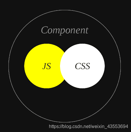
表面上,React的写法是html、css、js混合写在一起,实际上是用js在写html、css。React对html的封装是jsx,那么对css的封装是什么呢?这就涉及到今天需要讲的内容style-components。

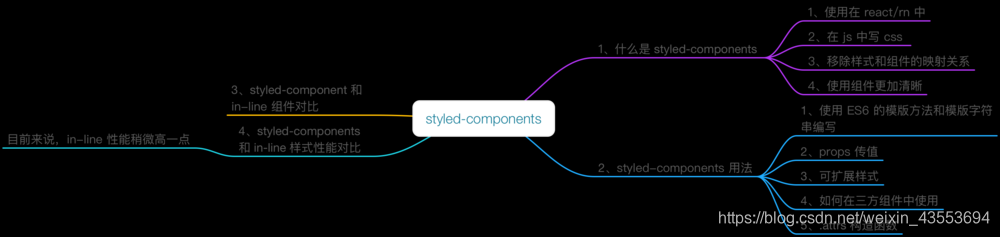
什么是style-components
style-components是针对React写的一套css in js框架,简单来讲就是在js中写css。
相对于与预处理器(sass、less)的好处是,css in js使用的是js语法,不用重新再学习新技术,也不会多一道编译步骤。
无疑会加快网页速度。如果有sass或less的开发经验,几分钟就可以学会style-components。
官方文档
https://www.styled-components.com/docs/basics
1. 安装
npm install --save style-components
2. 基础用法
style-components最基础的用法就是以组件的形式编写样式,如下:
import styled from 'styled-components';

const HomeWrapper = styled.div `
  width: 960px;
  margin: 0 auto;
  overflow: hidden;
`;
const HomeLeft = styled.div `
  float: left;
  width: 625px;
  margin-left: 15px;
  padding-top: 30px;
  .bannder-img {
    width: 625px;
    height: 270px;
  }
`;
const HomeRight = styled.div `
  float: right;
  width: 280px;
  margin-left: 15px;
  padding-top: 30px;
`;

render () {
    return (
        <HomeWrapper>
            <HomeLeft>
                left
            </HomeLeft>
            <HomeRight>
                right
            </HomeRight>
        </HomeWrapper>
    )
}
上面的代码定义了三个组件,分别为**HomeWrapper 、HomeLeft 、HomeRight,**这样每一个组件对应唯一的样式,不在出现样式污染的情况。
全局样式//:CSSReset
每一个组件对应唯一的样式,那么需要设置全局样式怎么办呢?
style-components的最新版提供了createGlobalStyle可以设置全局样式,如下:
import { createGlobalStyle } from 'styled-components';
//CSSReset
const GrobalStyle = createGlobalStyle `
 html, body, div, span, applet, object, iframe,
   h1, h2, h3, h4, h5, h6, p, blockquote, pre,
   a, abbr, acronym, address, big, cite, code,
   del, dfn, em, img, ins, kbd, q, s, samp,
   small, strike, strong, sub, sup, tt, var,
   b, u, i, center,
   dl, dt, dd, ol, ul, li,
   fieldset, form, label, legend,
   table, caption, tbody, tfoot, thead, tr, th, td,
   article, aside, canvas, details, embed,
   figure, figcaption, footer, header, hgroup,
   menu, nav, output, ruby, section, summary,
   time, mark, audio, video {
       margin: 0;
       padding: 0;
       border: 0;
       font-size: 100%;
       font: inherit;
       vertical-align: baseline;
   }
   /* HTML5 display-role reset for older browsers */
   article, aside, details, figcaption, figure,
   footer, header, hgroup, menu, nav, section {
       display: block;
   }
   body {
       line-height: 1;
   }
   ol, ul {
       list-style: none;
   }
   blockquote, q {
       quotes: none;
   }
   blockquote:before, blockquote:after,
   q:before, q:after {
       content: '';
       content: none;
   }
   table {
       border-collapse: collapse;
       border-spacing: 0;
   }

   @font-face {
     font-family: 'iconfont';  /* project id 897264 */
     src: url('//at.alicdn.com/t/font_897264_7ma62sn10m3.eot');
     src: url('//at.alicdn.com/t/font_897264_7ma62sn10m3.eot?#iefix') format('embedded-opentype'),
     url('//at.alicdn.com/t/font_897264_7ma62sn10m3.woff') format('woff'),
     url('//at.alicdn.com/t/font_897264_7ma62sn10m3.ttf') format('truetype'),
     url('//at.alicdn.com/t/font_897264_7ma62sn10m3.svg#iconfont') format('svg');
   }
   .iconfont {
     font-family:"iconfont" !important;
     font-size:16px;
     font-style:normal;
     -webkit-font-smoothing: antialiased;
     -moz-osx-font-smoothing: grayscale;
   }

   .clearfix:after {visibility: hidden;display: block;font-size: 0;content: ".";clear: both;height: 0;}
   .clearfix {zoom: 1;}
`;

render() {
   return (
       <Fragment>
           <Provider>...</Provider>
           <GrobalStyle/>
       </Fragment>
   )
}
上面的代码GrobalStyle是全局样式组件,只需在React组件的最外层引入即可。
图片引入
需要图片引入,如果像css一样的引入方式,会报错。正确的引入方式是import导入,再以变量的方式引入,如下:
import styled from 'styled-components';
import logPic from '../../statics/images/logo.png';

export const Logo = styled.div `
  position: absolute;
  top: 0;
  left: 0;
  width: 100px;
  height: 56px;
  background-image: url(${logPic});
  background-size: contain;
`;
上面的代码logPic是存放logo图片地址的变量,只需使用${logPic}的方式引入即可。如果是后台传过来的图片,如何使用的背景图呢?
props
上面提到的问题,可使用组件的传值。先看一个例子:
recommendList.map((item) => {
    return <RecommendItem key={item} imgUrl={item}/>
})

const RecommendItem = styled.div `
  width: 280px;
  height: 50px;
  background-image: url(${(props) => props.imgUrl});
  background-size: contain;
`;
从上面的例子,不难发现,父组件传入的值,会存放在子组件的props中,故操作props便能得到预期效果。
标签属性
使用style-components,需要使用标签属性,如input 的placeholder,a标签的href等,style-components提供了属性attrs,如下:
export const NavSearch = styled.input.attrs({
    placeholder: '搜索',
    type: 'text'
}) `
  width: 160px;
  height: 38px;
  margin-top: 9px;
  padding: 0 40px 0 20px;
  box-sizing: border-box;
  background-color: #eee;
  outline: none;
  border: none;
  border-radius: 19px;
  color: #666;
  &::placeholder {
    color: #999;
  }
  &.focused {
    width: 240px;
  }
`;
上面的代码,attrs里面是一个对象,如果需要多个属性,以对象的形式添加即可。
塑造组件
有一种情况,一些原本就已经是组件,需要给这些组件添加样式,这时需要用到塑造组件,如下:
const Link = ({className , children}) => (
    <a className={className}>
        {children}
    </a>
)

const StyledLink = styled(Link)`
    color: palevioletred;
`
render(
    <div>
        <Link>普通组件</Link>
        <StyledLink>添加了样式的组件</StyledLink>
    </div>
);
继承
如果某一组件的样式会用到多个地方,不能每个地方都重新写一套样式,这样代码不够优雅。
比如:一个button,有warning、有default、有primary等,这个button只是颜色不同,其他样式一样,这里便可用到继承。
const Button = styled.button`
    line-height: 1.499;
    display: inline-block;
    font-weight: 400;
    text-align: center;
    -ms-touch-action: manipulation;
    touch-action: manipulation;
    cursor: pointer;
    background-image: none;
    border: 1px solid transparent;
    white-space: nowrap;
    padding: 0 15px;
    font-size: 14px;
    border-radius: 4px;
    height: 32px;
    -webkit-user-select: none;
    -moz-user-select: none;
    -ms-user-select: none;
    user-select: none;
    -webkit-transition: all .3s cubic-bezier(.645,.045,.355,1);
    transition: all .3s cubic-bezier(.645,.045,.355,1);
    position: relative;
    -webkit-box-shadow: 0 2px 0 rgba(0,0,0,.015);
    box-shadow: 0 2px 0 rgba(0,0,0,.015);
    color: rgba(0,0,0,.65);
    background-color: #fff;
    border-color: #d9d9d9;
`;
const ButtonPrimary = styled(Button)`
    color: #fff;
    background-color: #1890ff;
    border-color: #1890ff;
`;
const ButtonWarning = styled(Button)`
    color: #f5222d;
    background-color: #f5f5f5;
    border-color: #d9d9d9;
`;
有人说,公用样式的组件完全可以写到全部样式里面,设置不同的class。这样做可行,但是为什么不直接去写css呢?
动画
官网上有这样一个例子,如下:
const rotate = keyframes`
from {
transform: rotate(0deg);
}
to {
transform: rotate(360deg);
}
`;
const Rotate = styled.div`
display: inline-block;
animation: ${rotate} 2s linear infinite;
padding: 2rem 1rem;
font-size: 1.2rem;
`;
render(
<Rotate>< ? ></Rotate>
);
个人觉得,如果是简单的动画,直接以这样的方式去做,即可,如果动画比较复杂,建议使用react-transition-group框架有更好的体验。
总结
style-components的常用用法介绍完成,当然官网上还有一些其他的用法,有兴趣可以了解下。
使用style-components会随机生成一个class名称,这样不会污染到全局变量,当然因为随机生成,维护会增加难度,期待下一版能解决这个问题。
react-transition-group2
这次用react-transition-group做一个togglebutton控制div显示和隐藏的例子,首先我们需要安装react-transition-group,输入:
npm install react-transition-group --save
yarn add react-transition-group
组件中引入CSSTransition模块:
import { CSSTransition } from 'react-transition-group'
将CSSTransition标签包裹在需要实现动画效果的元素外,然后进行相关属性的配置:
constructor(props){
        super(props);
        this.state = {
            show: true
        }
    }

    render() {
        return (
            <Fragment>
                <CSSTransition
                      in={this.state.show} // 如果this.state.show从false变为true,则动画入场,反之out出场
                      timeout={1000} //动画执行1秒
                      classNames='fade' //自定义的class名
                      unMountOnExit //可选,当动画出场后在页面上移除包裹的dom节点
                      onEntered={(el) => {
                            el.style.color='blue'   //可选,动画入场之后的回调,el指被包裹的dom,让div内的字体颜色等于蓝色
                      }}
                      onExited={() => {
                            xxxxx   //同理,动画出场之后的回调,也可以在这里来个setState啥的操作
                      }}

                >
                    <div>hello</div>
                </CSSTransition>
                <button onClick={this.handleToggole}>toggle</button>
            </Fragment>
        )
    }

    handleToggole: ()=> {
        this.setState({
            show: this.state.show ? false : true
        })
    }
}
一旦动画入场,插件将会自动的在包裹住的标签上添加很多css样式,默认class名是fade,所以我们需要给CSSTransition标签加上classNames=‘fade’,然后去css文件进行配置:
//enter是入场前的刹那(点击按钮),appear指页面第一次加载前的一刹那(自动)
.fade-enter, .fade-appear {
    opacity: 0;
}
//enter-active指入场后到入场结束的过程,appear-active则是页面第一次加载自动执行
.fade-enter-active, .fade-appear-active {
    opacity: 1;
    transition: opacity 1s ease-in;
}
//入场动画执行完毕后,保持状态
.fade-enter-done {
    opacity: 1;
}
//同理,出场前的一刹那,以下就不详细解释了,一样的道理
.fade-exit {
    opacity: 1;
}

.fade-exit-active {
    opacity: 0;
    transition: opacity 1s ease-in;
}

.fade-exit-done {
    opacity: 0;
}
如果页面上一组dom都需要添加动画效果时我们需要在最外面再加一个TransitionGroup
import React, { Component, Fragment } from 'react';
import { CSSTransition, TransitionGroup } from 'react-transition-group';
import './style.css';

class App extends Component {

    constructor(props){
        super(props);
        this.state = {
            list: []
        }
        this.handleAddItem = this.handleAddItem.bind(this);
    }

    render() {
        return (
            <Fragment>
                <TransitionGroup>
                {
                    this.state.list.map((item, index) => {
                        return (
                            <CSSTransition
                                timeout={1000}
                                classNames='fade'
                                unmountOnExit
                                onEntered={(el) => {el.style.color='blue'}}
                                appear={true}
                                key={index}
                            >
                                <div>{item}</div>
                            </CSSTransition>
                        )
                    })
                }
                </TransitionGroup>
                <button onClick={this.handleAddItem}>toggle</button>
            </Fragment>
        )
    }

    handleAddItem() {
        this.setState((prevState) => {
            return {
                list: [...prevState.list, 'item']
            }
        })
    }
}

export default App;
