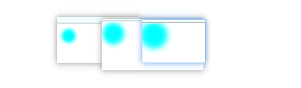
一个简单的呼吸灯效果
图:
<!DOCTYPE html>
<html lang="en">
<head>
  <meta charset="UTF-8">
  <meta name="viewport" content="width=device-width, initial-scale=1.0">
  <meta http-equiv="X-UA-Compatible" content="ie=edge">
  <title>Document</title>
  <style>
    body {
      position: relative;
    }
    #ball {
      position: relative;
      width: 10px;
      height: 10px;
      border-radius: 50%;
    }
    #ball::after {
      content: '';
      position: absolute;
      left: 0;
      top: 0;
      width: inherit;
      height: inherit;
      background-color: aqua;
      will-change: transform;
      box-shadow: 0 0 7px 10px aqua;
      border-radius: 50%;
      z-index: -1;
      animation: fadeIn 2s infinite linear alternate-reverse;
    }
    @keyframes fadeIn {
      from {
        transform: scale(.5);
      }
      to {
        transform: scale(1);
      }
    }
  </style>
</head>
<body>
  <div id="ball"></div>
</body>
</html>
