数据可视化是指通过可视化的手段探索数据,和数据分析紧密关联。通过代码来探索数据集的模式。
和显示酷炫的图片无关,而是让用户之前并不知道的数据含义和模式。
Python被广泛应用于遗传学,气候研究,政治经济分析。其中Matplotlib数据科学家最常使用的数学绘图工具。同时还会使用Plotly包。
安装Matplotlib
python3下的命令:
python3 -m pip install --user matplotlib
Matplotlib可绘制的图形可参见这里。
Matplotlib要显示图形,还需要后端的支持。那么到底支持哪些后端呢?
>>> import matplotlib
>>> matplotlib.rcsetup.all_backends
['GTK3Agg', 'GTK3Cairo', 'MacOSX', 'nbAgg', 'Qt4Agg', 'Qt4Cairo', 'Qt5Agg', 'Qt5Cairo', 'TkAgg', 'TkCairo', 'WebAgg', 'WX', 'WXAgg', 'WXCairo', 'agg', 'cairo', 'pdf', 'pgf', 'ps', 'svg', 'template']
>>>
查看当前使用的后端:
$ python3
Python 3.6.8 (default, Aug  7 2019, 08:02:28)
[GCC 4.8.5 20150623 (Red Hat 4.8.5-39.0.1)] on linux
Type "help", "copyright", "credits" or "license" for more information.
>>> import matplotlib
>>> matplotlib.get_backend()
'agg'
可是这个后端并不能运行示例程序:
$ p3 mpl_squares.py
mpl_squares.py:17: UserWarning: Matplotlib is currently using agg, which is a non-GUI backend, so cannot show the figure.
  plt.show()
Google了一大堆,大部分说要用tk,但我不知道怎么安装。
我是用以下方法解决的,安装的是Qt5。
$ sudo pip3 install PyQt5==5.9.2
$ python3
>>> import matplotlib
>>> matplotlib.get_backend()
'Qt5Agg'
如何安装其它后端呢? 以后再说。
绘制简单线图
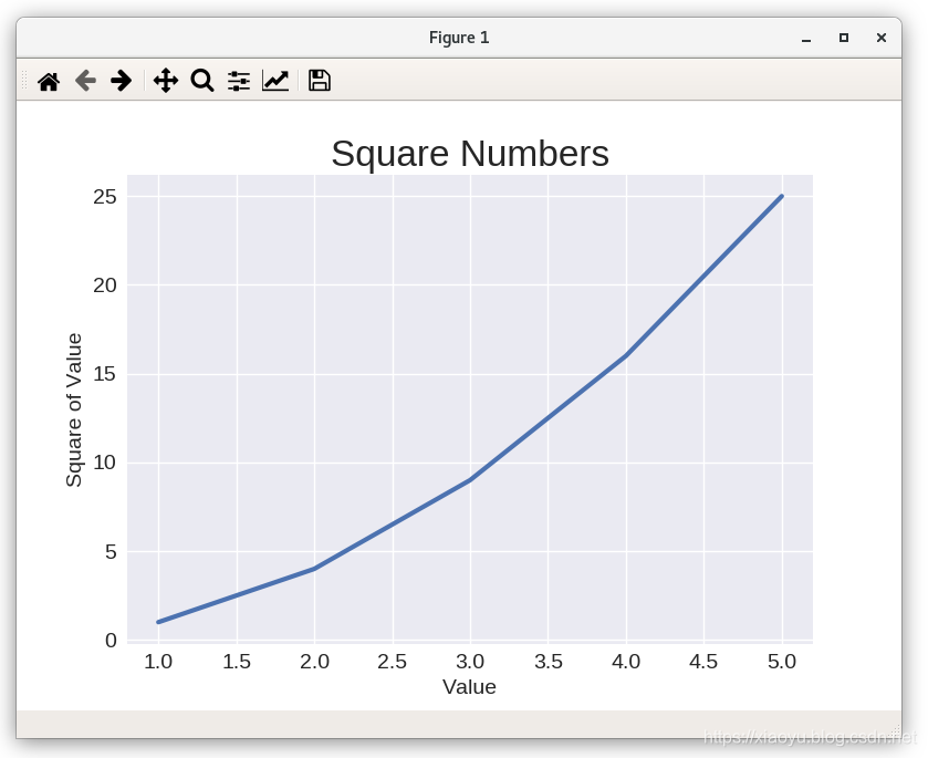
第一个示例程序mpl_squares.py代码如下:
import matplotlib.pyplot as plt
input_values = [1, 2, 3, 4, 5]
squares = [1, 4, 9, 16, 25]

plt.style.use('seaborn')
fig, ax = plt.subplots()
ax.plot(input_values, squares, linewidth=3)

# Set chart title and label axes.
ax.set_title("Square Numbers", fontsize=24)
ax.set_xlabel("Value", fontsize=14)
ax.set_ylabel("Square of Value", fontsize=14)

# Set size of tick labels.
ax.tick_params(axis='both', labelsize=14)

plt.show()
这个程序只有两行需要解释,一个是plt.style.use('seaborn')那行,seaborn是matplotlib库的延伸,是一种绘图风格。当然这一句是可选的。
>>> import matplotlib.pyplot as plt
>>> plt.style.available
['seaborn-ticks', 'ggplot', 'dark_background', 'bmh', 'seaborn-poster', 'seaborn-notebook', 'fast', 'seaborn', 'classic', 'Solarize_Light2', 'seaborn-dark', 'seaborn-pastel', 'seaborn-muted', '_classic_test', 'seaborn-paper', 'seaborn-colorblind', 'seaborn-bright', 'seaborn-talk', 'seaborn-dark-palette', 'tableau-colorblind10', 'seaborn-darkgrid', 'seaborn-whitegrid', 'fivethirtyeight', 'grayscale', 'seaborn-white', 'seaborn-deep']
一个是fig, ax = plt.subplots()的赋值方式,这表示右边的函数返回的是列表值,并分别赋予fig和ax。
例如:

>>> a,b,c = ['jan', 'feb', 'march']
>>> a
'jan'
>>> b
'feb'
>>> c
'march'
运行输出如下,注意最上方那一排菜单:
理解了第一个示例,第二个就简单多了,代码如下:
import matplotlib.pyplot as plt

x_values = range(1, 1001) # 在1001停止,因此是1到1000
y_values = [x**2 for x in x_values] # 记住这种简洁的赋值方式

plt.style.use('seaborn')
fig, ax = plt.subplots()
# c表示color,cmap表示color map
ax.scatter(x_values, y_values, c=y_values, cmap=plt.cm.Blues, s=10)

# Set chart title and label axes.
ax.set_title("Square Numbers", fontsize=24)
ax.set_xlabel("Value", fontsize=14)
ax.set_ylabel("Square of Value", fontsize=14)

# Set size of tick labels.
ax.tick_params(axis='both', which='major', labelsize=14)

# Set the range for each axis.
ax.axis([0, 1100, 0, 1100000])

plt.show()
关于color map,可参加此页面的Colormap reference。
如果不显示,只是存图片,可以将plt.show()替换为plt.savefig('squares_plot.png', bbox_inches='tight')。
随机漫步
Random Walk是一个术语,这里翻译为随机漫步,也就是通过随机决定下一步去哪。
花粉颗粒在水珠上的路径就是随机的。随机漫步在生化,经济等领域均有应用。
先来看如何产生5000个点的程序random_walk.py:
from random import choice

class RandomWalk:
    """A class to generate random walks."""

    def __init__(self, num_points=5000):
        """Initialize attributes of a walk."""
        self.num_points = num_points

        # All walks start at (0, 0).
        self.x_values = [0]
        self.y_values = [0]

    def fill_walk(self):
        """Calculate all the points in the walk."""

        # Keep taking steps until the walk reaches the desired length.
        while len(self.x_values) < self.num_points:

            # Decide which direction to go and how far to go in that direction.
            x_direction = choice([1, -1])
            x_distance = choice([0, 1, 2, 3, 4])
            x_step = x_direction * x_distance

            y_direction = choice([1, -1])
            y_distance = choice([0, 1, 2, 3, 4])
            y_step = y_direction * y_distance

            # Reject moves that go nowhere.
            if x_step == 0 and y_step == 0:
                continue

            # Calculate the new position.
            x = self.x_values[-1] + x_step
            y = self.y_values[-1] + y_step

            self.x_values.append(x)
            self.y_values.append(y)
5000个点的x和y坐标分别用两个List存储。第一个点是(0,0),下一个点的方向和x,y方向增量用choice生成,然后追加到List中。
然后可视化的部分如rw_visual.py:
import matplotlib.pyplot as plt

from random_walk import RandomWalk

# Keep making new walks, as long as the program is active.
while True:
    # Make a random walk.
    rw = RandomWalk(50_000)
    rw.fill_walk()

    # Plot the points in the walk.
    plt.style.use('classic')
    fig, ax = plt.subplots(figsize=(15, 9))
    point_numbers = range(rw.num_points)
    ax.scatter(rw.x_values, rw.y_values, c=point_numbers, cmap=plt.cm.Blues,
        edgecolors='none', s=1)

    # Emphasize the first and last points.
    ax.scatter(0, 0, c='green', edgecolors='none', s=100)
    ax.scatter(rw.x_values[-1], rw.y_values[-1], c='red', edgecolors='none',
        s=100)

    # Remove the axes.
#    ax.get_xaxis().set_visible(False)
#    ax.get_yaxis().set_visible(False)

    plt.show()

    keep_running = input("Make another walk? (y/n): ")
    if keep_running == 'n':
        break
运行效果如下:

其中绿色点是起点,总是(0,0),红色点是重点。因为路径是随机的,图片大小是固定的,因此(0,0)的位置不是固定的。
通过Plotly掷骰子
南方人伤不起。掷读zhi不是chi。骰读tou不是shai,当然骰子的俗称确实是色(shai)子。
Plotly是Python package,提供交互式的可视化,非常适合于在浏览器中使用。
首先安装Plotly:
$ python3 -m pip install --user plotly
Collecting plotly
  Downloading https://files.pythonhosted.org/packages/06/e1/88762ade699460dc3229c890f9845d16484a40955a590b65052f0958613c/plotly-4.5.0-py2.py3-none-any.whl (7.1MB)
    100% |████████████████████████████████| 7.1MB 121kB/s
Requirement already satisfied: six in /home/xiaoyu/.local/lib/python3.6/site-packages (from plotly)
Collecting retrying>=1.3.3 (from plotly)
  Downloading https://files.pythonhosted.org/packages/44/ef/beae4b4ef80902f22e3af073397f079c96969c69b2c7d52a57ea9ae61c9d/retrying-1.3.3.tar.gz
Installing collected packages: retrying, plotly
  Running setup.py install for retrying ... done
Successfully installed plotly-4.5.0 retrying-1.3.3
先来看Die这个类,默认是六面体,每面数字是1-6:
from random import randint

class Die:
    """A class representing a single die."""

    def __init__(self, num_sides=6):
        """Assume a six-sided die."""
        self.num_sides = num_sides

    def roll(self):
        """"Return a random value between 1 and number of sides."""
        return randint(1, self.num_sides)
第一个示例是掷1000次,统计1-6的次数,然后生成histgram。
die_visual.py代码如下:
from plotly.graph_objs import Bar, Layout
from plotly import offline

from die import Die

# Create a D6.
die = Die()

# Make some rolls, and store results in a list.
results = []
for roll_num in range(1000):
    result = die.roll()
    results.append(result)

# Analyze the results.
frequencies = []
for value in range(1, die.num_sides+1):
    frequency = results.count(value)
    frequencies.append(frequency)

# Visualize the results.
x_values = list(range(1, die.num_sides+1))
data = [Bar(x=x_values, y=frequencies)]

x_axis_config = {'title': 'Result'}
y_axis_config = {'title': 'Frequency of Result'}
my_layout = Layout(title='Results of rolling one D6 1000 times',
        xaxis=x_axis_config, yaxis=y_axis_config)
offline.plot({'data': data, 'layout': my_layout}, filename='d6.html')
A histogram(统计学上的直方图,矩形图) is a bar chart showing how often certain results occur.
运行结果会生成网页结果并用浏览器打开:
在此基础上,又做了一个掷两个骰子的例子,结果如下:

