版本:Qt5.12.5 ,参考Qt源码及文档示例
代码链接:https://github.com/gongjianbo/QmlComponentStyle.git
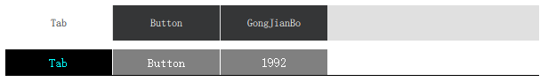
默认样式与自定义对比:
代码如下:
//basictabbutton.qml
//basictabbutton.qml
import QtQuick 2.12
import QtQuick.Controls 2.12
import QtQuick.Controls.impl 2.12
import QtQuick.Templates 2.12 as T

T.TabButton {
    id: control

    property color textColor: (control.checked||control.hovered) ? "cyan" : "white"
    property color buttonColor: control.checked ? "black": "gray"

    implicitWidth: Math.max(implicitBackgroundWidth + leftInset + rightInset,
                            implicitContentWidth + leftPadding + rightPadding)
    implicitHeight: Math.max(implicitBackgroundHeight + topInset + bottomInset,
                             implicitContentHeight + topPadding + bottomPadding)

    padding: 6
    spacing: 6
    font{
        family: "SimSun"
        pixelSize: 14
    }

    contentItem: Text {
        text: control.text
        font: control.font
        color: control.textColor
        horizontalAlignment: Text.AlignHCenter
        verticalAlignment: Text.AlignVCenter
        renderType: Text.NativeRendering
        elide: Text.ElideRight
    }

    background: Rectangle {
        implicitHeight: 30
        height: control.height - 1
        color: control.buttonColor
    }
}
//basictabbar.qml
//basictabbar.qml
import QtQuick 2.12
import QtQuick.Templates 2.12 as T

T.TabBar {
    id: control

    property color backgroundColor: "white"
    property color borderColor: "black"

    implicitWidth: Math.max(implicitBackgroundWidth + leftInset + rightInset,
                            contentWidth + leftPadding + rightPadding)
    implicitHeight: Math.max(implicitBackgroundHeight + topInset + bottomInset,
                             contentHeight + topPadding + bottomPadding)

    spacing: 1

    contentItem: ListView {
        model: control.contentModel
        currentIndex: control.currentIndex

        spacing: control.spacing
        orientation: ListView.Horizontal
        boundsBehavior: Flickable.StopAtBounds
        flickableDirection: Flickable.AutoFlickIfNeeded
        snapMode: ListView.SnapToItem

        highlightMoveDuration: 0
        highlightRangeMode: ListView.ApplyRange
        preferredHighlightBegin: 40
        preferredHighlightEnd: width - 40
    }

    background: Rectangle {
        implicitHeight: 30
        color: control.backgroundColor

        Rectangle {
            color: control.borderColor
            width: parent.width
            height: 1
            anchors.bottom: parent.bottom
        }
    }
}
//main.qml
使用如下
        TabBar{
            width: 600
            background: Rectangle{ color: palette.button }
            //tabbar默认平均分宽度
            TabButton{ width: 120; text: "Tab" }
            TabButton{ width: 120; text: "Button" }
            TabButton{ width: 120; text: "GongJianBo" }
        }

        BasicTabBar{
            width: 600
            //tabbar默认平均分宽度
            BasicTabButton{ width: 120; text: "Tab" }
            BasicTabButton{ width: 120; text: "Button" }
            BasicTabButton{ width: 120; text: "1992" }
        }