教程备份
flutter sample中的例子~
导航:
AnimatedList 删除和新增带动画效果的列表;
从flutter sample 改写简化的例子,数据增删效果换成了FadeTransition组件,类似的动画组件有SizeTransition,AlignTransition,SlideTransition,ScaleTransion,RotationTransition
// Copyright 2017 The Chromium Authors. All rights reserved.
// Use of this source code is governed by a BSD-style license that can be
// found in the LICENSE file.

import 'package:flutter/foundation.dart';
import 'package:flutter/material.dart';

class AnimatedListSample extends StatefulWidget {
 @override
 _AnimatedListSampleState createState() => _AnimatedListSampleState();
}

class _AnimatedListSampleState extends State<AnimatedListSample> {
 final GlobalKey<AnimatedListState> _listKey = GlobalKey<AnimatedListState>();
 List<int> _list;
 int _selectedItem;
 int _nextItem; // The next item inserted when the user presses the '+' button.

 @override
 void initState() {
 super.initState();
 _list = [0, 1, 2];
 _nextItem = 3;
 }

 // Used to build list items that haven't been removed.
 Widget _buildItem(
 BuildContext context, int index, Animation<double> animation) {
 return InkWell(
 onTap: () {
 setState(() {
 _selectedItem = _list[index];
 });
 },
 child: Card(
 color: _selectedItem == _list[index] ? Colors.lightGreen : Colors.white,
 child: FadeTransition(
 opacity: animation.drive(Tween(begin: 0.0, end: 1.0)),
 child: ListTile(
 selected: _selectedItem == _list[index],
 title: Text('${_list[index]}'),
 ),
 ),
 ),
 );
 }

 Widget _buildRemovedItem(
 int removedItem, BuildContext context, Animation<double> animation) {
 return InkWell(
 child: Card(
 color: Colors.lightGreen,
 child: FadeTransition(
  opacity: animation.drive(Tween(begin: 0.0, end: 1.0)),
 child: ListTile(
 selected: true,
 title: Text('${removedItem}'),
 ),
 ),
 ),
 );
 }

 // Insert the "next item" into the list model.
 void _insert() {
 _list.insert(0, _nextItem++);
 _listKey.currentState.insertItem(0, duration: Duration(milliseconds: 300));
 }

 // Remove the selected item from the list model.
 void _remove() {
 if (_selectedItem != null) {
 int index = _list.indexOf(_selectedItem);
 var removedItem = _list.removeAt(index);
 print(removedItem);
 _listKey.currentState.removeItem(index,
 (BuildContext context, Animation<double> animation) {
 return _buildRemovedItem(removedItem, context, animation);
 });
 setState(() {
 _selectedItem = null;
 });
 }
 }

 @override
 Widget build(BuildContext context) {
 return MaterialApp(
 home: Scaffold(
 appBar: AppBar(
 title: const Text('AnimatedList'),
 actions: <Widget>[
 IconButton(
 icon: const Icon(Icons.add_circle),
 onPressed: _insert,
 tooltip: 'insert a new item',
 ),
 IconButton(
 icon: const Icon(Icons.remove_circle),
 onPressed: _remove,
 tooltip: 'remove the selected item',
 ),
 ],
 ),
 body: Padding(
 padding: const EdgeInsets.all(16.0),
 child: AnimatedList(
 key: _listKey,
 initialItemCount: _list.length,
 itemBuilder: _buildItem,
 ),
 ),
 ),
 );
 }
}

void main() {
 runApp(AnimatedListSample());
}
ListView&&ExpansionTile 基于ExpansionTile实现可展开的ListView(树结构)
// Copyright 2017 The Chromium Authors. All rights reserved.
// Use of this source code is governed by a BSD-style license that can be
// found in the LICENSE file.
import 'package:flutter/material.dart';

class ExpansionTileSample extends StatelessWidget {
  @override
  Widget build(BuildContext context) {
    return MaterialApp(
      home: Scaffold(
        appBar: AppBar(
          title: const Text('ExpansionTile'),
        ),
        body: ListView.builder(
          itemBuilder: (BuildContext context, int index) => EntryItem(data[index]),
          itemCount: data.length,
        ),
      ),
    );
  }
}

//元数据结构
class Entry {
  Entry(this.title, [this.children = const <Entry>[]]);
  final String title;
  final List<Entry> children;
}
//数据
final List<Entry> data = <Entry>[
  Entry('Chapter A',
    <Entry>[
      Entry('Section A0',
        <Entry>[
          Entry('Item A0.1'),
          Entry('Item A0.2'),
          Entry('Item A0.3'),
        ],
      ),
      Entry('Section A1'),
      Entry('Section A2'),
    ],
  ),
  Entry('Chapter B',
    <Entry>[
      Entry('Section B0'),
      Entry('Section B1'),
    ],
  ),
  Entry('Chapter C',
    <Entry>[
      Entry('Section C0'),
      Entry('Section C1'),
      Entry('Section C2',
        <Entry>[
          Entry('Item C2.0'),
          Entry('Item C2.1'),
          Entry('Item C2.2'),
          Entry('Item C2.3'),
        ],
      ),
    ],
  ),
];

class EntryItem extends StatelessWidget {
  const EntryItem(this.entry);

  final Entry entry;

  Widget _buildTiles(Entry root) {
    if (root.children.isEmpty)
      return ListTile(title: Text(root.title));
    return ExpansionTile(
      key: PageStorageKey<Entry>(root),//保存页面滚动偏移量,重新渲染时可回到偏移量位置
      title: Text(root.title),
      children: root.children.map<Widget>(_buildTiles).toList(),
    );
  }

  @override
  Widget build(BuildContext context) {
    return _buildTiles(entry);
  }
}

void main() {
  runApp(ExpansionTileSample());
}
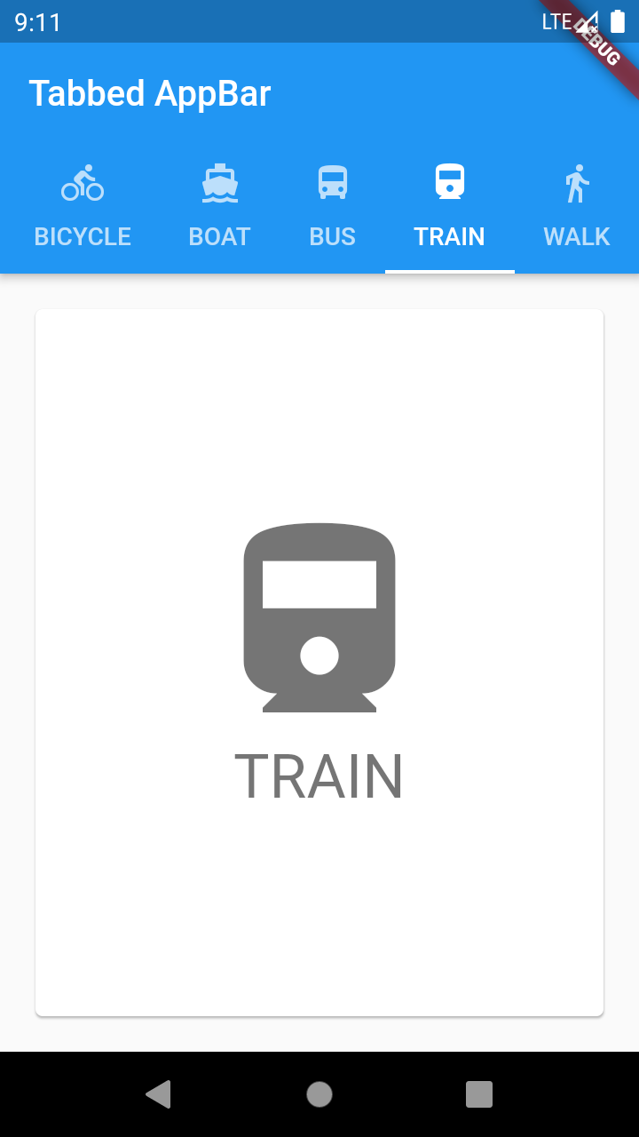
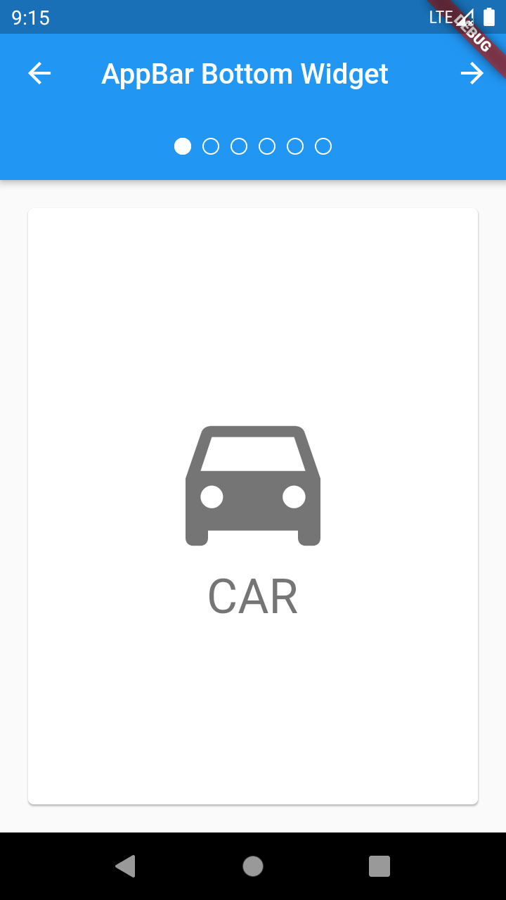
TabBar&&TabBarView&&DefaultTabController&&TabPageSelector 标签页
例子:TabPageSelector和TabBarView结合使用,创建一个TabController添加控制;
// Copyright 2017 The Chromium Authors. All rights reserved.
// Use of this source code is governed by a BSD-style license that can be
// found in the LICENSE file.

......

class _AppBarBottomSampleState extends State<AppBarBottomSample> with SingleTickerProviderStateMixin {
  TabController _tabController;

  @override
  void initState() {
    super.initState();
    _tabController = TabController(vsync: this, length: choices.length);
  }

  @override
  void dispose() {
    _tabController.dispose();
    super.dispose();
  }

  void _nextPage(int delta) {
    final int newIndex = _tabController.index + delta;
    if (newIndex < 0 || newIndex >= _tabController.length)
      return;
    _tabController.animateTo(newIndex);
  }

  @override
  Widget build(BuildContext context) {
    return MaterialApp(
      home: Scaffold(
        appBar: AppBar(
          title: const Text('AppBar Bottom Widget'),
          leading: IconButton(
            tooltip: 'Previous choice',
            icon: const Icon(Icons.arrow_back),
            onPressed: () { _nextPage(-1); },
          ),
          actions: <Widget>[
            IconButton(
              icon: const Icon(Icons.arrow_forward),
              tooltip: 'Next choice',
              onPressed: () { _nextPage(1); },
            ),
          ],
          bottom: PreferredSize(
            preferredSize: const Size.fromHeight(48.0),
            child: Theme(
              data: Theme.of(context).copyWith(accentColor: Colors.white),
              child: Container(
                height: 48.0,
                alignment: Alignment.center,
                child: TabPageSelector(controller: _tabController),
              ),
            ),
          ),
        ),
        body: TabBarView(
          controller: _tabController,
          children: choices.map<Widget>((Choice choice) {
            return Padding(
              padding: const EdgeInsets.all(16.0),
              child: ChoiceCard(choice: choice),
            );
          }).toList(),
        ),
      ),
    );
  }
}

......
......
例子:使用DefaultTabController默认控制页面中的TabBar和TabBarView
// Copyright 2017 The Chromium Authors. All rights reserved.
// Use of this source code is governed by a BSD-style license that can be
// found in the LICENSE file.

......

class TabbedAppBarSample extends StatelessWidget {
  @override
  Widget build(BuildContext context) {
    return MaterialApp(
      home: DefaultTabController(
        length: choices.length,
        child: Scaffold(
          appBar: AppBar(
            title: const Text('Tabbed AppBar'),
            bottom: TabBar(
              isScrollable: true,
              tabs: choices.map<Widget>((Choice choice) {
                return Tab(
                  text: choice.title,
                  icon: Icon(choice.icon),
                );
              }).toList(),
            ),
          ),
          body: TabBarView(
            children: choices.map<Widget>((Choice choice) {
              return Padding(
                padding: const EdgeInsets.all(16.0),
                child: ChoiceCard(choice: choice),
              );
            }).toList(),
          ),
        ),
      ),
    );
  }
}

......