代码:
<!DOCTYPE html>
<html>
    <head>
        <meta charset="UTF-8">
        <title></title>
        <style type="text/css">
            *{
                margin: 0;
                padding: 0;
            }
            .lb-wrapper{
                position: relative;
                margin: auto;
                margin-top: 100px;
                width: 210px;
                height:100px;
                perspective: 800px;
                /*border: 1px solid #ccc;*/
            }
            .lb-main{
                position: absolute;
                width: 100%;
                height: 100%;
                /*background-color: aquamarine;*/
                transform-style: preserve-3d;
                /*transform: translateZ(-288px) rotateX(0deg) rotateY(0deg);*/
                transform: translateZ(-80px) rotateX(0deg) rotateY(0deg);
                font-size: 40px;
                color: white;
                text-align: center;
                transition: 1s;
                 /* 动画名称 动画时长 延时时间 匀速 无限循环 逆播 */
                animation: move 25s 0.2s linear infinite alternate;
            }
            .lb-main figure{
                width: 100%;
                height: 100%;
                position: absolute;
                transform-style: preserve-3d;
                border: 2px solid black;
            }
            .lb-main figure:nth-of-type(1){
                background-color: firebrick;
                transform: rotateY(0deg) translateZ(288px) scale(0.95);
            }
            .lb-main figure:nth-of-type(2){
                background-color: lawngreen;
                transform:rotateY(40deg) translateZ(288px) scale(0.95);
            }
            .lb-main figure:nth-of-type(3){
                background-color: lightcoral;
                transform:rotateY(80deg) translateZ(288px) scale(0.95);
            }
            .lb-main figure:nth-of-type(4){
                background-color: coral;
                transform:rotateY(120deg) translateZ(288px) scale(0.95);
            }
            .lb-main figure:nth-of-type(5){
                background-color: fuchsia;
                transform:rotateY(160deg) translateZ(288px) scale(0.95);
            }
            .lb-main figure:nth-of-type(6){
                background-color: lightcoral;
                transform:rotateY(200deg) translateZ(288px) scale(0.95);
            }
            .lb-main figure:nth-of-type(7){
                background-color: brown;
                transform:rotateY(240deg) translateZ(288px) scale(0.95);
            }
            .lb-main figure:nth-of-type(8){
                background-color: turquoise;
                transform:rotateY(280deg) translateZ(288px) scale(0.95);
            }
            .lb-main figure:nth-of-type(9){
                background-color: orange;
                transform:rotateY(320deg) translateZ(288px) scale(0.95);
            }

            @keyframes move{
                0%{
                    transform: translateZ(-80px) rotateY(360deg);
                }
                100%{
                    transform: translateZ(-80px) rotateY(0deg);
                }
            }

        </style>
    </head>
    <body>
        <div class="lb-wrapper">
            <div class="lb-main">
                <figure>1</figure>
                <figure>2</figure>
                <figure>3</figure>
                <figure>4</figure>
                <figure>5</figure>
                <figure>6</figure>
                <figure>7</figure>
                <figure>8</figure>
                <figure>9</figure>
            </div>
        </div>
    </body>
</html>
详情和原理:
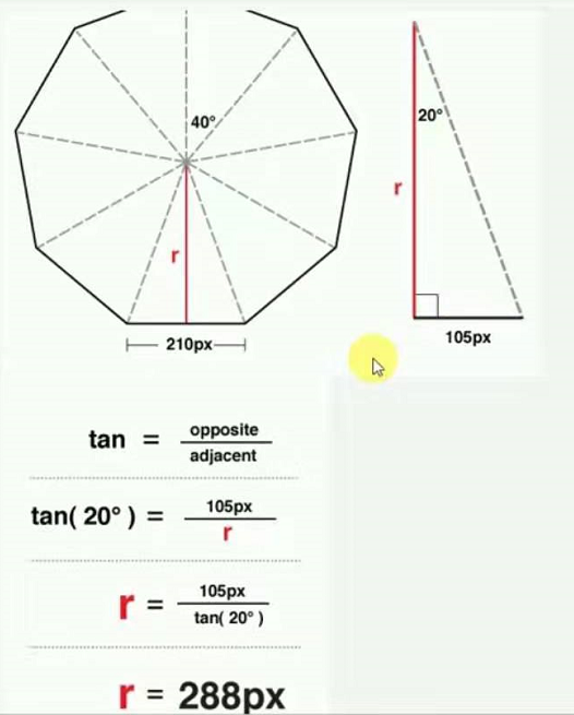
计算公式:

效果:

扫描二维码关注公众号,回复:
8290606 查看本文章
