版权声明:本文为博主原创文章,遵循 CC 4.0 BY-SA 版权协议,转载请附上原文出处链接和本声明。
单行溢出省略号:
p{width:100px;white-space: nowrap;/* 强制不换行 */overflow: hidden;/* 溢出隐藏 */text-overflow:ellipsis;/* 用省略号代替溢出部分 */}
弹性盒子的对齐方式
主轴横向对齐
justify-content:(设置在父元素上)
- center: 居中对齐(常用)
- space-between: 分开对齐(常用)
- space-around: 分开左右边距对齐
- flex-start: 起始对齐
- flex-end: 结束对齐
主轴纵向对齐
align-content:(设置在父元素上,不常用)
- flex-start: 起始对齐
- flex-end: 结束对齐
- center: 居中对齐
- space-between: 分开对齐
- space-around: 分开左右边距对齐
- strecth 上下拉升对齐
侧轴对齐
align-items (设置在父) 、align-self (设置在子)
- center: 居中对齐
- flex-start: 起始对齐
- flex-end: 结束对齐
- baseline: 基线对齐
- stretch: 上下拉升对齐
文本阴影属性的简写顺序:
text-shadow:x y 阴影范围 大小 颜色 inset(内阴影);
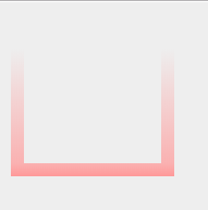
渐变边框:
body{background: #eee;}
.box { width: 100px;height: 100px; border:10px solid #ccc;
border-image: -webkit-linear-gradient(rgba(0,0,0,0) 30%,rgb(255,153,153)) 30 30;
border-image: -moz-linear-gradient(rgba(0,0,0,0) 30%,rgb(255,153,153)) 30 30;
border-image: linear-gradient(rgba(0,0,0,0) 30%,rgb(255,153,153)) 30 30; }


<div class="box"></div>
效果:
暂时就这些吧,等我有空会接着整理,这些是我自己经常记不住的,每次用都会百度一下,特此整理