条形图与直方图很相似,但是条形图x轴表示的不是数值而是类别。
bar(x, height, *, align=’center’, **kwargs)
bar(x, height, width, *, align=’center’, **kwargs)
bar(x, height, width, bottom, *, align=’center’, **kwargs)
#位置,高,宽,对齐方式algin,
简单条形图
index=[0,1,2,3,4]
values=[5,7,3,4,6]
std1=[0.8,1.0,0.4,0.9,1.3]
plt.bar(index,values,yerr=std1,error_kw={'ecolor':'r','capsize':6},label='first')
#yerr接收标准差,常常与erroe_kw一起使用,ecolor指定误差线颜色,capsize指定误差线两头横线的宽度
plt.legend(loc=2)
plt.xticks(index,['a','b','c','d','e'])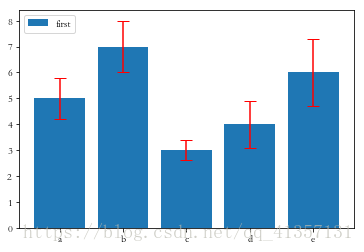
水平条形图
import numpy
import matplotlib.pyplot as plt
import matplotlib
from matplotlib import cm
index=[0,1,2,3,4]
values=sorted([5,7,3,4,6])
std1=[0.8,1.0,0.4,0.9,1.3]
col=cm.jet(numpy.array(values)/max(values))
plt.barh(index,values,color=col,alpha=0.6,
        xerr=std1,error_kw={'ecolor':'r','capsize':6})
#barh为水平条形图,相应的命名关键字参数由x变为y即可
plt.yticks(index,['a','b','c','d','e'],fontsize=15)
plt.grid(axis='x')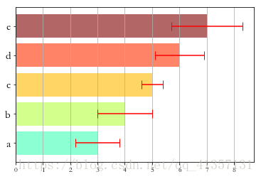
并列条形图
import numpy
import matplotlib.pyplot as plt
import matplotlib
index=numpy.arange(5)
values1=[5,7,3,4,6]
values2=[6,6,4,5,7]
values3=[5,6,5,4,6]
bw=0.3#条形图的宽度
plt.bar(index,values1,bw,color='b')
plt.bar(index+bw,values2,bw,color='g')
plt.bar(index+2*bw,values3,bw,color='r')
plt.xticks(index+bw,['a','b','c','d','e'])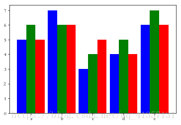
#将条形图放平
plt.barh(index,values1,bw,color='b')
plt.barh(index+bw,values2,bw,color='g')
plt.barh(index+2*bw,values3,bw,color='r')
plt.yticks(index+bw,['a','b','c','d','e'])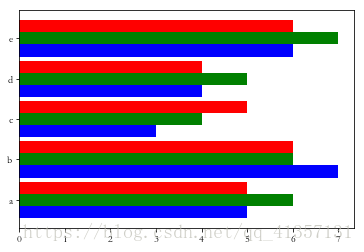
堆积条形图
import numpy
import matplotlib.pyplot as plt
import matplotlib
index=numpy.arange(4)
series1=numpy.array([1,2,2,3])
series2=numpy.array([1,2,2,3])
series3=numpy.array([2,3,3,4])
#因为列表元素不能相加,因此转化为数组,就可以直接相加了
plt.bar(index,series1,color='b')
plt.bar(index,series2,color='g',bottom=series1)
plt.bar(index,series3,color='r',bottom=(series2+series1))
plt.xticks(index,['jan15','feb15','mar15','apr15'])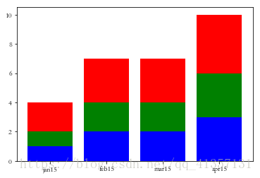
线条填充条形图
将条形图形状设置为白色,用关键字hatch指定填充的线条类型(|,,-,/,x)
同一字符出现的次数越多,形成阴影的线条越密集。
plt.bar(index,series1,color='w',hatch=r'|||')
plt.bar(index,series2,color='w',bottom=series1,hatch='xx')
plt.bar(index,series3,color='w',bottom=(series2+series1),hatch='////')
plt.xticks(index,['jan15','feb15','mar15','apr15'])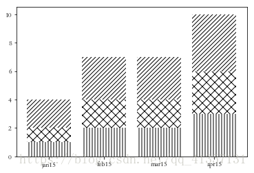
plt.barh(index,series1,color='b')
plt.barh(index,series2,color='g',left=series1)
plt.barh(index,series3,color='r',left=(series2+series1))
plt.yticks(index,['jan15','feb15','mar15','apr15'])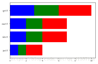
为dataframe数据类型添加条形图
frame=pandas.DataFrame({'series1':[1,2,2,3],
                        'series2':[1,2,2,3],
'series3':[2,3,3,4]})frame.plot(kind='bar')
plt.xticks(rotation=360,fontsize=15)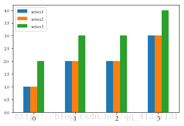
frame.plot(kind='barh')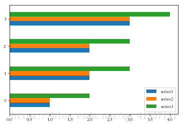
frame.plot(kind='bar',stacked=True)
plt.xticks(rotation=360,fontsize=15)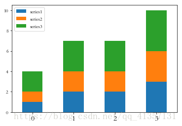
frame.plot(kind='barh',stacked=True,color=['r','g','b'])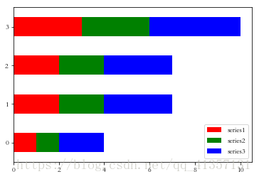
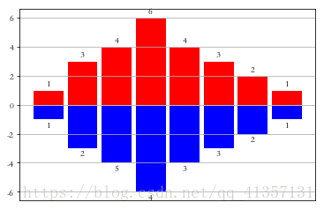
其它条形图
x0=numpy.arange(8)
y1=numpy.array([1,3,4,6,4,3,2,1])
y2=numpy.array([1,2,5,4,3,3,2,1])
plt.bar(x0,y1,0.9,facecolor='r',edgecolor='w')
plt.bar(x0,-y1,0.9,facecolor='b',edgecolor='w')
plt.xticks(())
plt.grid(True)
for x,y,z in zip(x0,y1,y2):
    plt.text(x,y+0.1,'%d' %y,ha='center',va='bottom')
    plt.text(x,-y-0.1,'%d' %z,ha='center',va='top')