https://blog.csdn.net/qq_31229137/article/details/80475231
注意:echart的demo页面的图表大小固定,在echart调整这些参数看不到大小变化
1.雷达图
radius: ‘25%’
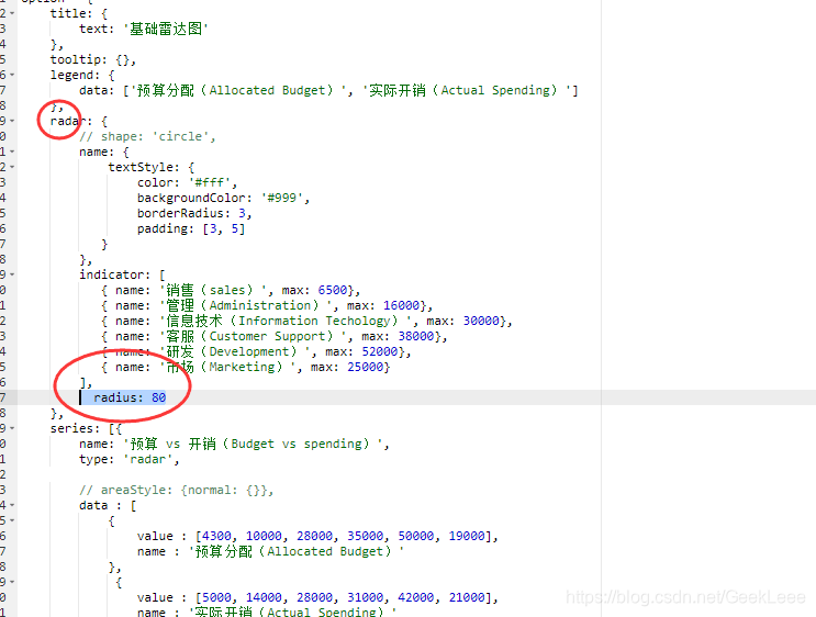
option = {
title: {
text: '基础雷达图'
},
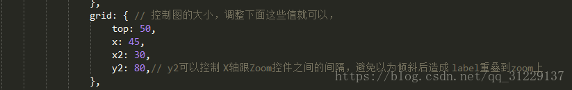
grid:{
x:35,
y:55,
x2:35,
y2:60,
borderWidth:1
},
tooltip: {},
legend: {
data: ['预算分配(Allocated Budget)', '实际开销(Actual Spending)']
},
radar: {
// shape: 'circle',
radius: '25%',
name: {
textStyle: {
color: '#fff',
backgroundColor: '#999',
borderRadius: 3,
padding: [3, 5]
}
},
indicator: [
{ name: '销售(sales)', max: 6500},
{ name: '管理(Administration)', max: 16000},
{ name: '信息技术(Information Techology)', max: 30000},
{ name: '客服(Customer Support)', max: 38000},
{ name: '研发(Development)', max: 52000},
{ name: '市场(Marketing)', max: 25000}
]
},
series: [{
name: '预算 vs 开销(Budget vs spending)',
type: 'radar',
// areaStyle: {normal: {}},
data : [
{
value : [4300, 10000, 28000, 35000, 50000, 19000],
name : '预算分配(Allocated Budget)'
},
{
value : [5000, 14000, 28000, 31000, 42000, 21000],
name : '实际开销(Actual Spending)'
}
]
}]
};;
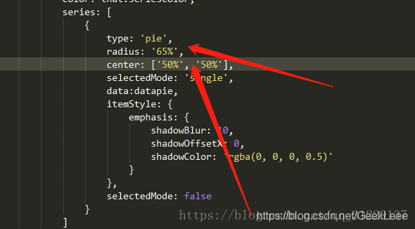
2、饼状图,直接在series里面,通过改变radius和center的大小值就可以调整大小。
3、柱状图和折线图的大小通过调整grid里面的值。