利用boder-raduis画图
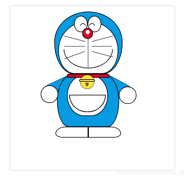
我们都知道用border-raduis可以给盒子画圆角,做头像让它看起来更加柔和,但其实它还有更大的价值,博主就用border-raduis画了个多啦A梦(因为我很喜欢多啦A梦所以利用业余时间搞了下)
纯HTML和CSS代码主要运用position定位,z-index层级关系和伪元素
大概look look…
用到的代码:
<!DOCTYPE html>
<html>
	<head>
		<meta charset="utf-8" />
		<title>哆啦A梦</title>
		<style>
			*{
				box-sizing: border-box;
			}
			body{
				margin: 0;
				padding: 0;
			}
			html,body{
				width: 100%;
				height: 100%;
			}
			.box{
				width: 600px;
				height: 600px;
				margin: 50px 200px;
				box-shadow: 0 0 5px #bbb;
			}
			#dlam{
				width: 100%;
				height: 100%;
				position: relative;
			}
			.head{
				position: relative;
				top: 20px;
				left: 160px;
				width: 250px;
				height: 230px;
				border: 2px solid #000;
				background-color: #059AE2;
				border-top-left-radius: 50% 48%;
				border-top-right-radius: 50% 48%;
				border-bottom-left-radius: 30% 50%;
				border-bottom-right-radius: 30% 50%;
			}
			.face{
				position: absolute;
				bottom: 0;
				left: 12px;
				width: 220px;
				height: 190px;
				background-color: #fff;
				border: 2px solid #000;
				border-top-left-radius: 50% 60%;
				border-top-right-radius: 50% 60%;
				border-bottom-left-radius: 30% 50%;
				border-bottom-right-radius: 30% 50%;
			}
			.eyes{
				position: absolute;
				width: 50px;
				height: 60px;
				background-color: #fff;
				border: 2px solid #000;
				border-radius: 100%;
				float: left;
			}
			.left-eye{
				top: 14px;
				left: 70px;
			}
			.left-eye:after{
				position: absolute;
				top: 24px;
				left: 23px;
				content: "";
				width: 15px;
				height: 15px;
				border: 2px solid #000;
				border-top-left-radius: 50%;
				border-right:none;
				border-bottom: none;
				transform: rotate(45deg);
			}
			.right-eye{
				top: 14px;
				left: 120px;
				}
			.right-eye:after{
				position: absolute;
				top: 24px;
				left: 6px;
				content: "";
				width: 15px;
				height: 15px;
				border: 2px solid #000;
				border-top-left-radius: 50%;
				border-right:none;
				border-bottom: none;
				transform: rotate(45deg);
				}
				.nose{
					position: absolute;
					top: 58px;
					left: 100px;
					width: 40px;
					height: 40px;
					border: 2px solid #000;
					border-radius: 50%;
					background-color: #fff;
					box-shadow: 0 -5px 0 10px #DA0227 inset;
				}
				.mouth{
					position: absolute;
					bottom: 20px;
					left: 33px;
					width: 180px;
					height: 70px;
					border: 2px solid #000;
					border-bottom-left-radius: 50% 100%;
					border-bottom-right-radius: 50% 100%;
					border-top: none;
				}
				.beard{
					position: absolute;
					height: 1px;
					background-color: #000;
					box-shadow: 0 0 2px #555;
				}
				.first{
					bottom: 100px;
					left: 35px;
					width: 75px;
				}
				.second{
					width: 75px;
					bottom:100px;
					left: 135px;
				}
				.third{
					width: 80px;
					bottom: 68px;
					left: 33px;
					transform: rotate(-20deg);
				}
				.fourth{
					width: 80px;
					bottom: 72px;
					left: 135px;
					transform: rotate(15deg);
				}
				.fifth{
					width: 80px;
					top: 97px;
					left: 32px;
					transform: rotate(15deg);
				}
				.sixth{
					width: 80px;
					top: 97px;
					left: 135px;
					transform: rotate(-15deg);
				}
				.mouth:after{
					content: "";
					position: absolute;
					top: 14px;
					left: 32px;
					width: 110px;
					height: 1px;
					background-color: #000;
					box-shadow: 0 0 2px #555;
					transform: rotate(90deg);
				}
				#dlam .body{
					position: absolute;
					top: 250px;
					left: 170px;
					width: 228px;
					height: 192px;
					background-color: #059AE2;
					border: 2px solid #000;
					border-top-left-radius: 40% 80%;
					border-top-right-radius: 40% 80%;
					border-bottom-left-radius: 30% 80%;
					border-bottom-right-radius: 30% 80%;
				}
				#dlam .body:after{
					content: "";
					position: absolute;
					top: -4px;
					left: 35px;
					width: 150px;
					height: 10px;
					border: 2px solid #000;
					background-color: #D90222;
					border-radius: 5px;
				}
				.belly{
					position: absolute;
					left: 35px;
					top:0;
					width: 150px;
					height: 150px;
					background-color: #fff;
					border: 2px solid #000;
					border-radius: 50%/60%;
				}
				.belly:after{
					content: "";
					position: absolute;
					top:70px;
					left: 6px;
					width: 130px;
					height: 60px;

					border-top: none;
					border: 2px solid #000;
					border-bottom-left-radius: 50% 100%;
					border-bottom-right-radius: 50% 100%;
				}
				.bell{
					position: absolute;
					top: 0;
					left: 84px;
					width: 50px;
					height: 50px;
					background-color: #FEE13E;
					border-radius: 100%;
					z-index: 2;
					box-shadow: 0 0 1px 1px #000;
				}
				.bell:after{
					content: "";
					position: absolute;
					top: 16px;
					left: -5px;
					width: 54px;
					height: 5px;
					background-color: #FCE875;
					border: 2px solid #000;
					border-radius: 5px;
				}
				.bell:before{
					content: "";
					position: absolute;
					top: 28px;
					left: 18px;
					width: 10px;
					height: 12px;
					background-color: #756742;
					border: 1px solid #423A25;
					border-top:none;
					border-bottom-left-radius: 50% 100%;
					border-bottom-right-radius: 50% 100%;
				}
				.left-hand{
					position: relative;
					top: 60px;
					left: 110px;
					width: 64px;
					height: 64px;
					border: 2px solid #000;
					border-radius: 50%;
					background-color: #fff;
				}
				.left-hand:after{
					content: "";
					position: absolute;
					top: -18px;
					left: 0;
					width: 120px;
					height: 50px;
					background-color: #059AE2;
					border-top-left-radius: 30% 50%;
					border-top-right-radius: 0% 0%;
					border-bottom-left-radius: 30% 50%;
					border-bottom-right-radius: 0% 0%;
					transform: rotate(-25deg);
					box-shadow: 0 0 1px 1px #000;
					z-index: -1;
				}
				.right-hand{
					position: relative;
					top: 0;
					left: 397px;
					width: 64px;
					height: 64px;
					border: 2px solid #000;
					border-radius: 50%;
					background-color: #fff;
				}
				.right-hand:after{
					content: "";
					position: absolute;
					top: -22px;
					left: -65px;
					width: 120px;
					height: 50px;
					background-color: #059AE2;
					border-top-left-radius: 30% 50%;
					border-top-right-radius: 0% 0%;
					border-bottom-left-radius: 30% 50%;
					border-bottom-right-radius: 0% 0%;
					transform: rotate(-152deg);
					box-shadow: 0 0 1px 1px #000;
					z-index: -1;
				}
				.foot-left{
					position: absolute;
					top: 73.5%;
					left: 164px;
					width: 120px;
					height: 40px;
					border:2px solid #000;
					border-top-left-radius: 40% 80%;
					border-top-right-radius: 0% 0%;
					border-bottom-left-radius: 30% 50%;
					border-bottom-right-radius: 0% 0%;
				}
				.foot-right{
					position: absolute;
					top: 73.5%;
					left: 284px;
					width: 120px;
					height: 40px;
					border:2px solid #000;
					border-top-left-radius: 0% 0%;
					border-top-right-radius: 40% 80%;
					border-bottom-left-radius: 0% 0%;
					border-bottom-right-radius: 30% 50%;
				}
		</style>
	</head>
	<body>
		<div class="box">
			<div id="dlam">
				<div class="head">
					<div class="face"></div>
					<div class="eyes left-eye"></div>
					<div class="eyes right-eye"></div>
					<div class="nose"></div>
					<div class="mouth"></div>
					<div class="beard first"></div>
					<div class="beard second"></div>
					<div class="beard third"></div>
					<div class="beard fourth"></div>
					<div class="beard fifth"></div>
					<div class="beard sixth"></div>
				</div>
				<div class="body">
					<div class="belly"></div>
					<div class="bell"></div>
				</div>
				<div class="hands left-hand"></div>
				<div class="hands right-hand"></div>
				<div class="foot-left"></div>
				<div class="foot-right"></div>
			</div>
		</div>
	</body>
</html>