一、定宽居中 布局:
下面只是其中一种方法,更多方法请参见该文章:狠狠戳我
*{margin: 0;padding: 0;}
.parent{background: #ccc;}

.content{
    background: red;
    width: 800px;   /*1*/
    margin: 0 auto; /*2*/
}
</style>

<div class="parent">
    <div class="content">dadsa</div>
</div>
效果图:

二、两列右侧自适应 布局:
左边定宽,右边自适应
要求:一个不定宽度的容器被分为左右两列,左边定宽500px,右边自适应剩余宽度,且两列之间间距为10px。
1、方法一:absolute + margin
1) 给定 左的width值
2)左 position: absolute;
3)右 margin-left: 510px;
<style>
*{margin: 0;padding: 0;}

.left{
    width:500px;        /*1*/
    background: blue;
    position: absolute; /*2*/  /*relative不行*/
}
.right{
    background: orange;
    margin-left: 510px; /*3*/  /*width + 10*/
}
</style>
<body>
<div class="parent">
    <div class="left">左侧定宽</div>
    <div class="right">右侧自适应</div>
</div>
效果图:

2、方法二:float + margin
1)写左元素width值
2)左 float: left;
3)右 margin-left: 510px;
<style>
*{margin: 0;padding: 0;}

.left{
    width:500px;       /*1*/
    background: blue;
    float:left;        /*2*/
}
.right{
    background: orange;
    margin-left: 510px; /*3*/  /*width + 10*/
}
</style>

<div class="parent">
    <div class="left">左侧定宽</div>
    <div class="right">右侧自适应</div>
</div>
效果图:同上
三、三列中间自适应 布局:
左右定宽,中间自适应
要求:一个不定宽度的容器被分为左中右三列,左边定宽300px,右边定宽150px,中间列自适应剩余宽度,且三列之间间距为10px。
1、方法一:absolute + margin
1)写左右元素width值
2) 左右设为:position: absolute;top:0;
3) 左为 left: 0; 右为 right: 0;
4) 中间:margin:0 160px 0 310px;
<style>
*{margin: 0;padding: 0;}
.left,.right,.center{height:300px;}

.left,.right{
    position: absolute; /*2*/  /*relative不行*/
    top:0;              /*2*/
}
.left{
    width:300px;        /*1*/
    background: red;
    left: 0;            /*3*/
}
.right{
    width:150px;        /*1*/
    background: orange;
    right: 0;           /*3*/
}
.center{
    background: blue;
    margin:0 160px 0 310px; /*4*/
}
</style>

<div class="parent">
    <div class="left">左侧定宽</div>
    <div class="center">中间自适应</div>
    <div class="right">右侧定宽</div>
</div>
效果图:
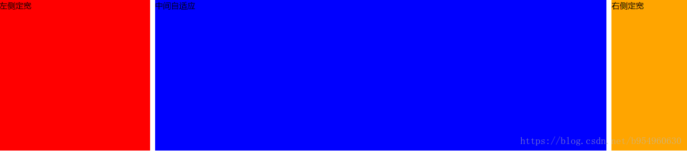
2、方法二:float + margin
1)写左、右元素width值
2)左float: left; 右float: right;
3)中 margin: 0 160px 0 310px;
注意:左、右、中三部分 HTML的顺序不能错。
<style>
*{margin: 0;padding: 0;}
.left,.right,.center{height:300px;}

.left{
    width:300px;  /*1*/
    background: red;
    float: left;  /*2*/
}
.right{
    width:150px;  /*1*/
    background: orange;
    float: right; /*2*/
}
.center{
    background: blue;
    margin: 0 160px 0 310px; /*3*/
}

</style>
<body>
<div class="parent">
    <!-- 注意顺序是左、右、中 -->
    <div class="left">左侧定宽</div>
    <div class="right">右侧定宽</div>
    <div class="center">中间自适应</div>
</div>
效果图:同上
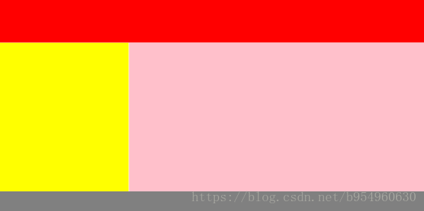
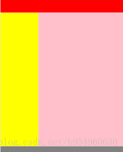
四、全屏自适应 布局:
1、方法一:absolute
<style>
*{margin: 0;padding: 0;}

.header,.left,.right,.footer{
    position:absolute;
    overflow:auto;
}
.header,.footer{
    width:100%;
}
.header,.left,.footer{
    left:0;
}
.header{
    top:0;
    height:100px;
    background:red;
}
.left,.right{
    top:100px;
    bottom:50px;
}
.left{
    width:300px;
    background:yellow;
}
.right{
    left:300px;
    right:0;
    background:pink;
}
.footer{
    bottom:0;
    height:50px;
    background:gray;
}
</style>

    <div class="header"></div>
    <div class="left"></div>
    <div class="right"></div>
    <div class="footer"></div>
效果图: